SaaS & Software Promotional Email Template
“Your outdated site is costing you sales”
Design Score
77/100This is a competent, visually striking promotional email that immediately identifies a core customer pain point: lost revenue due to an outdated website. It effectively uses the brand's bold color palette and a logical inverted-pyramid structure to guide the reader toward the portfolio and contact forms. However, it leans too heavily on negative, fear-based framing ('Stop Losing Revenue', 'Costs You Sales'), which slightly contradicts the brand's goal of providing 'reassurance' and 'empowerment'. Furthermore, while the value proposition is clear, asking for a 'Free Quote' multiple times creates a high-friction barrier for readers who might just be exploring.
Create Your Own
Generate professional email designs like this one in seconds with Kopi AI.
Email Details
- Subject Line
- Your outdated site is costing you sales
- Brand
- Beyond the Brand Media®
- Industry
- SaaS & Software
- Email Type
- Promotional
- Created
- April 8, 2026
Brand Colors
Email Copy
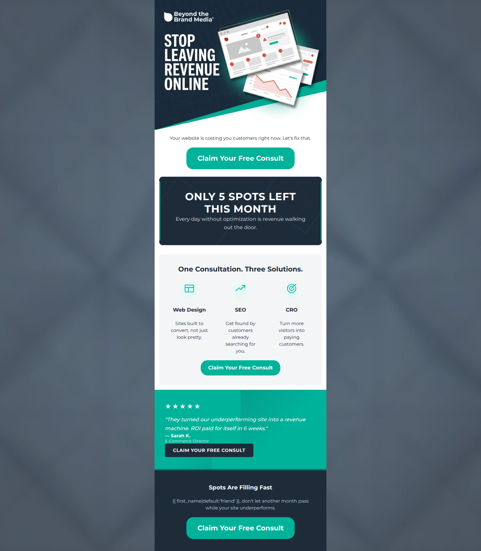
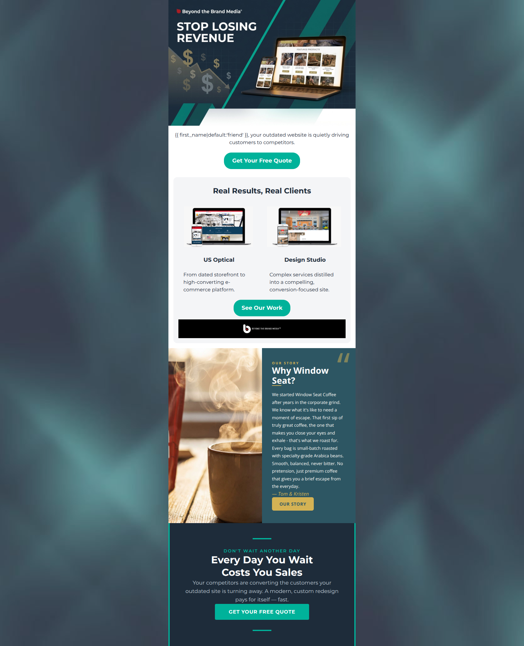
friend, your outdated website is quietly driving customers to competitors.
→ Get Your Free Quote
Real Results, Real Clients
US Optical
From dated storefront to high-converting e-commerce platform.
Design Studio
Complex services distilled into a compelling, conversion-focused site.
→ See Our Work
Why This Email Works
This is a competent, visually striking promotional email that immediately identifies a core customer pain point: lost revenue due to an outdated website. It effectively uses the brand's bold color palette and a logical inverted-pyramid structure to guide the reader toward the portfolio and contact forms. However, it leans too heavily on negative, fear-based framing ('Stop Losing Revenue', 'Costs You Sales'), which slightly contradicts the brand's goal of providing 'reassurance' and 'empowerment'. Furthermore, while the value proposition is clear, asking for a 'Free Quote' multiple times creates a high-friction barrier for readers who might just be exploring.
Hero (top/initial part) Impact
75/100- Hits a massive, tangible pain point immediately ('Stop Losing Revenue').
- Visuals effectively contrast the dark background with the bright teal CTA.
- Quickly establishes the context (websites/e-commerce) through the device imagery.
Content Structure & Flow
82/100- Excellent use of the inverted pyramid framework to build a case for clicking.
- Distinct visual sections (white, light gray, dark navy) clearly separate different types of content.
- Ends strong with a dedicated urgency block rather than just letting the email trail off.
Visual Hierarchy & Layout
78/100- The teal CTA buttons dominate the visual hierarchy, making the desired action unmistakable.
- Grid-based portfolio and feature cards make complex information easy to digest visually.
- Consistent application of brand colors establishes a premium, professional feel.
Call-to-Action Strength
85/100- Excellent color contrast makes buttons impossible to miss.
- Buttons are sized appropriately for easy tapping/clicking.
- The secondary CTA ('See Our Work') provides an excellent alternative path for users wanting proof before committing to a quote.
Message Clarity & Tone
72/100- Zero technical jargon used; entirely focused on business outcomes.
- The relationship between an outdated site and lost revenue is made explicit and undeniable.
- Feature descriptions effectively translate capabilities (e-commerce builds) into benefits (speed, trust, turning browsers into buyers).
Readability & Scannability
88/100- Excellent use of bullet-like formatting via the two-column cards.
- High contrast between text and background colors ensures legibility.
- Headings ('Real Results, Real Clients') clearly telegraph what the subsequent section is about.
Offer & Value Proposition
65/100- The core value proposition is tied directly to the customer's ultimate goal: making more money.
- The inclusion of portfolio examples acts as proof that the agency can deliver on its value prop.
Personalization & Audience Fit
70/100- Accurately targets the audience's lack of time and need for bottom-line results.
- Avoids treating the reader like a web developer by omitting technical implementation details.
Copy Conciseness & Word Economy
80/100- No throat-clearing introductions ('We are excited to announce...').
- Uses strong, active verbs ('Turn browsers into buyers', 'distilled into').
Quick Wins
- Change the fallback dynamic tag from 'friend' to something more professional, or remove the greeting entirely and start with the statement.
- Change the middle CTA copy to a lower-friction ask, such as 'See How We Work' or 'Request an Audit'.
- Add a small H2 headline above the two-column feature cards to provide a transition from the hero text.
Create Professional Email Designs
Generate beautiful, on-brand email designs in seconds. Just enter your brand URL and let AI do the rest.