Other Promotional Email Template
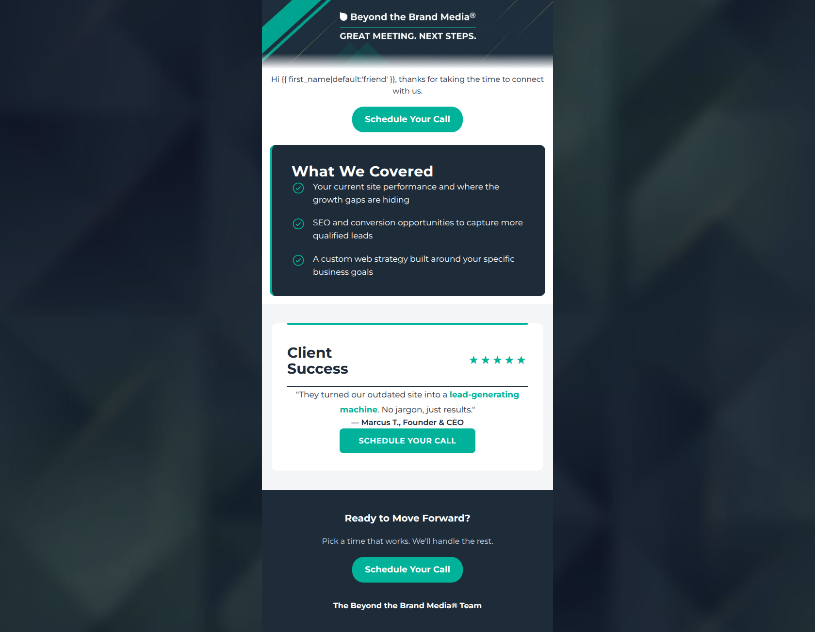
“Following Up on Our Meeting”
Design Score
84/100This is a strong, highly professional post-meeting follow-up email that effectively leverages the brand's bold visual identity. The email excels in visual hierarchy, scannability, and CTA clarity, presenting a frictionless path for the user to schedule their next call. The primary areas for improvement lie in making the opening copy more engaging, clarifying the specific outcome of the next call, and injecting deeper personalization into the meeting recap to reinforce the premium, bespoke nature of the agency's services.
Create Your Own
Generate professional email designs like this one in seconds with Kopi AI.
Email Details
- Subject Line
- Following Up on Our Meeting
- Brand
- Beyond the Brand Media®
- Industry
- Other
- Email Type
- Promotional
- Created
- April 23, 2026
Brand Colors
Email Copy
Hi friend, thanks for taking the time to connect with us.
→ Schedule Your Call
Ready to Move Forward?
Pick a time that works. We'll handle the rest.
→ Schedule Your Call
The Beyond the Brand Media® Team
Why This Email Works
This is a strong, highly professional post-meeting follow-up email that effectively leverages the brand's bold visual identity. The email excels in visual hierarchy, scannability, and CTA clarity, presenting a frictionless path for the user to schedule their next call. The primary areas for improvement lie in making the opening copy more engaging, clarifying the specific outcome of the next call, and injecting deeper personalization into the meeting recap to reinforce the premium, bespoke nature of the agency's services.
1. Hero (top/initial part) Impact
75/100- Clean, on-brand graphic immediately establishes identity and professionalism.
- Sets clear, unambiguous context for why the user is receiving the email.
2. Content Structure & Flow
85/100- Excellent use of the inverted pyramid, driving attention directly to the conversion points.
- The inclusion of social proof immediately following the value proposition is a highly effective conversion tactic.
3. Visual Hierarchy & Layout
92/100- The high-contrast dark card acts as a visual anchor, breaking up the email beautifully.
- Teal checkmarks and borders guide the reader's eye seamlessly toward the subsequent CTA.
4. Call-to-Action Strength
95/100- All buttons point to a single, unified conversion goal without any competing secondary actions.
- The high-contrast teal buttons on both white and dark backgrounds make the action visually unmissable.
5. Message Clarity & Tone
88/100- The tone perfectly balances professional capability with approachability.
- The testimonial explicitly addresses a primary customer pain point (jargon) and provides the desired outcome (lead-generating machine).
6. Readability & Scannability
90/100- Short, punchy sentences prevent the reader from being overwhelmed by text.
- Iconography (checkmarks, stars) breaks up the text and makes the content visually digestible.
7. Offer & Value Proposition
80/100- The recap points are benefit-driven ('capture more leads') rather than just feature-driven.
- The testimonial serves as a strong secondary value proposition.
8. Personalization & Audience Fit
72/100- The content speaks directly to the target audience's core desires: efficiency, leads, and strategy.
9. Copy Conciseness & Word Economy
88/100- Every text block serves a distinct purpose in moving the user toward the CTA.
- The testimonial is distilled down to its most impactful core message.
Quick Wins
- Left-align the introductory text beneath the hero graphic for improved readability and a more personal feel.
- Update the 'Ready to Move Forward?' header to something more specific to the service, like 'Ready to build your strategy?'.
- Clarify exactly what the user will achieve on the 'Scheduled Call' (e.g., reviewing a proposal, next steps in onboarding).




Create Professional Email Designs
Generate beautiful, on-brand email designs in seconds. Just enter your brand URL and let AI do the rest.