Electronics & Tech Welcome Email Template
“Welcome aboard — let's build something great”
Design Score
85/100This is a strong, conversion-focused welcome email that effectively communicates the brand's core value proposition: delivering complex digital solutions without the jargon. The visual hierarchy is excellent, utilizing the brand's dark navy and vibrant teal to draw the eye directly to the service offerings and the primary Calls to Action. The copy is tight, benefit-driven, and perfectly aligned with the target audience's desire for measurable growth over technical specs. While the execution is highly competent, minor friction points exist in the pacing of the CTAs and the slight vagueness of the opening hook. Addressing these will elevate this from a strong email to an outstanding one.
Create Your Own
Generate professional email designs like this one in seconds with Kopi AI.
Email Details
- Subject Line
- Welcome aboard — let's build something great
- Brand
- Beyond the Brand Media®
- Industry
- Electronics & Tech
- Email Type
- Welcome
- Created
- April 22, 2026
Brand Colors
Email Copy
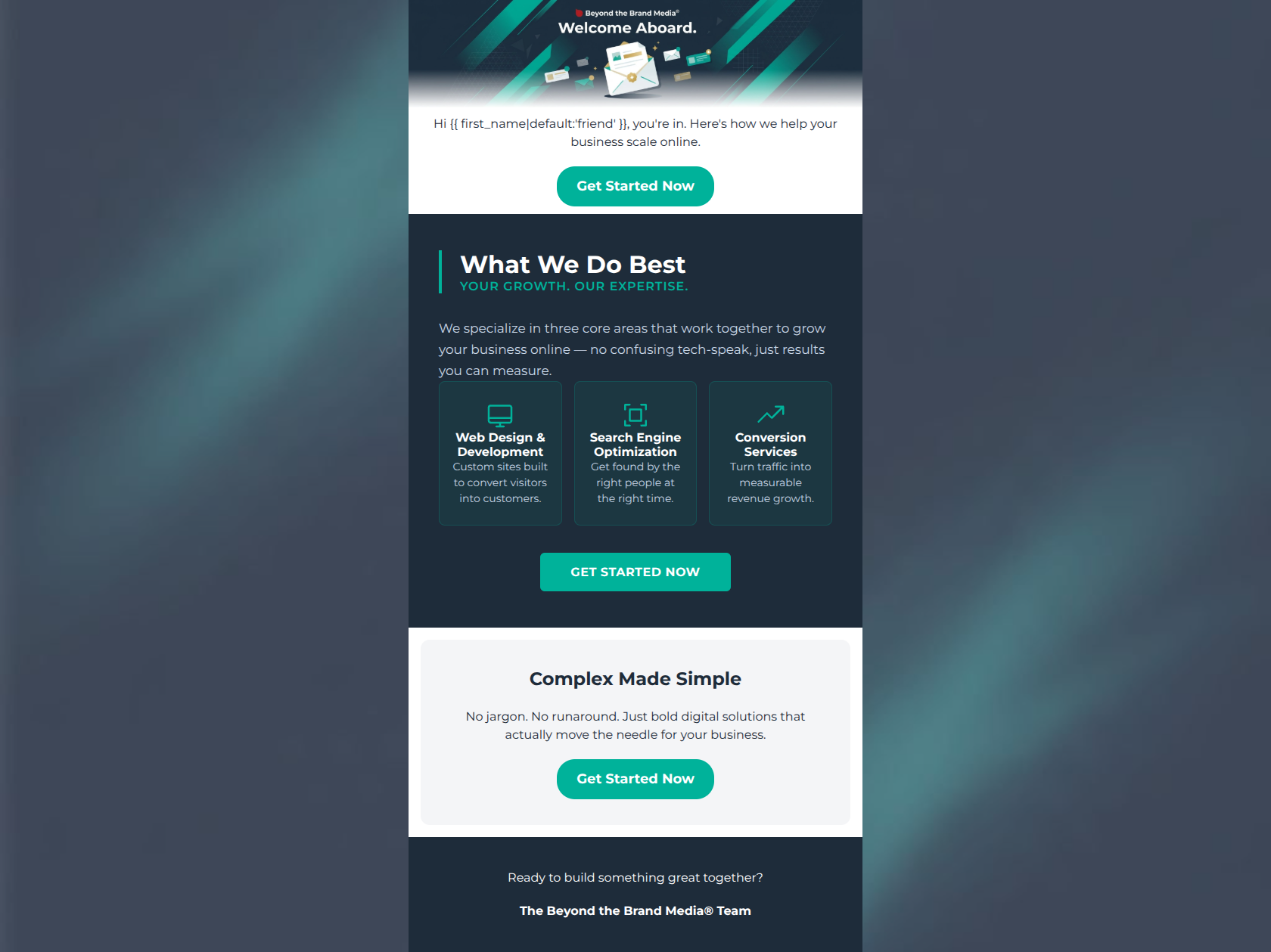
Hi friend, you're in. Here's how we help your business scale online.
→ Get Started Now
Complex Made Simple
No jargon. No runaround. Just bold digital solutions that actually move the needle for your business.
→ Get Started Now
Ready to build something great together?
The Beyond the Brand Media® Team
Why This Email Works
This is a strong, conversion-focused welcome email that effectively communicates the brand's core value proposition: delivering complex digital solutions without the jargon. The visual hierarchy is excellent, utilizing the brand's dark navy and vibrant teal to draw the eye directly to the service offerings and the primary Calls to Action. The copy is tight, benefit-driven, and perfectly aligned with the target audience's desire for measurable growth over technical specs. While the execution is highly competent, minor friction points exist in the pacing of the CTAs and the slight vagueness of the opening hook. Addressing these will elevate this from a strong email to an outstanding one.
Hero (top/initial part) Impact
75/100- The hero image utilizes brand colors and clean geometry, immediately establishing a modern, professional aesthetic.
- The introductory copy instantly pivots from a greeting to the core benefit: helping the business scale online.
Content Structure & Flow
85/100- Excellent use of color blocking to delineate different sections of the email.
- The flow logically builds from specific service offerings to the broader emotional benefit ('No jargon').
Visual Hierarchy & Layout
90/100- The dark mode service grid acts as a visual anchor, ensuring the most important content receives the most attention.
- The teal CTA buttons pop brilliantly against both the white and navy backgrounds, passing the 'squint test' with flying colors.
Call-to-Action Strength
95/100- Flawless adherence to a single primary goal; no competing secondary actions dilute the click-through focus.
- High-contrast button design makes the action undeniable at every scroll depth.
Message Clarity & Tone
88/100- Perfect alignment with the brand's 'expert but approachable' voice.
- The subheadline 'What We Do Best: YOUR GROWTH. OUR EXPERTISE.' is a powerful, concise summary of the agency-client relationship.
Readability & Scannability
90/100- The three-column icon grid is the ideal format for digesting service categories quickly.
- Short, punchy sentences prevent 'wall of text' fatigue.
Offer & Value Proposition
85/100- Service descriptions are heavily benefit-driven (e.g., 'built to convert visitors' instead of 'custom coded PHP').
- The 'Complex Made Simple' block serves as an excellent overarching value statement.
Personalization & Audience Fit
85/100- The anti-jargon stance perfectly matches the audience's stated pain points.
- The focus on 'measurable revenue growth' speaks directly to the audience's primary goal.
Copy Conciseness & Word Economy
92/100- The service grid descriptions are masterclasses in tight copy (e.g., 'Get found by the right people at the right time').
- No wasted paragraphs; the email respects the reader's time.
Quick Wins
- Standardize the casing of the CTA buttons (make them all Title Case: 'Get Started Now').
- Move the bottom CTA to sit directly underneath the final text 'Ready to build something great together?'.
- Tighten the maximum width of the text in the 'Complex Made Simple' card to prevent overly long lines on desktop.




Create Professional Email Designs
Generate beautiful, on-brand email designs in seconds. Just enter your brand URL and let AI do the rest.