SaaS & Software Promotional Email Template
“Only 5 spots left this month”
Design Score
86/100This is a highly effective, tightly executed promotional email that clearly understands its target audience's pain points. The inverted pyramid structure effectively funnels attention from a strong, problem-focused hook down to a well-supported offer. The CTA strategy is nearly flawless, employing consistent repetition and unambiguous language. To move this from an 86 to a 95+, minor adjustments to visual consistency and flow—specifically regarding the placement of the urgency block and clarifying the exact nature of the consultation—are required.
Create Your Own
Generate professional email designs like this one in seconds with Kopi AI.
Email Details
- Subject Line
- Only 5 spots left this month
- Brand
- Beyond the Brand Media®
- Industry
- SaaS & Software
- Email Type
- Promotional
- Created
- April 23, 2026
Brand Colors
Email Copy
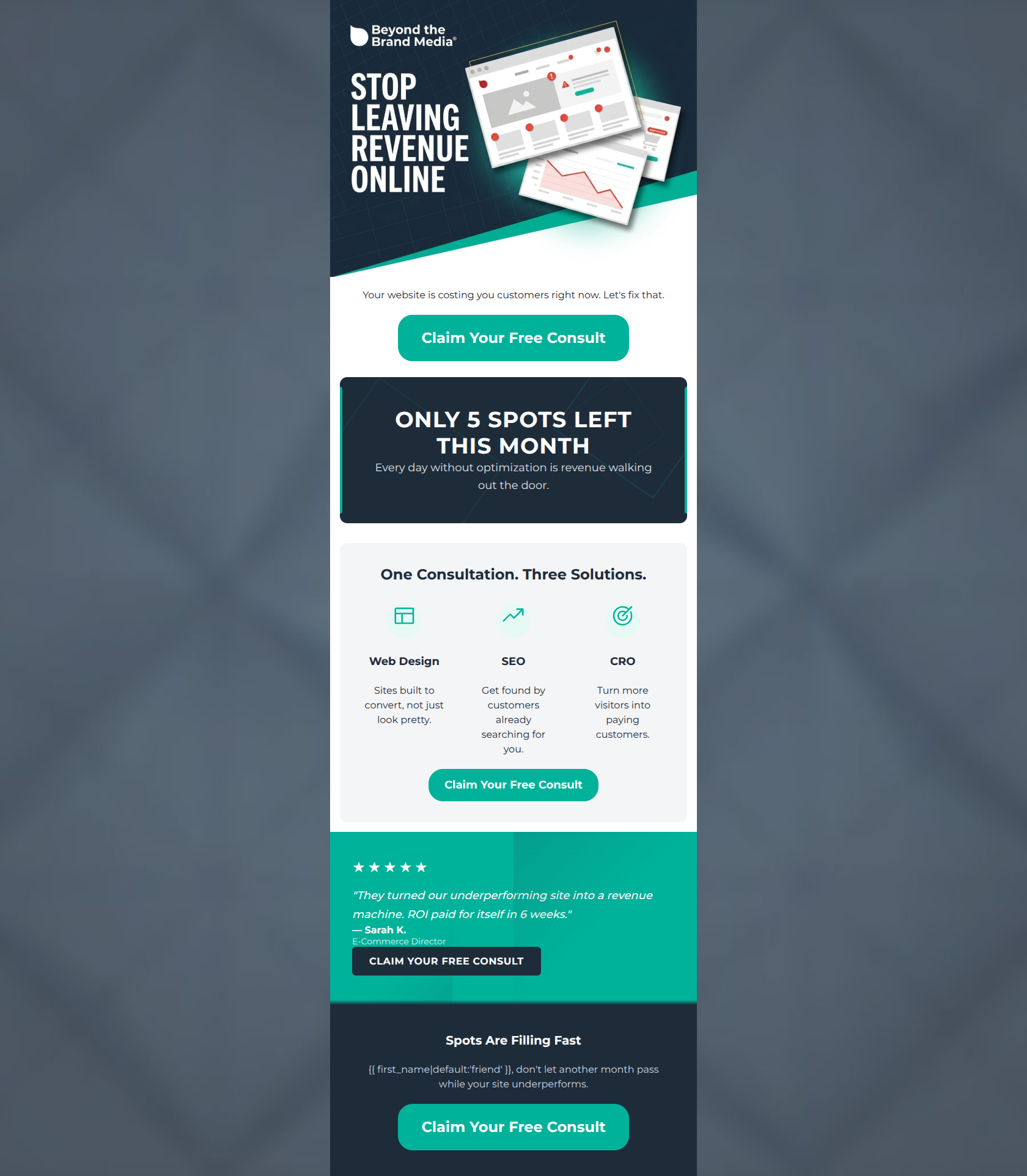
Your website is costing you customers right now. Let's fix that.
→ Claim Your Free Consult
One Consultation. Three Solutions.
Web Design
Sites built to convert, not just look pretty.
SEO
Get found by customers already searching for you.
CRO
Turn more visitors into paying customers.
→ Claim Your Free Consult
Spots Are Filling Fast
friend, don't let another month pass while your site underperforms.
→ Claim Your Free Consult
Why This Email Works
This is a highly effective, tightly executed promotional email that clearly understands its target audience's pain points. The inverted pyramid structure effectively funnels attention from a strong, problem-focused hook down to a well-supported offer. The CTA strategy is nearly flawless, employing consistent repetition and unambiguous language. To move this from an 86 to a 95+, minor adjustments to visual consistency and flow—specifically regarding the placement of the urgency block and clarifying the exact nature of the consultation—are required.
Hero (top/initial part) Impact
85/100- Highly relevant hero graphic that visualizes the customer's primary pain point.
- Immediate introduction of a clear, high-contrast CTA above the fold.
Content Structure & Flow
82/100- Logical progression from identifying a problem to offering a solution and providing social proof.
- Clear delineation of sections using background color changes.
Visual Hierarchy & Layout
85/100- Excellent use of stark contrasting background colors (white, navy, teal) to create distinct, readable sections.
- The three-column layout successfully breaks up text and makes the services highly scannable.
Call-to-Action Strength
95/100- Unambiguous singular primary action repeated strategically throughout the email.
- Action-oriented CTA copy ('Claim') rather than passive ('Submit' or 'Learn More').
Message Clarity & Tone
88/100- Zero technical jargon; highly focused on the tangible business results (revenue, finding customers).
- Direct, confident, and professional tone that speaks to business owners.
Readability & Scannability
90/100- Excellent use of whitespace and varied font weights to guide the eye.
- Bite-sized copy blocks under the icons make technical services easily digestible.
Offer & Value Proposition
84/100- The value proposition is directly tied to stopping revenue loss, a high-priority pain point.
- Framing the three services under 'One Consultation' simplifies the ask.
Personalization & Audience Fit
75/100- Deep alignment with the target audience's desire to stop wasting money on underperforming digital assets.
Copy Conciseness & Word Economy
92/100- No wasted paragraphs; the copy is distilled and intentional.
- Strong, impactful single sentences like 'Every day without optimization is revenue walking out the door.'
Quick Wins
- Ensure all CTA buttons utilize the exact same color scheme (teal background, white text) for instant visual recognition.
- Format the text immediately below the hero image as a slightly larger, bolder subheadline rather than standard body text.
- Adjust the text wrapping in the three-column service section so the text flows more evenly across the columns.
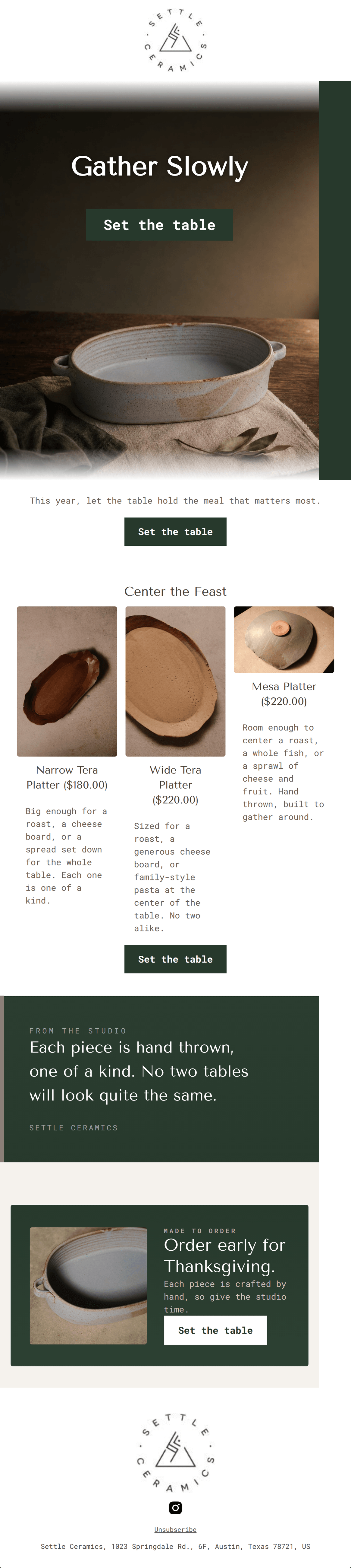



Create Professional Email Designs
Generate beautiful, on-brand email designs in seconds. Just enter your brand URL and let AI do the rest.