Health & Wellness Cart Abandonment Email Template
โYour optimal hydration is waiting in your cartโ

Design Score
78/100This is a solid, clean cart abandonment email that effectively utilizes a strong promotional offer (25% off) and bold brand imagery to capture attention. The hero section does heavy lifting by immediately establishing the context and the incentive. However, the email relies heavily on generic brand assets rather than dynamically showing the user's actual abandoned items, which leaves conversion potential on the table. Minor layout inconsistencies, such as shifting text alignments, also introduce slight friction into the user's reading path.
Create Your Own
Generate professional email designs like this one in seconds with Kopi AI.
Email Details
- Subject Line
- Your optimal hydration is waiting in your cart
- Brand
- Liquid IV [eval-prod 2026-03-22]
- Industry
- Health & Wellness
- Email Type
- Cart Abandonment
- Created
- March 22, 2026
Brand Colors

Email Copy
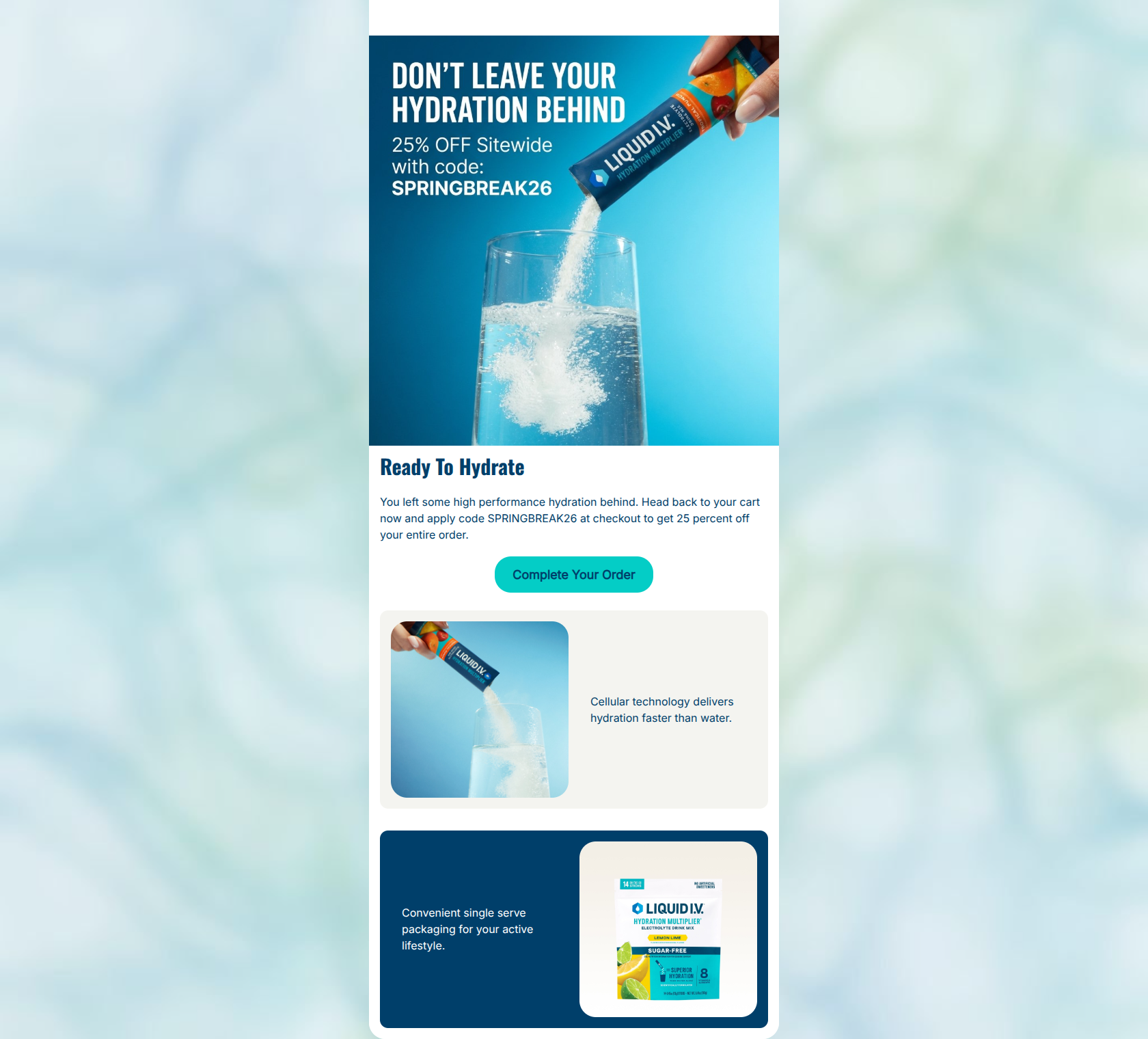
Ready To Hydrate
You left some high performance hydration behind. Head back to your cart now and apply code SPRINGBREAK26 at checkout to get 25 percent off your entire order.
โ Complete Your Order
Cellular technology delivers hydration faster than water.
Convenient single serve packaging for your active lifestyle.
Why This Email Works
This is a solid, clean cart abandonment email that effectively utilizes a strong promotional offer (25% off) and bold brand imagery to capture attention. The hero section does heavy lifting by immediately establishing the context and the incentive. However, the email relies heavily on generic brand assets rather than dynamically showing the user's actual abandoned items, which leaves conversion potential on the table. Minor layout inconsistencies, such as shifting text alignments, also introduce slight friction into the user's reading path.
Hero (top/initial part) Impact
85/100- Unmissable, high-contrast text overlay on the hero image.
- Immediate context setting ('Don't leave your hydration behind').
- High-quality, on-brand imagery that feels active and refreshing.
Content Structure & Flow
75/100- Clear hierarchy starting with the main offer and ending with brand reinforcement.
- Alternating light and dark background cards break up visual monotony.
Visual Hierarchy & Layout
72/100- Excellent use of the brand's vibrant teal (#04CDC6) to make the primary CTA stand out against the white background.
- Clean, distinct sections separated by rounded cards.
Call-to-Action Strength
78/100- Highly specific, action-oriented button copy.
- Strong color contrast makes the button the most obvious interactive element.
Message Clarity & Tone
82/100- Directly addresses the user's action (leaving items behind).
- Maintains the 'high performance' vocabulary that fits the brand psychographics.
Readability & Scannability
80/100- Excellent color contrast for all text elements.
- Short, digestible sentences.
Offer & Value Proposition
88/100- Aggressive, clear discount offer.
- Pairs the financial incentive with a reminder of the product's functional value.
Personalization & Audience Fit
65/100- Aesthetic and copy tone strongly resonate with the young, active target demographic.
- Aims the messaging directly at 'high performance'.
Quick Wins
- Align the 'Complete Your Order' CTA to the left to match the text above it.
- Change '25 percent' to '25%' and bold the promo code in the body copy.
- Increase the font size of the text within the lower two feature cards.
Create Professional Email Designs
Generate beautiful, on-brand email designs in seconds. Just enter your brand URL and let AI do the rest.