Health & Wellness Cart Abandonment Email Template
“Your cart is thirsty 💧”

Design Score
86/100This is a highly effective, tightly constructed cart abandonment email. It excels in conciseness, logical flow, and strict adherence to a single primary conversion goal. By avoiding filler copy and immediately reminding the user of the value proposition and a specific incentive (free shipping), it removes friction from the decision-making process. The primary areas for improvement are minor visual hierarchy adjustments and text alignment to create a smoother scanning experience.
Create Your Own
Generate professional email designs like this one in seconds with Kopi AI.
Email Details
- Subject Line
- Your cart is thirsty 💧
- Brand
- Liquid I.V.
- Industry
- Health & Wellness
- Email Type
- Cart Abandonment
- Created
- May 7, 2026
Brand Colors
Email Copy
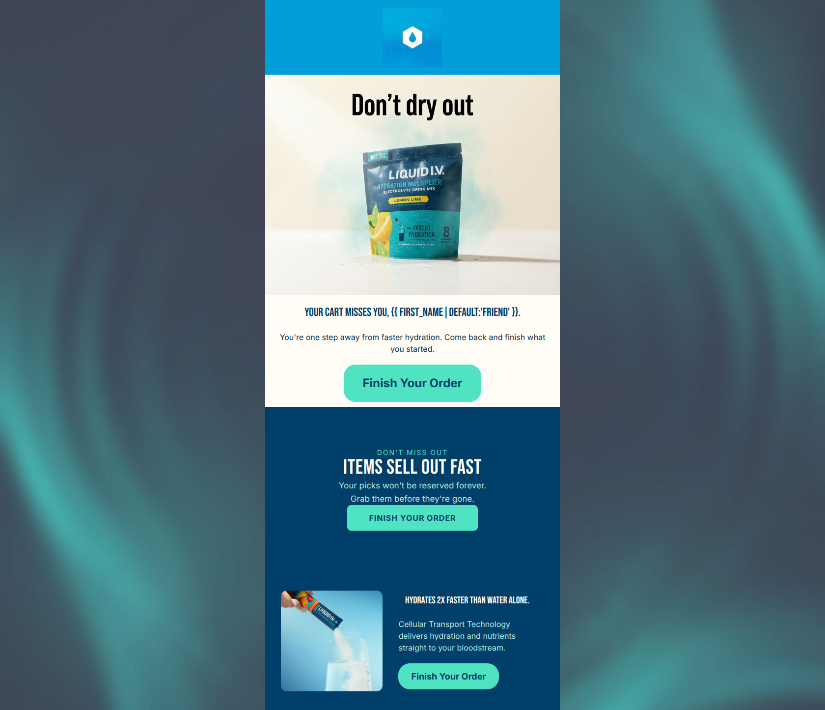
Friend, your hydration's still waiting.
→ Complete Your Order
WHY FINISH CHECKOUT
Hydration that hits different
3x the electrolytes of leading sports drinks 8 vitamins and nutrients Faster hydration than water alone
→ Complete Your Order
FREE SHIPPING UNLOCKED
You're over $40
Lock it in before your cart resets.
→ Complete Your Order
Why This Email Works
This is a highly effective, tightly constructed cart abandonment email. It excels in conciseness, logical flow, and strict adherence to a single primary conversion goal. By avoiding filler copy and immediately reminding the user of the value proposition and a specific incentive (free shipping), it removes friction from the decision-making process. The primary areas for improvement are minor visual hierarchy adjustments and text alignment to create a smoother scanning experience.
1. Hero (top/initial part) Impact
85/100- Strong, context-aware hero copy embedded in the image.
- Immediate placement of the primary CTA above the fold.
- High-quality product imagery that feels energetic.
2. Content Structure & Flow
88/100- Clear, three-part narrative structure that directly supports conversion.
- No distracting secondary content or navigation links.
- Excellent use of distinct visual sections to break up information.
3. Visual Hierarchy & Layout
80/100- Excellent use of bolding to highlight key metrics (3x, 8, Faster).
- Generous use of negative space within the colored blocks to prevent clutter.
- Clear distinction between headings and body text.
4. Call-to-Action Strength
95/100- Perfect repetition of a single, clear action.
- No competing secondary CTAs.
- High contrast on the first two primary buttons, making them impossible to miss.
5. Message Clarity & Tone
85/100- On-brand, confident messaging.
- Clear articulation of the free shipping incentive.
- Avoids begging or desperate language often found in abandonment emails.
6. Readability & Scannability
88/100- Zero wall-of-text issues.
- Strategic use of line breaks to create a pseudo-list in the value prop section.
- High contrast between text and background colors.
7. Offer & Value Proposition
90/100- Reiterates the core technical differentiators (3x electrolytes, faster hydration).
- Explicitly states the achieved incentive (free shipping unlocked).
8. Personalization & Audience Fit
75/100- Uses the first name to grab initial attention.
- References the specific cart threshold ($40) the user has achieved.
9. Copy Conciseness & Word Economy
95/100- Zero filler content.
- Highly distilled value propositions.
- Respects the reader's time and attention span.
Quick Wins
- Change the alignment of the text `<TEXT color="#FDFCF6" textAlign="left">` in the middle block to `textAlign="center"` to match the headings above it and smooth the visual scan path.
- Update the opening line to a more active verb phrase, such as '{{ first_name|default:'Friend' }}, grab your hydration before it's gone.'
- Investigate the source of the stray '#FDFCF6' text artifact visible beneath the hero image in the rendering and remove it.



Create Professional Email Designs
Generate beautiful, on-brand email designs in seconds. Just enter your brand URL and let AI do the rest.