Health & Wellness Cart Abandonment Email Template
“You left your hydration behind”

Design Score
86/100This is a highly effective, frictionless cart abandonment email. It adheres perfectly to best practices for scannability, visual hierarchy, and CTA consistency. The inverted pyramid structure seamlessly guides the reader from the primary reminder down through core value propositions and finally to a secondary shipping incentive. The email's primary weakness lies in its slightly robotic tone; it misses the opportunity to inject Liquid I.V.'s energetic, 'coach-like' brand voice, relying instead on generic transactional phrasing. Overall, it is a strong conversion vehicle that only needs minor copy tweaks to reach excellence.
Create Your Own
Generate professional email designs like this one in seconds with Kopi AI.
Email Details
- Subject Line
- You left your hydration behind
- Brand
- Liquid IV [eval-prod 2026-05-07]
- Industry
- Health & Wellness
- Email Type
- Cart Abandonment
- Created
- May 7, 2026
Brand Colors
Email Copy
Pick up where you left off
Your Hydration Multiplier is still in your cart, friend.
→ Complete my order
Why finish checkout
3x electrolytes
8 vitamins
Faster than water
→ Complete my order
Free shipping on $40+
Almost there. Don't let hydration slip away.
→ Complete my order
Why This Email Works
This is a highly effective, frictionless cart abandonment email. It adheres perfectly to best practices for scannability, visual hierarchy, and CTA consistency. The inverted pyramid structure seamlessly guides the reader from the primary reminder down through core value propositions and finally to a secondary shipping incentive. The email's primary weakness lies in its slightly robotic tone; it misses the opportunity to inject Liquid I.V.'s energetic, 'coach-like' brand voice, relying instead on generic transactional phrasing. Overall, it is a strong conversion vehicle that only needs minor copy tweaks to reach excellence.
Hero (top/initial part) Impact
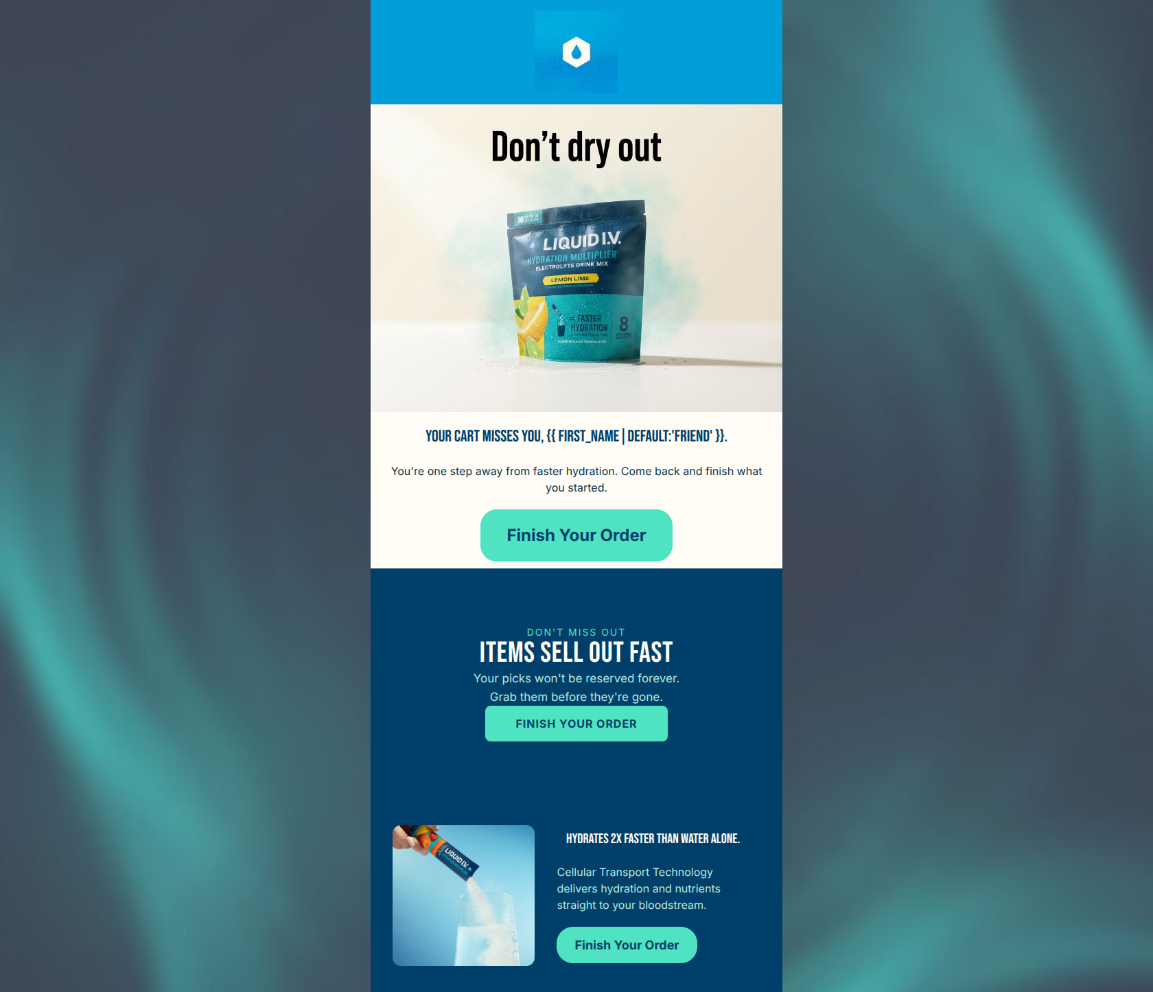
85/100- Immediate context setting; the user knows exactly why they are receiving this email within a split second.
- High-quality, well-lit product imagery that reinforces the brand's premium positioning.
Content Structure & Flow
90/100- Excellent use of clear, distinct horizontal sections to segment information.
- Perfect rhythm of text, imagery, and CTAs that keeps the user moving downward.
Visual Hierarchy & Layout
94/100- Outstanding use of color contrast; the primary CTA buttons pass the 'squint test' with flying colors against both light and dark backgrounds.
- The three-column icon layout breaks up the text and allows for rapid skimming of core product features.
Call-to-Action Strength
98/100- Absolute clarity of action; there is zero ambiguity about what the user is supposed to do.
- Strategic placement of CTAs after every major persuasive element (hero, value props, offer).
Message Clarity & Tone
75/100- Zero ambiguity or confusing jargon; the message is instantly understandable.
- The core value propositions are clearly stated and easy to grasp.
Readability & Scannability
92/100- Excellent word economy; sentences are short, punchy, and to the point.
- Generous use of whitespace and padding around key elements prevents visual clutter.
Offer & Value Proposition
85/100- Strong secondary incentive positioned perfectly at the bottom to catch users who are hesitating over shipping costs.
- Clear, numerical value props (3x, 8) that add authority and specificity.
Personalization & Audience Fit
70/100- Appropriate use of fallback text ('friend') for the first-name variable.
- Directly addresses the user's specific context (leaving an item in the cart).
Copy Conciseness & Word Economy
95/100- Ruthless editing; the copy is distilled down to its most impactful elements.
- Avoids the common trap of over-explaining the product in a cart recovery email.
Quick Wins
- Change the sterile heading 'Why finish checkout' to a customer-centric benefit like 'What your body is missing'.
- Add one or two words to the icon labels to provide context (e.g., '8 Essential Vitamins').
- Remove the baked-in text from the hero image to clean up the visual presentation at the top of the email.



Create Professional Email Designs
Generate beautiful, on-brand email designs in seconds. Just enter your brand URL and let AI do the rest.