Health & Wellness Cart Abandonment Email Template
“You left something behind”

Design Score
86/100This is a highly effective, punchy cart abandonment email that clearly understands its single objective: driving the user back to checkout. The structure logically progresses from a clear reminder to a functional value proposition, culminating in a strong urgency trigger. The visual hierarchy is excellent, and the repetitive, unambiguous CTA strategy perfectly aligns with conversion best practices. To push this from 'strong' to 'outstanding', the email needs to leverage dynamic cart data to show exactly what was left behind, and it should utilize the brand's 'Free shipping over $40' offer to overcome final purchasing friction.
Create Your Own
Generate professional email designs like this one in seconds with Kopi AI.
Email Details
- Subject Line
- You left something behind
- Brand
- Liquid IV [eval-prod 2026-05-06]
- Industry
- Health & Wellness
- Email Type
- Cart Abandonment
- Created
- May 6, 2026
Brand Colors
Email Copy
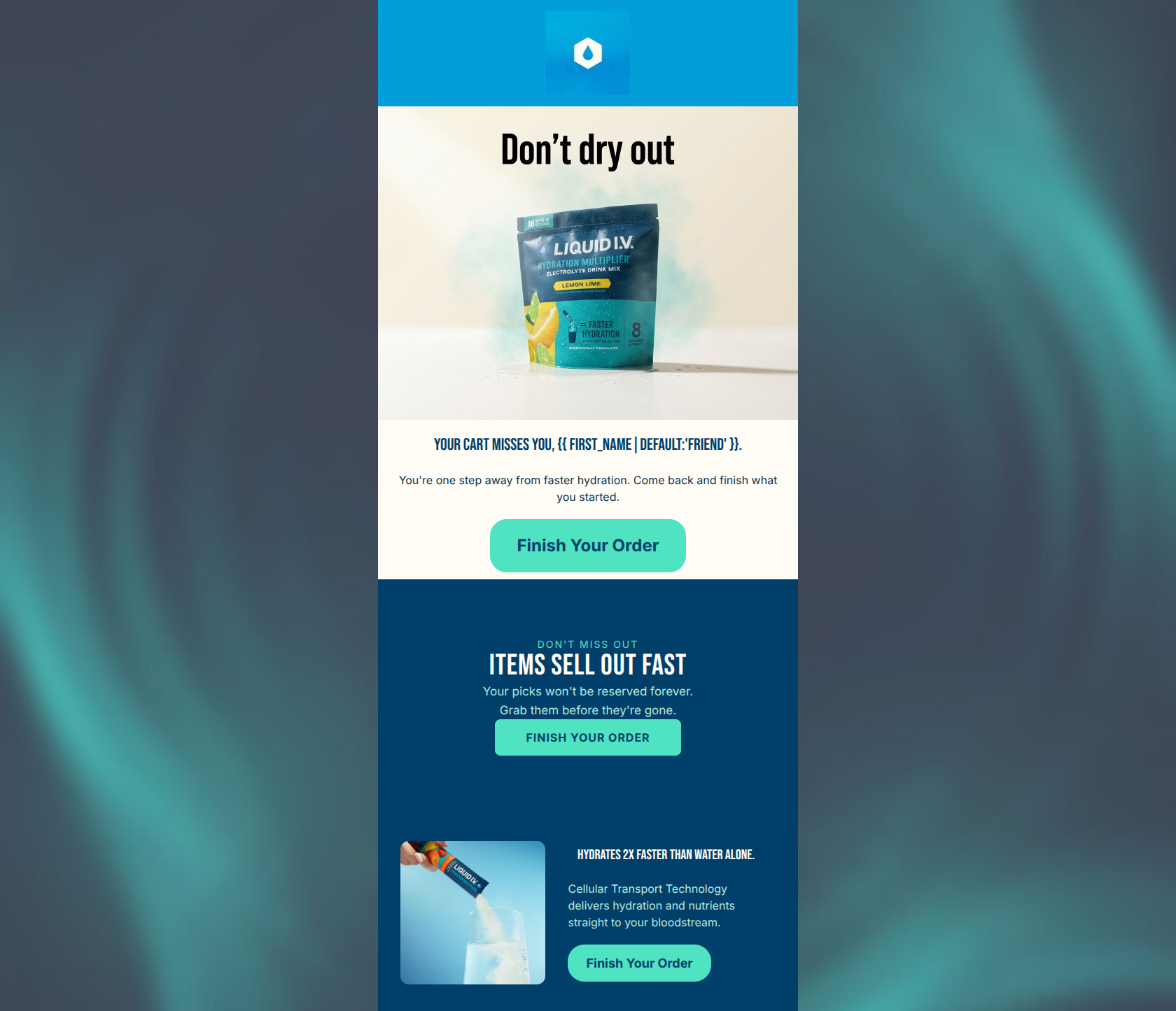
Your hydration is waiting
Hi friend, finish what you started.
→ Complete your order
Faster than water alone
CTT® delivers hydration straight to your bloodstream.
→ Complete your order
Why This Email Works
This is a highly effective, punchy cart abandonment email that clearly understands its single objective: driving the user back to checkout. The structure logically progresses from a clear reminder to a functional value proposition, culminating in a strong urgency trigger. The visual hierarchy is excellent, and the repetitive, unambiguous CTA strategy perfectly aligns with conversion best practices. To push this from 'strong' to 'outstanding', the email needs to leverage dynamic cart data to show exactly what was left behind, and it should utilize the brand's 'Free shipping over $40' offer to overcome final purchasing friction.
Hero (top/initial part) Impact
85/100- Immediate clarity of purpose—the user instantly knows why they are receiving this email.
- High-quality, on-brand product and lifestyle imagery that feels refreshing.
- Direct and conversational greeting.
Content Structure & Flow
88/100- Distinct, easily digestible sections that guide the eye downward.
- Logical psychological progression from 'you forgot this' to 'here is why it works' to 'buy it before it's gone'.
- Excellent use of background color blocking to separate thoughts.
Visual Hierarchy & Layout
90/100- Bold, high-contrast design that aligns perfectly with the brand's energetic identity.
- Central alignment makes the email incredibly easy to read on mobile devices.
- The urgency card at the bottom visually breaks from the earlier sections, signaling a shift in message priority.
Call-to-Action Strength
95/100- Unambiguous button copy that tells the user exactly what will happen when they click.
- Excellent repetition of the primary action throughout the scroll depth.
- High-contrast button styling makes the CTAs the most prominent elements in their respective sections.
Message Clarity & Tone
85/100- Zero ambiguity in the messaging; the user knows what to do.
- Effectively leverages the proprietary 'CTT®' terminology to establish scientific authority.
- Strong, action-oriented verbs ('finish', 'complete').
Readability & Scannability
95/100- Extremely short sentences that reduce cognitive load.
- High contrast text against both light and dark backgrounds.
- Clear typographical hierarchy between headings and body copy.
Offer & Value Proposition
75/100- Clearly articulates the unique selling proposition (superior hydration via CTT).
- Positions the product as a smarter alternative to plain water.
Personalization & Audience Fit
75/100- Uses a fallback ('friend') for the first-name tag to ensure the sentence doesn't break.
- The overall energetic aesthetic fits the active, health-conscious target demographic well.
Copy Conciseness & Word Economy
92/100- Gets straight to the point in the hero section.
- Explains a complex scientific concept (Cellular Transport Technology) in a single, simple sentence.
- Urgency copy is direct and factual ('Items aren't reserved').
Quick Wins
- Add a small 'Free shipping on orders over $40' banner or text snippet directly below the first or second CTA to remove a common barrier to checkout.
- Increase the margin/padding slightly between the hero section and the navy value-prop block to give the content more room to breathe.



Create Professional Email Designs
Generate beautiful, on-brand email designs in seconds. Just enter your brand URL and let AI do the rest.