Health & Wellness Cart Abandonment Email Template
“You left your hydration behind 💧”

Design Score
81/100A visually striking and highly scannable cart abandonment email that executes the fundamentals of visual hierarchy and CTA repetition flawlessly. The use of brand colors—specifically the neon teal against the cream and dark navy backgrounds—creates an immediate and obvious path to conversion. However, the email falls short on personalization and friction-reduction; it lacks dynamic cart contents to remind the user what they left behind, and it fails to leverage existing brand offers (like free shipping thresholds) to push a hesitant buyer over the edge.
Create Your Own
Generate professional email designs like this one in seconds with Kopi AI.
Email Details
- Subject Line
- You left your hydration behind 💧
- Brand
- Liquid IV [eval-prod 2026-04-25]
- Industry
- Health & Wellness
- Email Type
- Cart Abandonment
- Created
- April 25, 2026
Brand Colors
Email Copy
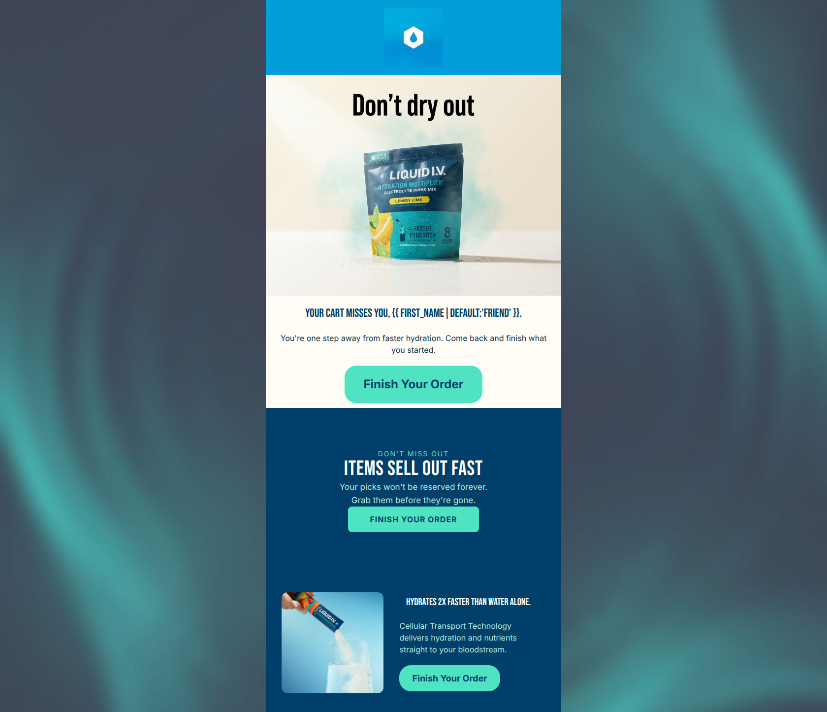
Your cart's getting cold.
Finish up before it slips away.
→ Complete My Order
CTT® hydrates 2x faster than water alone.
Powered by our Cellular Transport Technology®.
→ Complete My Order
Why This Email Works
A visually striking and highly scannable cart abandonment email that executes the fundamentals of visual hierarchy and CTA repetition flawlessly. The use of brand colors—specifically the neon teal against the cream and dark navy backgrounds—creates an immediate and obvious path to conversion. However, the email falls short on personalization and friction-reduction; it lacks dynamic cart contents to remind the user what they left behind, and it fails to leverage existing brand offers (like free shipping thresholds) to push a hesitant buyer over the edge.
Hero Impact
75/100- Strong, eye-catching hero image that uses brand elements (hexagons, vibrant colors).
- The embedded graphic text 'Don't leave thirsty' is clever and contextually relevant.
Content Structure & Flow
85/100- Zero friction in the user journey from opening to seeing the primary action.
- The secondary block serves as a highly effective logical reinforcement without cluttering the primary message.
Visual Hierarchy & Layout
90/100- The neon teal button (#50E3C2) pops aggressively against both the cream body (#FFFDF6) and the navy card (#0A344D).
- Ample whitespace around the text and buttons makes the email feel premium and uncrowded.
Call-to-Action Strength
98/100- Flawless repetition of the primary conversion goal.
- Exceptional color contrast makes the buttons impossible to miss.
Message Clarity & Tone
78/100- The language is straightforward and easy to understand at a glance.
- Successfully balances the lifestyle vibe in the hero with the clinical authority in the secondary block.
Readability & Scannability
95/100- Extreme conciseness allows the user to digest the entire email in under 3 seconds.
- Appropriate use of typography scale to differentiate headings from body copy.
Offer & Value Proposition
65/100- Effectively reiterates the core product differentiator (Cellular Transport Technology) to remind the user why they wanted the product in the first place.
Personalization & Audience Fit
55/100- Aesthetically aligns perfectly with the target audience's preference for clean, energetic, and modern wellness brands.
Copy Conciseness & Word Economy
95/100- Zero fluff; the email gets straight to the point.
- The secondary block distills complex scientific technology into a single, highly readable sentence.
Quick Wins
- Add a line of text mentioning the 'Free Shipping on orders over $40' threshold to reduce purchasing friction.
- Update 'Your cart's getting cold' to more brand-relevant copy like 'Your hydration is waiting.'
- Ensure the hero image links to the cart (it currently does, which is correct, maintain this).



Create Professional Email Designs
Generate beautiful, on-brand email designs in seconds. Just enter your brand URL and let AI do the rest.