Health & Wellness Cart Abandonment Email Template
“Your hydration is waiting”
Design Score
88/100This is a highly competent, textbook cart abandonment email. It effectively utilizes the inverted pyramid, maintains strict adherence to a single conversion goal, and reinforces the brand's core scientific value propositions to overcome potential purchase hesitation. The repetition of the primary CTA is excellent. The main areas for improvement involve elevating the generic 'Your cart misses you' copy to better match the brand's energetic tone, and tightening up minor visual alignment inconsistencies.
Create Your Own
Generate professional email designs like this one in seconds with Kopi AI.
Email Details
- Subject Line
- Your hydration is waiting
- Brand
- Liquid IV [eval-prod 2026-04-15]
- Industry
- Health & Wellness
- Email Type
- Cart Abandonment
- Created
- April 15, 2026
Brand Colors
Email Copy
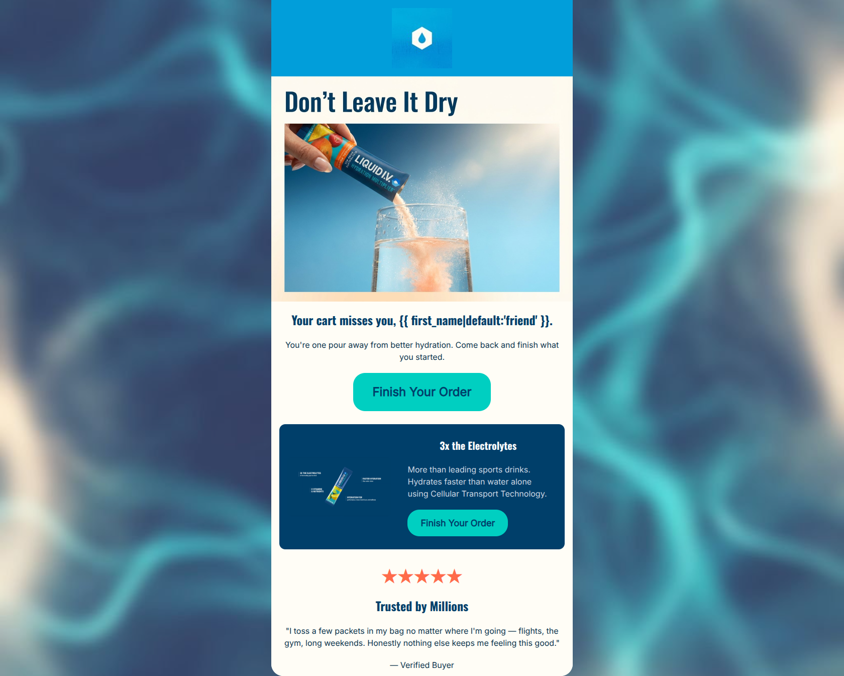
Your cart misses you, friend.
You're one pour away from better hydration. Come back and finish what you started.
→ Finish Your Order
3x the Electrolytes
More than leading sports drinks. Hydrates faster than water alone using Cellular Transport Technology.
→ Finish Your Order
★★★★★
Trusted by Millions
"I toss a few packets in my bag no matter where I'm going — flights, the gym, long weekends. Honestly nothing else keeps me feeling this good."
— Verified Buyer
Why This Email Works
This is a highly competent, textbook cart abandonment email. It effectively utilizes the inverted pyramid, maintains strict adherence to a single conversion goal, and reinforces the brand's core scientific value propositions to overcome potential purchase hesitation. The repetition of the primary CTA is excellent. The main areas for improvement involve elevating the generic 'Your cart misses you' copy to better match the brand's energetic tone, and tightening up minor visual alignment inconsistencies.
Hero Impact
85/100- Dynamic, action-oriented hero image that clearly communicates the product use case.
- Excellent use of the inverted pyramid, funneling attention directly to the first CTA.
- Clever connection between the 'pour' imagery and the abandonment context.
Content Structure & Flow
90/100- Textbook cart abandonment flow that doesn't just nag, but reminds the user *why* they wanted the product.
- Each distinct section ends with a clear opportunity to convert, catching users at different levels of intent.
Visual Hierarchy & Layout
86/100- Excellent use of the brand's navy background to highlight the technical value proposition without overwhelming the whole email.
- CTAs visually dominate their respective sections due to the high-contrast cyan color.
Call-to-Action Strength
98/100- Perfect repetition of the single primary goal.
- The copy 'Finish Your Order' is highly specific to the context of the email.
- The high-contrast cyan (#00CFC1) on both light and dark backgrounds ensures the buttons are unmissable.
Message Clarity & Tone
85/100- Clearly communicates the specific reasons to choose Liquid I.V. over competitors ('More than leading sports drinks').
- The tone strikes the right balance between helpful reminder and authoritative health brand.
Readability & Scannability
88/100- High contrast text on the navy background block ensures readability.
- Information is chunked into easily digestible sections.
Offer & Value Proposition
85/100- Protects premium brand positioning by pushing value over discounts in the first abandonment touchpoint.
- Directly addresses the primary value prop (faster hydration/electrolytes) to justify the purchase.
Personalization & Audience Fit
88/100- The testimonial specifically mentions 'travel, gym, hangovers,' which perfectly aligns with the varied pain points of the target psychographics.
- Use of the first-name merge tag makes the generic greeting feel slightly warmer.
Copy Conciseness & Word Economy
92/100- Zero filler text; highly distilled messaging.
- The subheadline 'You're one pour away from better hydration' communicates outcome and action in just eight words.
Quick Wins
- Center-align the 'Finish Your Order' button in the middle navy block to create a clean, consistent vertical scan path.
- Update the hero headline from 'Your cart misses you' to a more energetic, brand-specific phrase like 'Don't leave your hydration hanging.'
- Increase the size of the product image in the '3x the Electrolytes' block so it balances better with the text.




Create Professional Email Designs
Generate beautiful, on-brand email designs in seconds. Just enter your brand URL and let AI do the rest.