Health & Wellness Cart Abandonment Email Template
“Your hydration is waiting”
Design Score
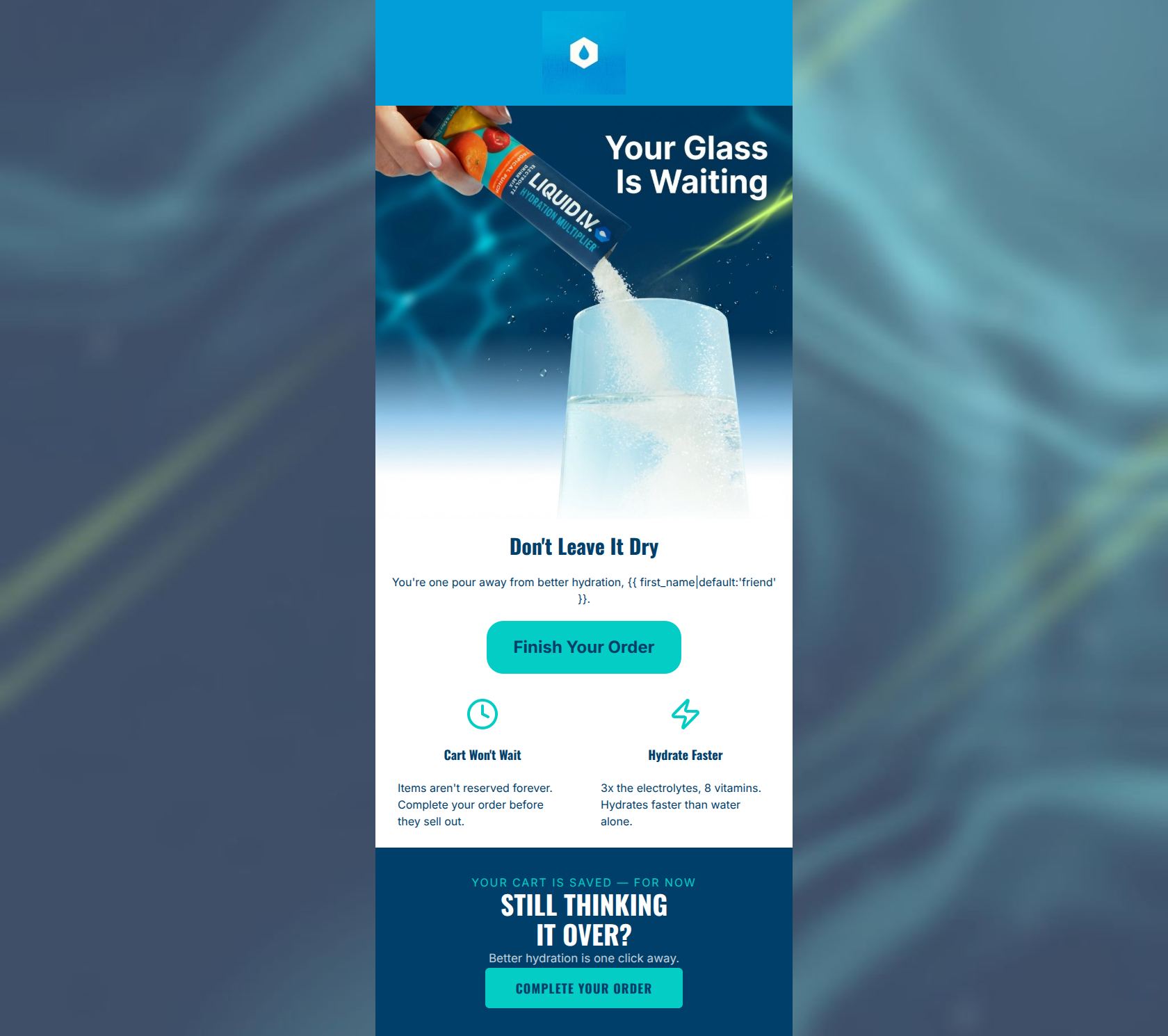
81/100This is a visually striking and on-brand cart abandonment email that effectively utilizes Liquid I.V.'s energetic color palette and concise copy. The visual hierarchy is strong, leading the eye naturally to clear CTAs. However, the email misses a critical conversion driver: it fails to display the actual items left in the cart. By relying on generic imagery and copy instead of dynamic product insertion, the email leaves significant revenue on the table by forcing the user to remember what they intended to buy.
Create Your Own
Generate professional email designs like this one in seconds with Kopi AI.
Email Details
- Subject Line
- Your hydration is waiting
- Brand
- Liquid IV [eval 2026-03-26]
- Industry
- Health & Wellness
- Email Type
- Cart Abandonment
- Created
- March 26, 2026
Brand Colors
Email Copy
Don't Leave It Dry
You're one pour away from better hydration, friend.
→ Finish Your Order
Cart Won't Wait
Items aren't reserved forever. Complete your order before they sell out.
Hydrate Faster
3x the electrolytes, 8 vitamins. Hydrates faster than water alone.
Why This Email Works
This is a visually striking and on-brand cart abandonment email that effectively utilizes Liquid I.V.'s energetic color palette and concise copy. The visual hierarchy is strong, leading the eye naturally to clear CTAs. However, the email misses a critical conversion driver: it fails to display the actual items left in the cart. By relying on generic imagery and copy instead of dynamic product insertion, the email leaves significant revenue on the table by forcing the user to remember what they intended to buy.
Hero (top/initial part) Impact
82/100- Strong, active imagery that demonstrates the product in use.
- Clever, on-brand headline that avoids generic 'Forgot something?' tropes.
Content Structure & Flow
88/100- Logical progression from problem/hook to solution/benefits to urgency.
- Clean separation of sections prevents visual clutter.
Visual Hierarchy & Layout
88/100- Excellent use of the brand's navy/cyan contrast to drive attention to the final CTA.
- Clean, symmetrical two-column layout for the value propositions.
Call-to-Action Strength
85/100- Action-oriented verbs that clearly communicate the next step.
- High-contrast button design that stands out from both the white and navy backgrounds.
Message Clarity & Tone
85/100- Maintains an energetic, accessible tone.
- Seamlessly connects the act of checking out to the physical benefit of hydration.
Readability & Scannability
92/100- Excellent use of white space and iconography to break up text.
- Short, easily digestible sentences that reduce cognitive load.
Offer & Value Proposition
65/100- Strong reinforcement of core brand value props (3x electrolytes, hydrates faster) for users who may have hesitated due to value concerns.
Personalization & Audience Fit
60/100- Appropriate use of fallback logic ({{ first_name|default:'friend' }}) prevents broken tags.
Copy Conciseness & Word Economy
90/100- Zero filler words; highly distilled messaging.
- Value propositions are communicated in brief, punchy fragments rather than dense paragraphs.
Quick Wins
- Sharpen the urgency copy to include a specific timeframe (e.g., 'We'll hold your cart for 24 hours').
- Test a more direct, utility-driven subject line/hero headline combination like 'You Left Something Behind'.




Create Professional Email Designs
Generate beautiful, on-brand email designs in seconds. Just enter your brand URL and let AI do the rest.