Health & Wellness Cart Abandonment Email Template
“Your hydration is waiting.”

Design Score
79/100This cart abandonment email establishes a solid, straightforward flow with clear messaging and a strong visual connection to the product in the hero section. The use of brand colors is effective for creating distinct content blocks. However, it relies heavily on generic messaging ('your picks') rather than dynamic personalization, and misses an opportunity to leverage Liquid I.V.'s strong social mission as an emotional conversion driver. To move from 'good' to 'excellent', the email needs to dynamically reflect the user's specific abandoned items and provide a stronger incentive or emotional reason to complete the checkout.
Create Your Own
Generate professional email designs like this one in seconds with Kopi AI.
Email Details
- Subject Line
- Your hydration is waiting.
- Brand
- Liquid IV [eval 2026-03-26]
- Industry
- Health & Wellness
- Email Type
- Cart Abandonment
- Created
- March 26, 2026
Brand Colors
Email Copy
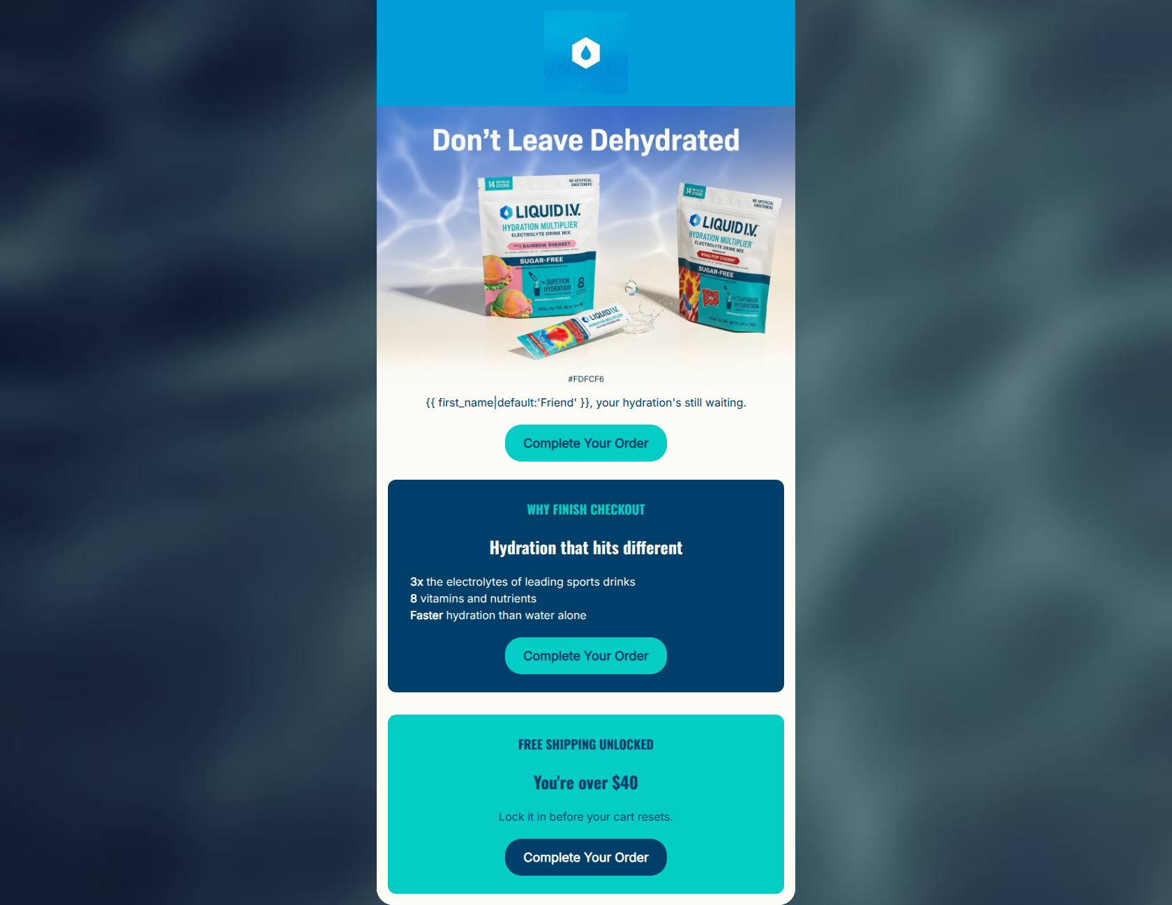
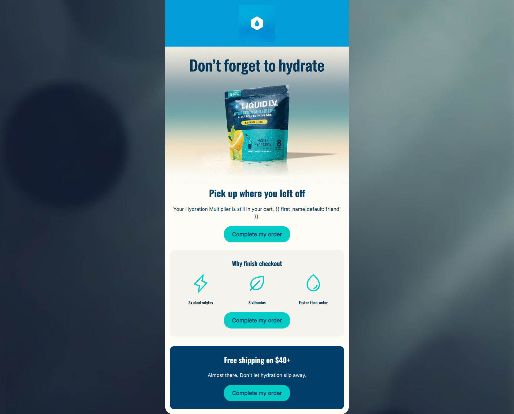
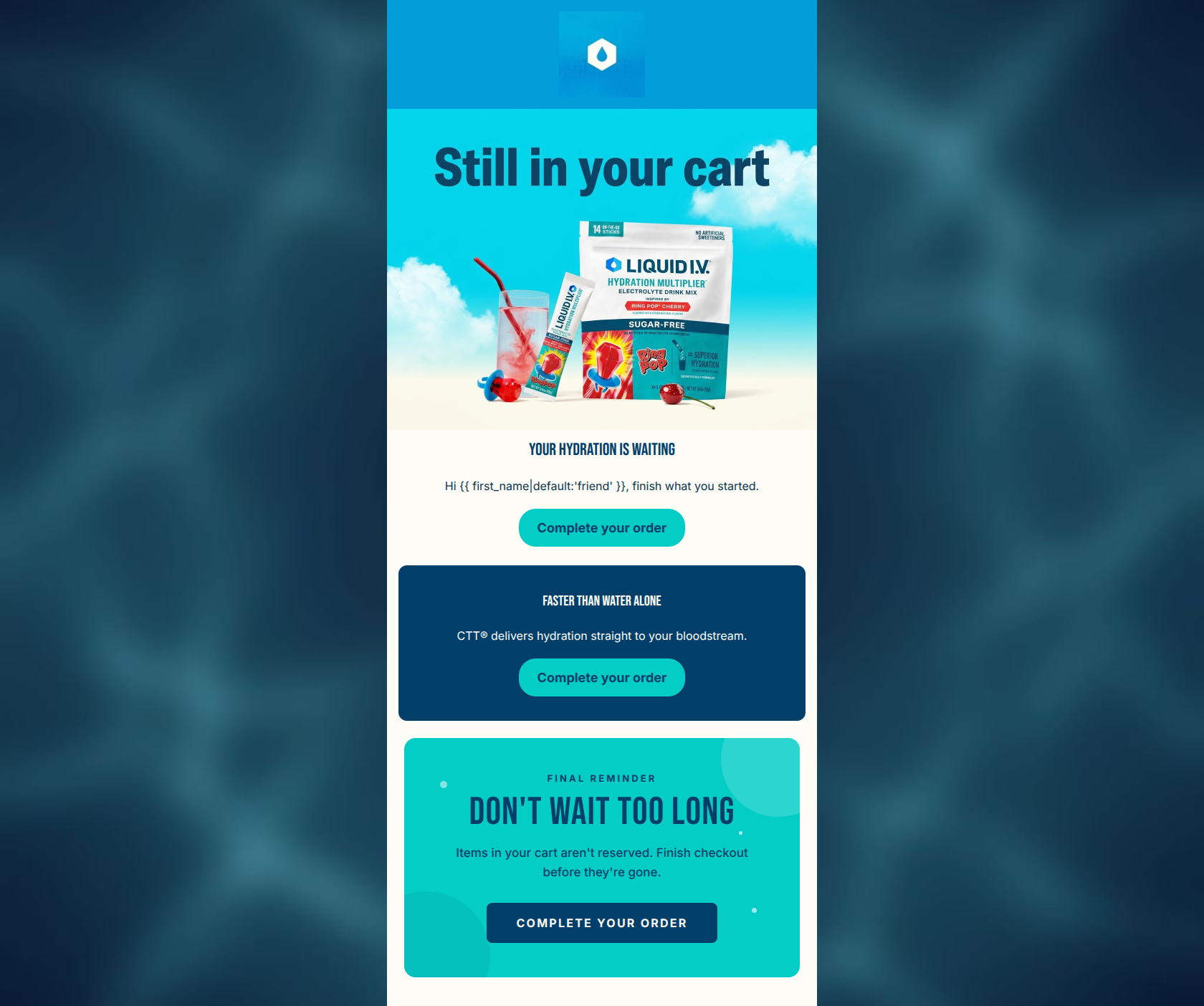
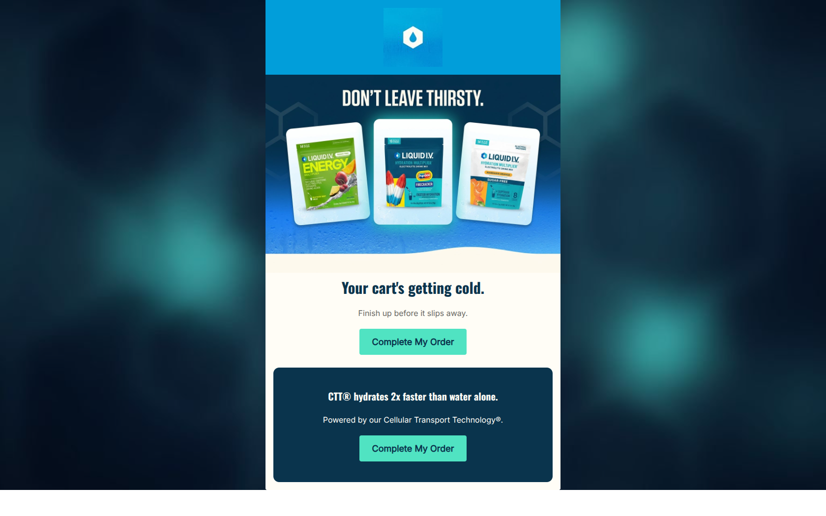
Don't Leave Thirsty
You left something good behind. Your cart is still ready.
→ Return To Your Cart
Worth It
Hydrates faster than water alone. 8 vitamins and nutrients.
→ Return To Your Cart
Why This Email Works
This cart abandonment email establishes a solid, straightforward flow with clear messaging and a strong visual connection to the product in the hero section. The use of brand colors is effective for creating distinct content blocks. However, it relies heavily on generic messaging ('your picks') rather than dynamic personalization, and misses an opportunity to leverage Liquid I.V.'s strong social mission as an emotional conversion driver. To move from 'good' to 'excellent', the email needs to dynamically reflect the user's specific abandoned items and provide a stronger incentive or emotional reason to complete the checkout.
Hero (top/initial part) Impact
80/100- Strong, thematic 'HYDRATION ON HOLD' visual overlay.
- Playful, on-brand headline ('Don't Leave Thirsty').
- Immediate introduction of the primary CTA above the fold.
Content Structure & Flow
85/100- Logical progression from reminder to urgency to value reinforcement.
- Distinct visual blocks make the narrative easy to follow.
- Ends on a strong note highlighting the core product benefits.
Visual Hierarchy & Layout
75/100- Excellent use of the primary teal color to draw the eye to the CTAs.
- Clear visual separation of the three distinct messaging pillars.
- Centered layout creates a focused, linear reading path.
Call-to-Action Strength
82/100- High-contrast button color makes the primary action unmissable.
- Action-oriented, unambiguous copy.
- Appropriate button sizing for easy clicking.
Message Clarity & Tone
78/100- Clear, concise communication of the core message (you left something behind).
- Maintains a helpful, rather than pushy, tone.
- Effectively reiterates the scientific/nutritional benefits in the footer card.
Readability & Scannability
90/100- High-contrast color pairings ensure effortless reading.
- Short paragraph lengths prevent cognitive overload.
- Clear typographic hierarchy distinguishes headings from body copy.
Offer & Value Proposition
70/100- Clearly restates the product's primary unique selling proposition (CTT).
- Focuses on benefits (faster hydration) rather than just features.
Personalization & Audience Fit
65/100- Contextually relevant to the user's recent browsing behavior.
Copy Conciseness & Word Economy
88/100- No throat-clearing openers; gets straight to the point.
- Bullet-point style benefit statements in the footer card.
- Highly scannable text blocks.
Quick Wins
- Add a text link or secondary button to the middle 'Urgency' card to capture clicks immediately.
- Change the bottom CTA button copy to 'Complete Checkout' to vary the phrasing.
- Increase the font size of the 'Worth It' heading in the navy card.
- Bold the phrase 'faster than water alone' to highlight the core differentiator.
Create Professional Email Designs
Generate beautiful, on-brand email designs in seconds. Just enter your brand URL and let AI do the rest.