Health & Wellness Cart Abandonment Email Template
“Your hydration is waiting”
Design Score
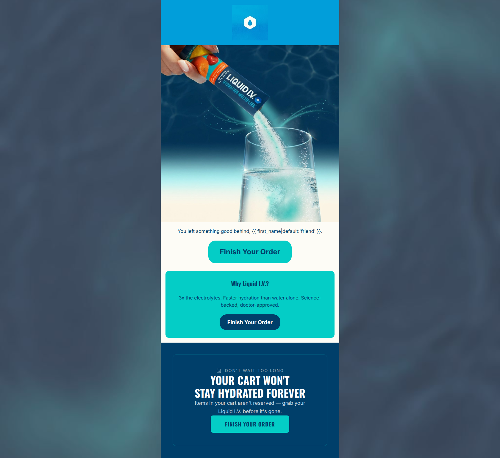
81/100This is a solid, punchy cart abandonment email that clearly communicates the brand's core value propositions and maintains a consistent call to action. The tone is engaging and brand-aligned, particularly the clever urgency copy at the bottom. However, it leaves money on the table by relying on a generic hero image instead of dynamically displaying the abandoned products, and the visual hierarchy is slightly inverted, with the loudest typography sitting at the very bottom of the email.
Create Your Own
Generate professional email designs like this one in seconds with Kopi AI.
Email Details
- Subject Line
- Your hydration is waiting
- Brand
- Liquid IV [eval-prod 2026-05-07]
- Industry
- Health & Wellness
- Email Type
- Cart Abandonment
- Created
- May 7, 2026
Brand Colors
Email Copy
You left something good behind, friend.
→ Finish Your Order
Why Liquid I.V.?
3x the electrolytes. Faster hydration than water alone. Science-backed, doctor-approved.
→ Finish Your Order
Why This Email Works
This is a solid, punchy cart abandonment email that clearly communicates the brand's core value propositions and maintains a consistent call to action. The tone is engaging and brand-aligned, particularly the clever urgency copy at the bottom. However, it leaves money on the table by relying on a generic hero image instead of dynamically displaying the abandoned products, and the visual hierarchy is slightly inverted, with the loudest typography sitting at the very bottom of the email.
Hero (top/initial part) Impact
75/100- The dynamic product shot immediately identifies the brand and product category.
- Context is established immediately; the user knows exactly why they are receiving the email.
Content Structure & Flow
85/100- Clear, linear narrative that guides the user from realization to action.
- Distinct visual blocks make it easy to digest the different components of the message.
Visual Hierarchy & Layout
72/100- Excellent use of high-contrast brand colors (teal and navy) to organize information.
- The layout is narrow and focused, minimizing peripheral distractions.
Call-to-Action Strength
95/100- Perfect consistency: exactly the same destination (cart) and the same compelling verb phrase ('Finish Your Order').
- Excellent placement, offering an 'out' at every logical stage of the scroll.
Message Clarity & Tone
88/100- The line 'Your cart won't stay hydrated forever' is a brilliant, brand-specific spin on standard urgency copy.
- The value prop section uses confident, clinical language ('Science-backed, doctor-approved') that builds trust.
Readability & Scannability
82/100- High contrast text (navy on white/teal, white on navy) ensures effortless reading.
- Short, punchy sentences reduce cognitive load.
Offer & Value Proposition
78/100- The 'Why Liquid I.V.?' section aggressively condenses the brand's complex CTT science into three easily digestible points.
Personalization & Audience Fit
65/100- Uses basic first-name personalization in the intro.
- Speaks directly to the audience's desire for efficient, science-backed solutions.
Copy Conciseness & Word Economy
92/100- Zero throat-clearing or filler text.
- The value proposition is delivered in fragments, prioritizing speed of consumption over grammatical completeness.
Quick Wins
- Left-align the text in the 'Why Liquid I.V.?' block and format it as bullet points for faster scanning.
- Increase the font size of the hero text ('You left something good behind') so it visually anchors the top of the email.
- Ensure the hero headline uses an 'H1' or equivalent styling to improve visual hierarchy.




Create Professional Email Designs
Generate beautiful, on-brand email designs in seconds. Just enter your brand URL and let AI do the rest.