Health & Wellness Cart Abandonment Email Template
“Your hydration is waiting”
Design Score
79/100This is a solid, functional cart abandonment email that adheres well to structural best practices. It features a clear inverted pyramid, strong visual hierarchy, and excellent CTA repetition pointing consistently to the cart. However, it relies heavily on generic cart-abandonment tropes ('Your items aren't reserved forever') rather than leveraging Liquid I.V.'s energetic brand voice or dynamically showing the user what they actually left behind. Elevating the copy to focus on the missed benefits of hydration and displaying the specific abandoned items would push this email from good to outstanding.
Create Your Own
Generate professional email designs like this one in seconds with Kopi AI.
Email Details
- Subject Line
- Your hydration is waiting
- Brand
- Liquid IV [eval 2026-03-26]
- Industry
- Health & Wellness
- Email Type
- Cart Abandonment
- Created
- April 24, 2026
Brand Colors
Email Copy
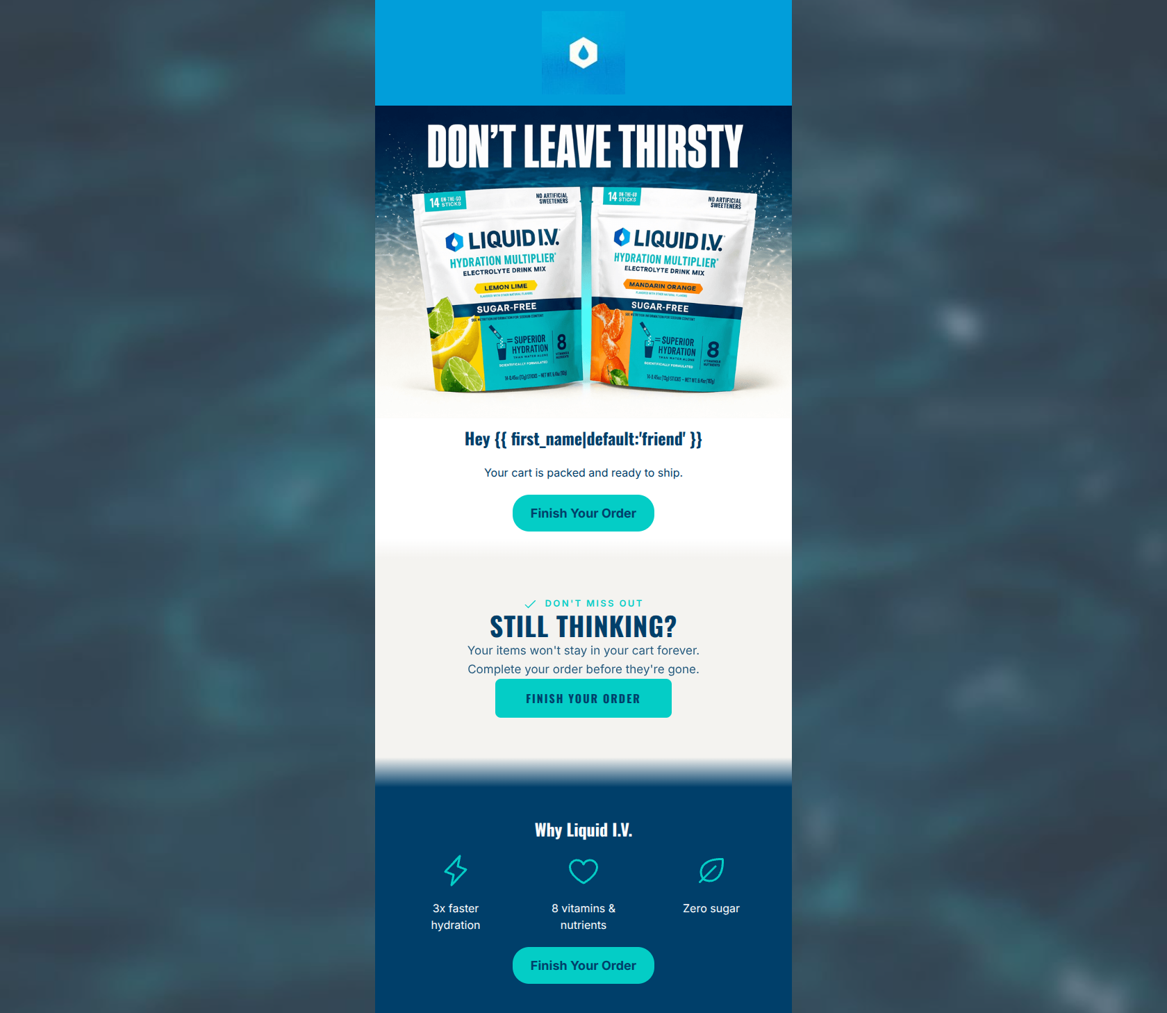
Hey friend
Your cart is packed and ready to ship.
→ Finish Your Order
Why Liquid I.V.
3x faster hydration
8 vitamins & nutrients
Zero sugar
→ Finish Your Order
Why This Email Works
This is a solid, functional cart abandonment email that adheres well to structural best practices. It features a clear inverted pyramid, strong visual hierarchy, and excellent CTA repetition pointing consistently to the cart. However, it relies heavily on generic cart-abandonment tropes ('Your items aren't reserved forever') rather than leveraging Liquid I.V.'s energetic brand voice or dynamically showing the user what they actually left behind. Elevating the copy to focus on the missed benefits of hydration and displaying the specific abandoned items would push this email from good to outstanding.
Hero (top/initial part) Impact
75/100- Immediate product recognition.
- Use of personalization right away catches attention.
- Direct and to the point.
Content Structure & Flow
80/100- Classic inverted pyramid structure.
- Logical flow from problem (abandoned cart) to solution (value props) to action.
Visual Hierarchy & Layout
78/100- High contrast CTAs that are impossible to miss.
- Excellent use of iconography in the 'Why Liquid I.V.' section to break up text.
Call-to-Action Strength
95/100- Consistent destination URL across all buttons.
- Clear, directive copy ('Finish Your Order').
- High visual prominence with the teal brand color.
Message Clarity & Tone
70/100- Unambiguous purpose—the user immediately knows why they received this.
- No confusing or competing secondary messages.
Readability & Scannability
90/100- Generous whitespace around key elements.
- Bite-sized copy blocks.
- Clear distinction between headings and body copy.
Offer & Value Proposition
75/100- Excellent reinforcement of product benefits at the bottom of the email.
- Focus on 'Why' rather than just 'What'.
Personalization & Audience Fit
65/100- Use of the first name in the greeting builds immediate rapport.
Copy Conciseness & Word Economy
85/100- No throat-clearing intro paragraphs.
- Direct, action-oriented language.
Quick Wins
- Fix the inconsistent casing on the middle CTA button to match the others.
- Condense the redundant sentences in the 'Still Thinking?' section into a single, punchier line.
- Move the 'DON'T LEAVE THIRSTY' text from the image into a live HTML heading.




Create Professional Email Designs
Generate beautiful, on-brand email designs in seconds. Just enter your brand URL and let AI do the rest.