Health & Wellness Cart Abandonment Email Template
“Your hydration is waiting.”
Design Score
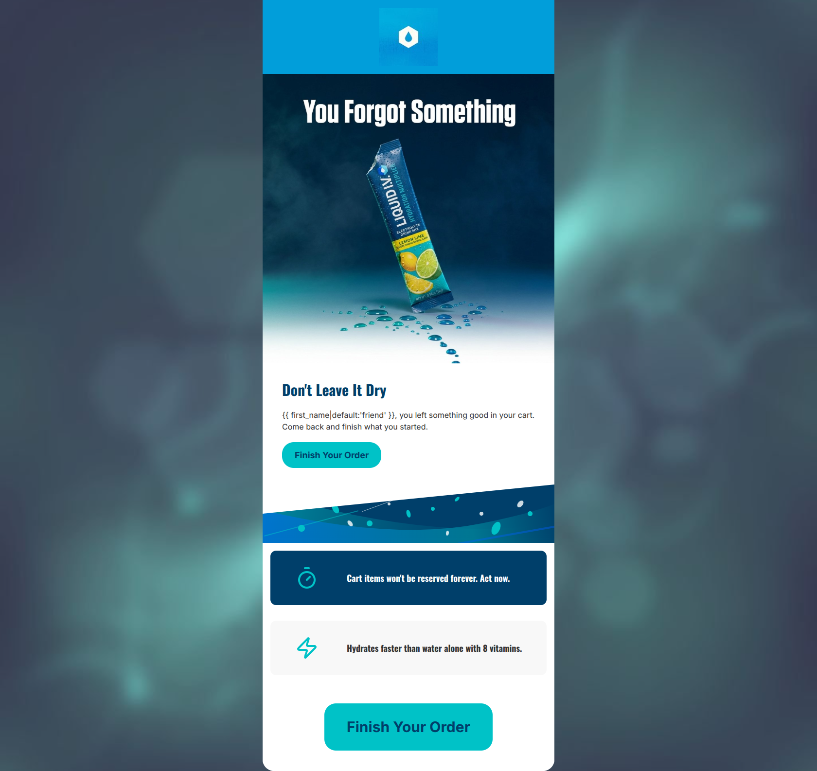
73/100This cart abandonment email is visually striking and aligns well with the energetic, science-forward brand identity of Liquid I.V. However, it relies too heavily on generic aesthetics rather than specific conversion levers. The fatal flaw is the absence of the actual abandoned product(s). For a cart abandonment flow, showing the user exactly what they left behind is the single highest-leverage tactic to drive clicks. The current generic hero image and copy feel like a broad broadcast rather than a personalized nudge. The visual hierarchy is generally good, and the CTAs are clear, but the email leaves significant revenue on the table by not leveraging dynamic content and relying on somewhat generic urgency.
Create Your Own
Generate professional email designs like this one in seconds with Kopi AI.
Email Details
- Subject Line
- Your hydration is waiting.
- Brand
- Liquid IV [eval 2026-03-26]
- Industry
- Health & Wellness
- Email Type
- Cart Abandonment
- Created
- March 26, 2026
Brand Colors
Email Copy
Don't Leave It Dry
friend, you left something good in your cart. Come back and finish what you started.
→ Finish Your Order
Cart items won't be reserved forever. Act now.
Hydrates faster than water alone with 8 vitamins.
→ Finish Your Order
Why This Email Works
This cart abandonment email is visually striking and aligns well with the energetic, science-forward brand identity of Liquid I.V. However, it relies too heavily on generic aesthetics rather than specific conversion levers. The fatal flaw is the absence of the actual abandoned product(s). For a cart abandonment flow, showing the user exactly what they left behind is the single highest-leverage tactic to drive clicks. The current generic hero image and copy feel like a broad broadcast rather than a personalized nudge. The visual hierarchy is generally good, and the CTAs are clear, but the email leaves significant revenue on the table by not leveraging dynamic content and relying on somewhat generic urgency.
Hero (top/initial part) Impact
65/100- Strong brand visual identity with the vibrant colors and water droplet motif.
- Immediate establishment of the context ('You Forgot Something').
Content Structure & Flow
75/100- Logical progression from addressing the abandonment to reinforcing the product value.
- Secondary sections are neatly contained in distinct, easy-to-digest blocks.
Visual Hierarchy & Layout
75/100- Excellent use of the primary teal brand color to make the CTAs pop against both white and navy backgrounds.
- Good use of whitespace around the informational blocks to prevent visual clutter.
Call-to-Action Strength
85/100- High-contrast color choice ensures the buttons are impossible to miss.
- Direct, outcome-focused copy ('Finish Your Order').
Message Clarity & Tone
70/100- The headline 'Don't Leave It Dry' is memorable and perfectly on-brand.
- The value proposition regarding '8 vitamins' and 'faster than water' is clear and concise.
Readability & Scannability
85/100- Iconography quickly communicates the core concepts (time/urgency, energy/hydration).
- Text blocks are kept to one or two sentences, reducing cognitive load.
Offer & Value Proposition
70/100- Clearly reiterates the functional benefit of the product rather than just asking for money.
Personalization & Audience Fit
55/100- Uses basic liquid tags for first name personalization.
Copy Conciseness & Word Economy
90/100- No filler words or lengthy paragraphs.
- Gets straight to the point immediately.
Quick Wins
- Center-align the text under the hero image to fix the jagged visual hierarchy.
- Change the second CTA copy to 'Claim My Cart' or 'Hydrate Now' to avoid repetition.
- Soften the 'Act now' urgency copy to sound more like an encouraging coach rather than a pushy salesperson.




Create Professional Email Designs
Generate beautiful, on-brand email designs in seconds. Just enter your brand URL and let AI do the rest.