Health & Wellness Cart Abandonment Email Template
“Your cart is thirsty”
Design Score
80/100This is a strong, highly competent cart abandonment email that clearly understands its target audience. The messaging leverages the Liquid I.V. brand voice perfectly, tapping into the user's desire to maintain 'momentum' and 'progress.' The offer is lucrative and paired with compelling urgency. However, the execution relies too heavily on text embedded in images, and the visual hierarchy suffers from flat CTA buttons and a slightly disjointed center section. Refining the typography alignment and elevating the interactive elements will push this from a B+ to an A.
Create Your Own
Generate professional email designs like this one in seconds with Kopi AI.
Email Details
- Subject Line
- Your cart is thirsty
- Brand
- Liquid IV [eval 2026-03-21]
- Industry
- Health & Wellness
- Email Type
- Cart Abandonment
- Created
- March 21, 2026
Brand Colors
Email Copy
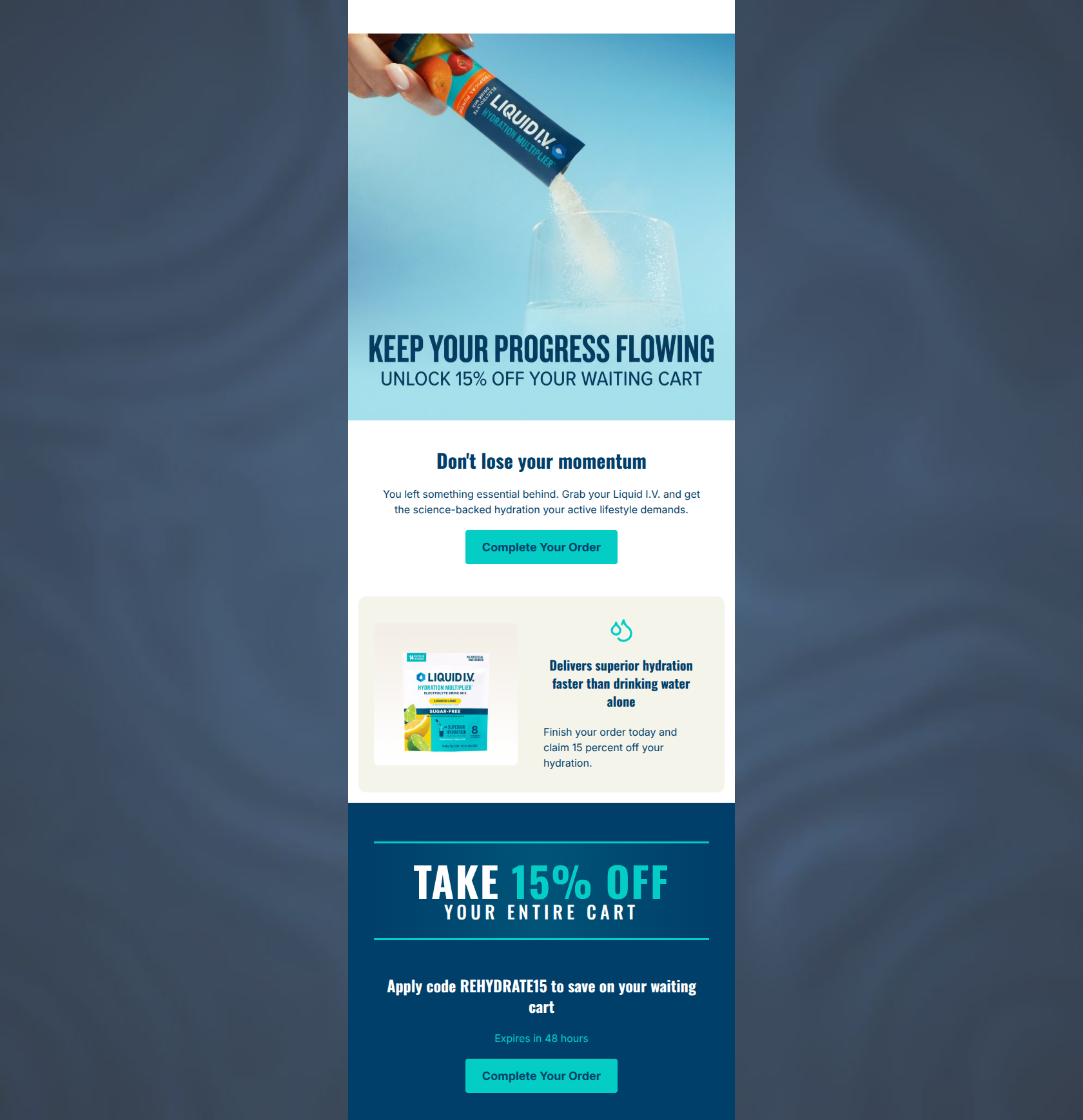
Don't lose your momentum
You left something essential behind. Grab your Liquid I.V. and get the science-backed hydration your active lifestyle demands.
→ Complete Your Order
Delivers superior hydration faster than drinking water alone
Finish your order today and claim 15 percent off your hydration.
Apply code REHYDRATE15 to save on your waiting cart
Expires in 48 hours
→ Complete Your Order
Why This Email Works
This is a strong, highly competent cart abandonment email that clearly understands its target audience. The messaging leverages the Liquid I.V. brand voice perfectly, tapping into the user's desire to maintain 'momentum' and 'progress.' The offer is lucrative and paired with compelling urgency. However, the execution relies too heavily on text embedded in images, and the visual hierarchy suffers from flat CTA buttons and a slightly disjointed center section. Refining the typography alignment and elevating the interactive elements will push this from a B+ to an A.
Hero (top/initial part) Impact
75/100- Action-oriented imagery connects immediately to the product's value (pouring the powder).
- The tone perfectly matches the active, health-conscious target audience.
Content Structure & Flow
80/100- Logical 'Hook -> Value -> Offer -> Urgency' progression.
- Clear delineation of sections using background colors to guide the eye.
Visual Hierarchy & Layout
72/100- Effective use of the brand's navy and off-white colors to create distinct content zones.
- The massive typography in the 'TAKE 15% OFF' section establishes a clear visual anchor at the bottom.
Call-to-Action Strength
78/100- Clear, unambiguous action phrasing.
- Consistent use of the brand's vibrant teal for buttons.
Message Clarity & Tone
85/100- Excellent use of motivational, active language tailored to the target demographic.
- Seamless integration of the core brand promise ('science-backed hydration') into the abandonment message.
Readability & Scannability
82/100- Excellent text-to-background contrast across all sections.
- Concise copy that avoids dense blocks of text.
Offer & Value Proposition
88/100- Combines a strong financial incentive with clear, time-bound urgency.
- Reinforces product value alongside the discount.
Personalization & Audience Fit
75/100- Psychological messaging perfectly aligns with the target audience's fears (losing momentum) and goals (superior hydration).
Quick Wins
- Change '15 percent' to '15%' in the middle card copy for faster visual processing.
- Left-align the text block inside the off-white value proposition card to smooth out the reading path.
- Make the promo code 'REHYDRATE15' visually distinct (e.g., bold or inside a stylized box) so it doesn't get lost in the heading.




Create Professional Email Designs
Generate beautiful, on-brand email designs in seconds. Just enter your brand URL and let AI do the rest.