Health & Wellness Cart Abandonment Email Template
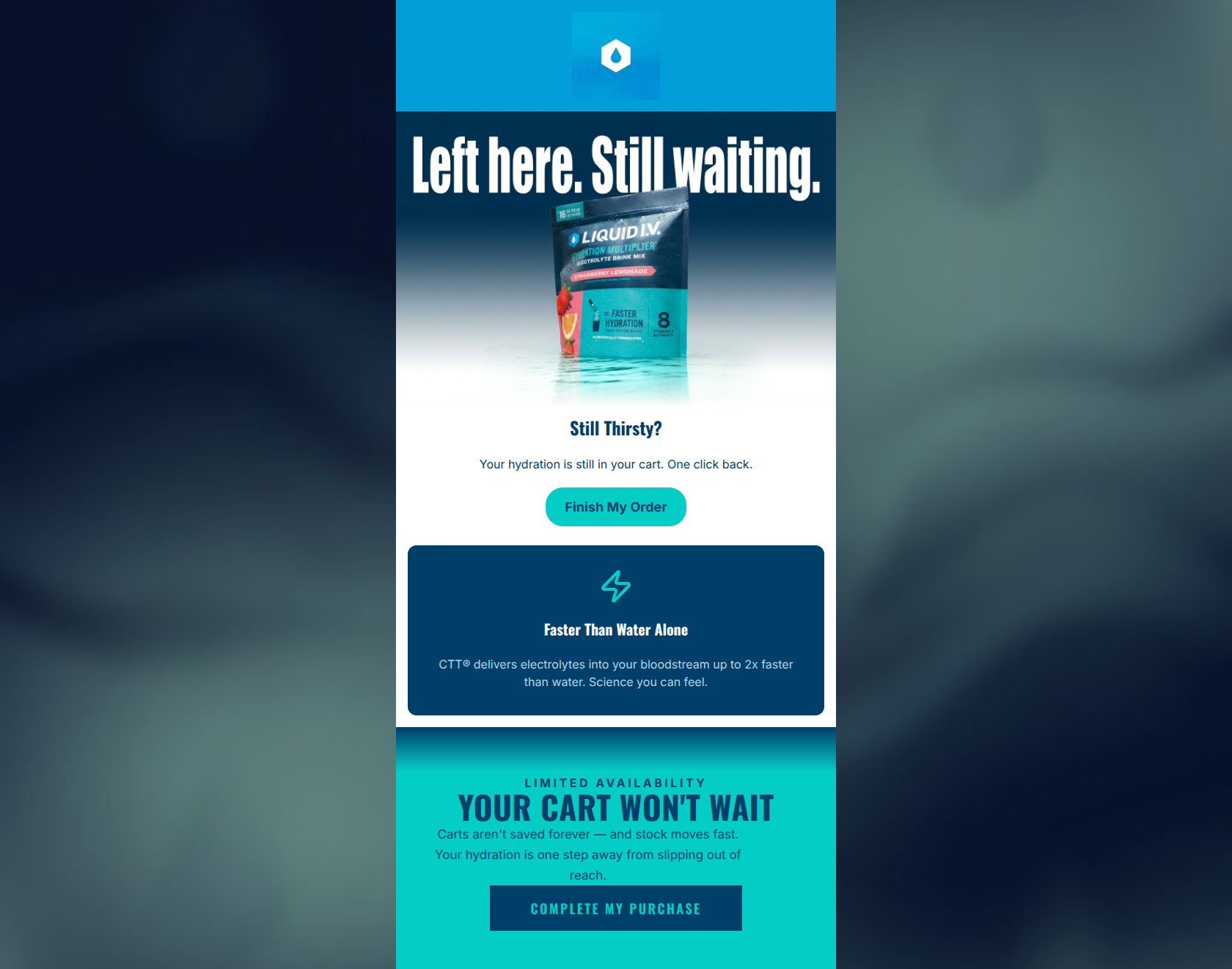
“Your cart is still thirsty.”
Design Score
81/100A solid, visually striking cart abandonment email that effectively utilizes brand colors and concise copy. The core value proposition is clearly communicated without being overwhelming. However, the email relies on generic imagery rather than dynamic cart contents, employs slightly artificial urgency, and suffers from a critical contrast failure on the final CTA button. Fixing the bottom button and personalizing the hero would elevate this from good to excellent.
Create Your Own
Generate professional email designs like this one in seconds with Kopi AI.
Email Details
- Subject Line
- Your cart is still thirsty.
- Brand
- Liquid IV [eval 2026-03-26]
- Industry
- Health & Wellness
- Email Type
- Cart Abandonment
- Created
- March 26, 2026
Brand Colors
Email Copy
Still Thirsty?
Your hydration is still in your cart. One click back.
→ Finish My Order
Faster Than Water Alone
CTT® delivers electrolytes into your bloodstream up to 2x faster than water. Science you can feel.
Why This Email Works
A solid, visually striking cart abandonment email that effectively utilizes brand colors and concise copy. The core value proposition is clearly communicated without being overwhelming. However, the email relies on generic imagery rather than dynamic cart contents, employs slightly artificial urgency, and suffers from a critical contrast failure on the final CTA button. Fixing the bottom button and personalizing the hero would elevate this from good to excellent.
Hero (top/initial part) Impact
85/100- Immediate clarity on the email's purpose (cart abandonment).
- Strong use of an action-oriented, product-relevant headline ('Still Thirsty?').
Content Structure & Flow
88/100- Excellent use of the inverted pyramid principle in the top section.
- Clear, modular sections that guide the eye downward seamlessly.
Visual Hierarchy & Layout
80/100- Strong use of the brand's vibrant teal and deep navy to create distinct content zones.
- The lightning bolt icon effectively draws attention to the value proposition.
Call-to-Action Strength
75/100- The primary CTA button color (#04CDC6) contrasts perfectly with the white background.
- Using first-person language ('My Order') increases the sense of ownership.
Message Clarity & Tone
82/100- Distills the complex CTT® technology into a simple, benefit-driven statement.
- Maintains an energetic and authoritative brand voice throughout.
Readability & Scannability
88/100- Excellent use of bolding and varied font sizes to establish a clear reading path.
- The text-to-background contrast in the top two sections is flawless.
Offer & Value Proposition
80/100- Effectively leverages the brand's core differentiator (CTT®) as the primary reason to return to the cart.
- Focuses on the tangible outcome ('Faster Than Water Alone') rather than just the feature.
Personalization & Audience Fit
70/100- The messaging ('Still Thirsty?') directly addresses the physiological need the product solves.
Copy Conciseness & Word Economy
92/100- Zero filler words. Reads like an email engineered for quick scanning.
- High impact-to-word-count ratio.
Quick Wins
- Fix the text color on the 'COMPLETE MY PURCHASE' button; change it to white to ensure it passes contrast accessibility standards against the navy background.
- Update the slightly clunky 'One click back.' copy to 'You're one click away.'
- Add a brief mention of 'Free Shipping on orders over $40' to reduce purchase friction.




Create Professional Email Designs
Generate beautiful, on-brand email designs in seconds. Just enter your brand URL and let AI do the rest.