Health & Wellness Cart Abandonment Email Template
“Your cart is getting thirsty.”
Design Score
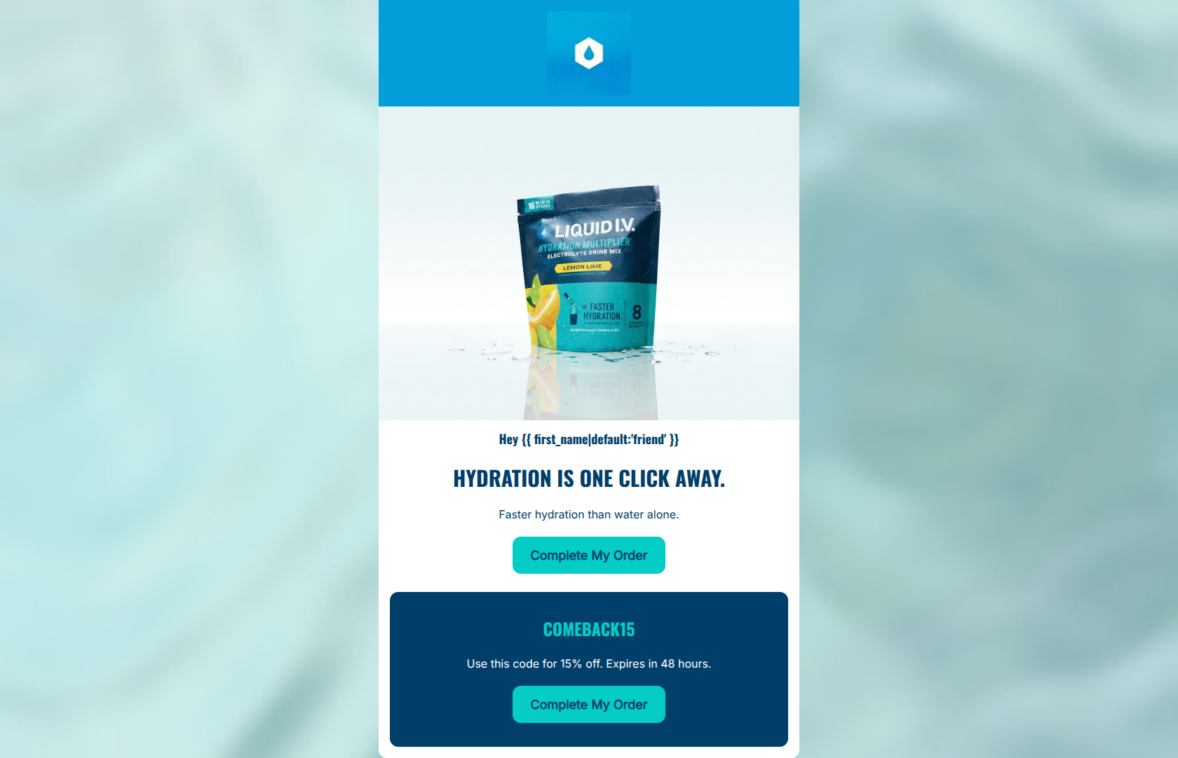
81/100This cart abandonment email is highly concise, visually punchy, and effectively leverages Liquid I.V.'s energetic brand palette. It successfully communicates the core value proposition and provides a clear, time-bound incentive to complete the purchase. However, the structure feels slightly disjointed due to the repetitive, stacked calls-to-action in a very short viewport. By consolidating the layout and making the discount application more seamless, the email can reduce cognitive load and drive higher click-through rates.
Create Your Own
Generate professional email designs like this one in seconds with Kopi AI.
Email Details
- Subject Line
- Your cart is getting thirsty.
- Brand
- Liquid IV [eval 2026-03-26]
- Industry
- Health & Wellness
- Email Type
- Cart Abandonment
- Created
- March 26, 2026
Brand Colors
Email Copy
Hey friend
HYDRATION IS ONE CLICK AWAY.
Faster hydration than water alone.
→ Complete My Order
COMEBACK15
Use this code for 15% off. Expires in 48 hours.
→ Complete My Order
Why This Email Works
This cart abandonment email is highly concise, visually punchy, and effectively leverages Liquid I.V.'s energetic brand palette. It successfully communicates the core value proposition and provides a clear, time-bound incentive to complete the purchase. However, the structure feels slightly disjointed due to the repetitive, stacked calls-to-action in a very short viewport. By consolidating the layout and making the discount application more seamless, the email can reduce cognitive load and drive higher click-through rates.
Hero (top/initial part) Impact
85/100- High-quality, on-brand product imagery.
- Bold, confident typography that aligns with the brand voice.
- Immediate reiteration of the core value prop ('Faster hydration than water alone').
Content Structure & Flow
75/100- Simple, linear path down the page.
- Distinct visual separation of the promotional offer.
Visual Hierarchy & Layout
82/100- Excellent use of the vibrant teal (#04CDC6) against the dark blue to make key elements pop.
- Clean, uncluttered layout.
Call-to-Action Strength
78/100- Action-oriented phrasing tailored to the user's current stage in the funnel.
- Buttons have excellent color contrast and are easy to tap.
Message Clarity & Tone
85/100- Clear statement of the expiration timeline drives urgency.
- Unambiguous instructions on how to use the code.
Readability & Scannability
95/100- Centered alignment works well here because the text lines are very short.
- High contrast makes all text effortlessly readable.
Offer & Value Proposition
88/100- The promo code ('COMEBACK15') is bold and unmissable.
- The 48-hour expiration provides a strong reason to act now.
Personalization & Audience Fit
70/100- Acknowledges the user with a greeting.
- The messaging is highly tailored to someone who has already shown purchase intent.
Copy Conciseness & Word Economy
90/100- Gets straight to the point without 'throat-clearing' openers.
- Communicates the offer, the timeline, and the value in under 25 words.
Quick Wins
- Change the second CTA text to 'Claim 15% Off & Checkout' to differentiate it from the top button.
- Add a small text line under the code stating 'Click to auto-apply at checkout' (assuming this functionality is enabled).
- Remove the top 'Complete My Order' button entirely to streamline the user's focus towards the discounted offer.




Create Professional Email Designs
Generate beautiful, on-brand email designs in seconds. Just enter your brand URL and let AI do the rest.