Health & Wellness Cart Abandonment Email Template
“You left your hydration behind”
Design Score
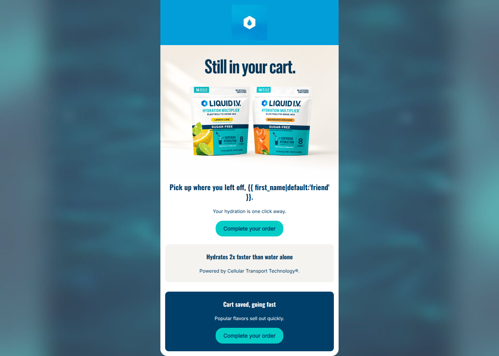
83/100This is a solid, highly concise cart abandonment email that respects the user's time. It excels in word economy, readability, and presents a very clear, repeated Call to Action. However, it relies heavily on generic imagery rather than dynamic cart contents, which misses a major personalization opportunity. The visual structure in the bottom half also feels slightly disjointed with stacked, contrasting blocks.
Create Your Own
Generate professional email designs like this one in seconds with Kopi AI.
Email Details
- Subject Line
- You left your hydration behind
- Brand
- Liquid IV [eval 2026-03-26]
- Industry
- Health & Wellness
- Email Type
- Cart Abandonment
- Created
- April 24, 2026
Brand Colors
Email Copy
Pick up where you left off, friend.
Your hydration is one click away.
→ Complete your order
Hydrates 2x faster than water alone
Powered by Cellular Transport Technology®.
Cart saved, going fast
Popular flavors sell out quickly.
→ Complete your order
Why This Email Works
This is a solid, highly concise cart abandonment email that respects the user's time. It excels in word economy, readability, and presents a very clear, repeated Call to Action. However, it relies heavily on generic imagery rather than dynamic cart contents, which misses a major personalization opportunity. The visual structure in the bottom half also feels slightly disjointed with stacked, contrasting blocks.
Hero (top/initial part) Impact
75/100- Immediate clarity on the email's purpose.
- Inverted pyramid structure funnels eyes directly to the primary CTA.
Content Structure & Flow
80/100- Short, punchy sequence that doesn't demand too much attention.
- Logical narrative flow from problem (abandonment) to solution to urgency.
Visual Hierarchy & Layout
78/100- Excellent use of whitespace in the hero section.
- High-contrast CTA buttons are impossible to miss.
Call-to-Action Strength
95/100- Perfect repetition of the primary goal.
- Visually prominent and high contrast against all backgrounds used.
Message Clarity & Tone
82/100- Very clear, unambiguous messaging.
- Maintains the brand's energetic and direct voice.
Readability & Scannability
92/100- Zero walls of text.
- Excellent text contrast against all background colors.
Offer & Value Proposition
85/100- Strong reinforcement of the core scientific differentiator (CTT).
Personalization & Audience Fit
65/100- Attempts basic personalization via the first name token.
Copy Conciseness & Word Economy
98/100- Ruthlessly edited copy.
- Respects the user's time and scanning behavior.
Quick Wins
- Change the default first-name fallback from 'friend' to either blank (adjusting punctuation dynamically) or an on-brand term like 'hydration hacker'.
- Remove the background color from the value prop block to smooth out the visual flow down the page.




Create Professional Email Designs
Generate beautiful, on-brand email designs in seconds. Just enter your brand URL and let AI do the rest.