Health & Wellness Cart Abandonment Email Template
“You left your hydration behind!”
Design Score
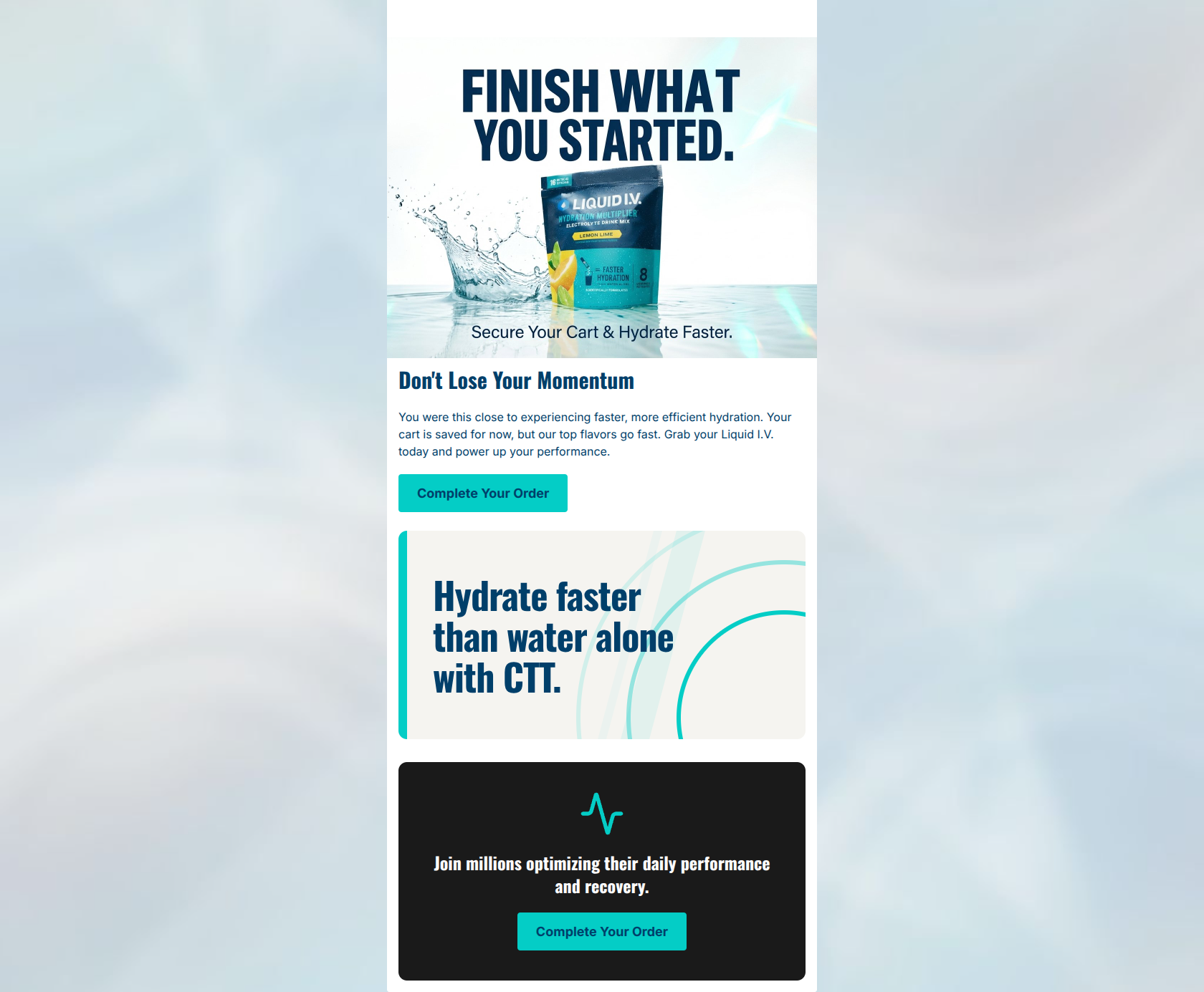
71/100This cart abandonment email successfully captures Liquid I.V.'s energetic, high-performance brand voice and utilizes strong, on-brand color blocking. The visual hierarchy naturally draws the eye down the page. However, it completely misses the mark on the most critical element of a cart abandonment strategy: it fails to show the user what they actually left in their cart. Relying on a generic product image rather than a personalized, dynamic cart summary leaves a significant amount of conversion potential on the table.
Create Your Own
Generate professional email designs like this one in seconds with Kopi AI.
Email Details
- Subject Line
- You left your hydration behind!
- Brand
- Liquid IV [eval-prod 2026-03-22]
- Industry
- Health & Wellness
- Email Type
- Cart Abandonment
- Created
- March 22, 2026
Brand Colors
Email Copy
Don't Lose Your Momentum
You were this close to experiencing faster, more efficient hydration. Your cart is saved for now, but our top flavors go fast. Grab your Liquid I.V. today and power up your performance.
→ Complete Your Order
Join millions optimizing their daily performance and recovery.
→ Complete Your Order
Why This Email Works
This cart abandonment email successfully captures Liquid I.V.'s energetic, high-performance brand voice and utilizes strong, on-brand color blocking. The visual hierarchy naturally draws the eye down the page. However, it completely misses the mark on the most critical element of a cart abandonment strategy: it fails to show the user what they actually left in their cart. Relying on a generic product image rather than a personalized, dynamic cart summary leaves a significant amount of conversion potential on the table.
Hero Impact
75/100- Strong, motivational headline pairing that drives immediate action.
- Visually arresting product photography that reinforces the hydration benefit.
Content Structure & Flow
65/100- Good use of the inverted pyramid principle in individual sections, driving the eye to the CTA.
- The CTT banner acts as an effective, scannable visual break that reinforces the core value proposition.
Visual Hierarchy & Layout
82/100- Excellent contrast between background layers and CTA buttons.
- High-contrast, oversized typography commands attention and guides the scanning eye.
Call-to-Action Strength
78/100- The bright teal (#04CDC6) button against white and dark backgrounds makes the CTA impossible to miss.
- Clear, action-oriented verbs are used.
Message Clarity & Tone
88/100- Tone is incredibly authentic to the brand's 'motivational and scientific' persona.
- Creates FOMO naturally ('our top flavors go fast') without relying on aggressive red text or countdown timers.
Readability & Scannability
85/100- Oversized headings create an effortless scan path.
- Minimal text clutter; every word serves a purpose.
Offer & Value Proposition
65/100- The unique selling proposition (CTT technology) is given its own dedicated, high-impact visual real estate.
- Focuses heavily on the outcome ('power up your performance') rather than just the feature.
Personalization & Audience Fit
40/100- The imagery and tone strongly align with the target demographic's desire for active, optimized lifestyles.
Quick Wins
- Change the primary CTA copy from 'Complete Your Order' to 'Return to Cart' to reduce perceived friction.
- Add a text shadow or adjust the gradient behind the 'Secure Your Cart & Hydrate Faster' overlay to ensure legibility.
- Align the text structures consistently (either make the hero text center-aligned to match the footer, or vice versa) for a cleaner visual flow.




Create Professional Email Designs
Generate beautiful, on-brand email designs in seconds. Just enter your brand URL and let AI do the rest.