Health & Wellness Cart Abandonment Email Template
“You left your hydration behind”
Design Score
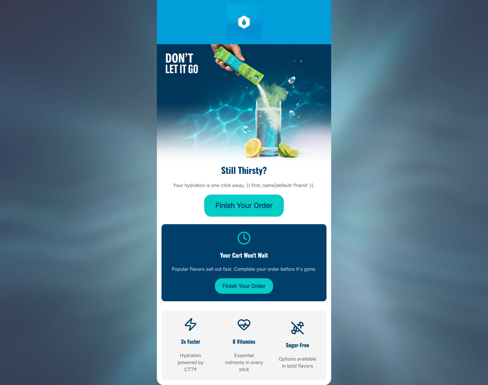
80/100This is a visually striking, on-brand cart abandonment email that leverages high-contrast design and succinct copy to drive users back to checkout. The visual hierarchy is excellent, and the inclusion of core value propositions (3x Faster, 8 Vitamins, Sugar-Free) at the bottom is a smart way to reaffirm the purchase decision for hesitant buyers. However, the email relies entirely on generic urgency rather than specific personalization. By omitting a dynamic block showing the actual products left in the cart, the email misses the most powerful lever in cart recovery: reminding the user exactly what they wanted. It functions well as a basic nudge but leaves conversion potential on the table by not being hyper-specific.
Create Your Own
Generate professional email designs like this one in seconds with Kopi AI.
Email Details
- Subject Line
- You left your hydration behind
- Brand
- Liquid IV [eval 2026-03-26]
- Industry
- Health & Wellness
- Email Type
- Cart Abandonment
- Created
- March 26, 2026
Brand Colors
Email Copy
Still Thirsty?
Your hydration is one click away, friend.
→ Finish Your Order
Your Cart Won't Wait
Popular flavors sell out fast. Complete your order before it's gone.
→ Finish Your Order
3x Faster
Hydration powered by CTT®
8 Vitamins
Essential nutrients in every stick
Sugar-Free
Options available in bold flavors
Why This Email Works
This is a visually striking, on-brand cart abandonment email that leverages high-contrast design and succinct copy to drive users back to checkout. The visual hierarchy is excellent, and the inclusion of core value propositions (3x Faster, 8 Vitamins, Sugar-Free) at the bottom is a smart way to reaffirm the purchase decision for hesitant buyers. However, the email relies entirely on generic urgency rather than specific personalization. By omitting a dynamic block showing the actual products left in the cart, the email misses the most powerful lever in cart recovery: reminding the user exactly what they wanted. It functions well as a basic nudge but leaves conversion potential on the table by not being hyper-specific.
1. Hero Impact
85/100- High-quality, appetizing product imagery that reinforces the end benefit (refreshing hydration).
- Clever, contextually relevant headline ('Still Thirsty?').
- Immediate, high-contrast CTA button above the fold.
2. Content Structure & Flow
75/100- Clear delineation of sections using distinct background colors (White -> Navy -> Light Grey).
- Ends on a strong note by reinforcing the brand's core differentiators (CTT, Vitamins, Sugar-Free).
3. Visual Hierarchy & Layout
92/100- Flawless use of the cyan (#04CDC6) brand color exclusively for interactive/CTA elements.
- Excellent contrast between text and background in all three distinct color blocks.
- Clean, easily scannable grid for the bottom value propositions.
4. Call-to-Action Strength
78/100- Buttons are large, clear, and possess excellent color contrast.
- Copy is action-oriented and clear about what happens next.
5. Message Clarity & Tone
82/100- Direct, uncomplicated language.
- Tone aligns well with an active, on-the-go lifestyle brand.
6. Readability & Scannability
95/100- Bite-sized copy blocks.
- Excellent use of icons to anchor text.
- Strong typographic hierarchy between headings (h1, h3, h4) and body text.
7. Offer & Value Proposition
80/100- Smart inclusion of overarching brand value props in a transactional email.
- Value props are concise and focus on the most important differentiators.
8. Personalization & Audience Fit
60/100- Includes a fallback for the first name merge tag so it doesn't break if data is missing.
9. Copy Conciseness & Word Economy
88/100- Zero filler words.
- Headings do the heavy lifting, allowing the body text to be minimal.
Quick Wins
- Vary the CTA copy on the second button (e.g., 'Secure My Order' or 'Claim My Cart') to reduce repetitiveness.
- Remove the 'DON'T LET IT GO' text baked into the hero image to reduce visual clutter and let the main 'Still Thirsty?' headline stand alone.
- Update the subcopy in the urgency block to focus on a benefit, e.g., 'Don't miss out on your daily hydration. Popular flavors sell out fast.'




Create Professional Email Designs
Generate beautiful, on-brand email designs in seconds. Just enter your brand URL and let AI do the rest.