Health & Wellness Cart Abandonment Email Template
“You left hydration behind.”
Design Score
80/100This is a structurally sound and highly scannable cart abandonment email. It effectively utilizes the brand's vibrant color palette and concise copy to drive users back to their cart. The repetition of the primary CTA is excellent and builds a clear, undeniable conversion path. However, it relies heavily on generic product imagery rather than dynamic cart contents, and it misses an opportunity to leverage the brand's powerful social mission to close the sale.
Create Your Own
Generate professional email designs like this one in seconds with Kopi AI.
Email Details
- Subject Line
- You left hydration behind.
- Brand
- Liquid IV [eval 2026-03-26]
- Industry
- Health & Wellness
- Email Type
- Cart Abandonment
- Created
- April 24, 2026
Brand Colors
Email Copy
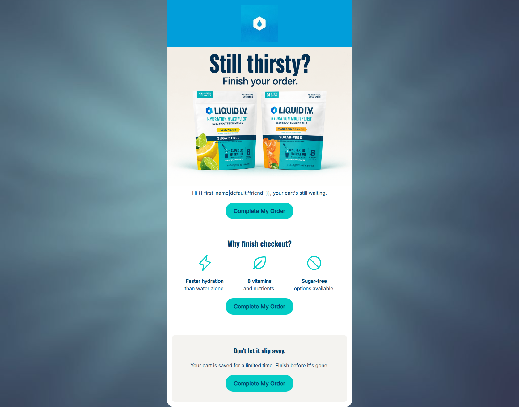
Hi friend, your cart's still waiting.
→ Complete My Order
Why finish checkout?
Faster hydration than water alone.
8 vitamins and nutrients.
Sugar-free options available.
→ Complete My Order
Don't let it slip away.
Your cart is saved for a limited time. Finish before it's gone.
→ Complete My Order
Why This Email Works
This is a structurally sound and highly scannable cart abandonment email. It effectively utilizes the brand's vibrant color palette and concise copy to drive users back to their cart. The repetition of the primary CTA is excellent and builds a clear, undeniable conversion path. However, it relies heavily on generic product imagery rather than dynamic cart contents, and it misses an opportunity to leverage the brand's powerful social mission to close the sale.
Hero (top/initial part) Impact
80/100- Clever, on-brand headline that ties a biological need (thirst) to the conversion action.
- High-quality, vibrant product imagery that establishes brand identity instantly.
Content Structure & Flow
75/100- Excellent use of repeated CTAs following every major content block.
- Logical narrative progression from the problem (forgotten cart) to the solution (brand benefits).
Visual Hierarchy & Layout
78/100- The bright cyan (#04CDC6) buttons provide excellent contrast against the navy text and white/beige backgrounds.
- The 3-column icon row effectively breaks up vertical scrolling and anchors the eye.
Call-to-Action Strength
95/100- Perfect consistency in CTA copy and destination.
- High-contrast button color ensures the primary action is unmissable in the 'squint test'.
- Strategic placement after every major persuasive argument.
Message Clarity & Tone
82/100- Punchy, benefit-driven copy ('Faster hydration than water alone').
- Playful but direct opening headline.
Readability & Scannability
88/100- Excellent use of bold text to highlight key phrases ('Faster hydration', '8 vitamins', 'Sugar-free').
- Ample whitespace around text blocks prevents crowding.
Offer & Value Proposition
75/100- Clearly reiterates the functional reasons to buy the product.
Personalization & Audience Fit
65/100- First-name personalization establishes a direct connection.
Copy Conciseness & Word Economy
85/100- No throat-clearing openers or paragraphs of text.
- Icons replace the need for lengthy bullet points.
Quick Wins
- Tighten the urgency copy in the final section to remove repetition.
- Increase the font weight or size of the 'Why finish checkout?' heading to improve visual hierarchy.
- Adjust the placement of the personalized greeting so it doesn't float awkwardly between the image and the button.




Create Professional Email Designs
Generate beautiful, on-brand email designs in seconds. Just enter your brand URL and let AI do the rest.