Health & Wellness Cart Abandonment Email Template
“You left hydration behind”
Design Score
81/100This is a strong, highly focused cart abandonment email that effectively leverages the brand's 'Still Thirsty?' messaging and core value propositions to drive users back to checkout. The inverted pyramid structure works perfectly, guiding the eye from the hero directly down to the primary CTA. However, it leaves money on the table by introducing off-path links in the value proposition section and missing the opportunity to leverage the brand's existing 'Free Shipping' threshold to overcome purchase hesitation. Overall, it's a very solid baseline that requires only minor structural tweaks to optimize conversion.
Create Your Own
Generate professional email designs like this one in seconds with Kopi AI.
Email Details
- Subject Line
- You left hydration behind
- Brand
- Liquid IV [eval 2026-03-26]
- Industry
- Health & Wellness
- Email Type
- Cart Abandonment
- Created
- April 24, 2026
Brand Colors
Email Copy
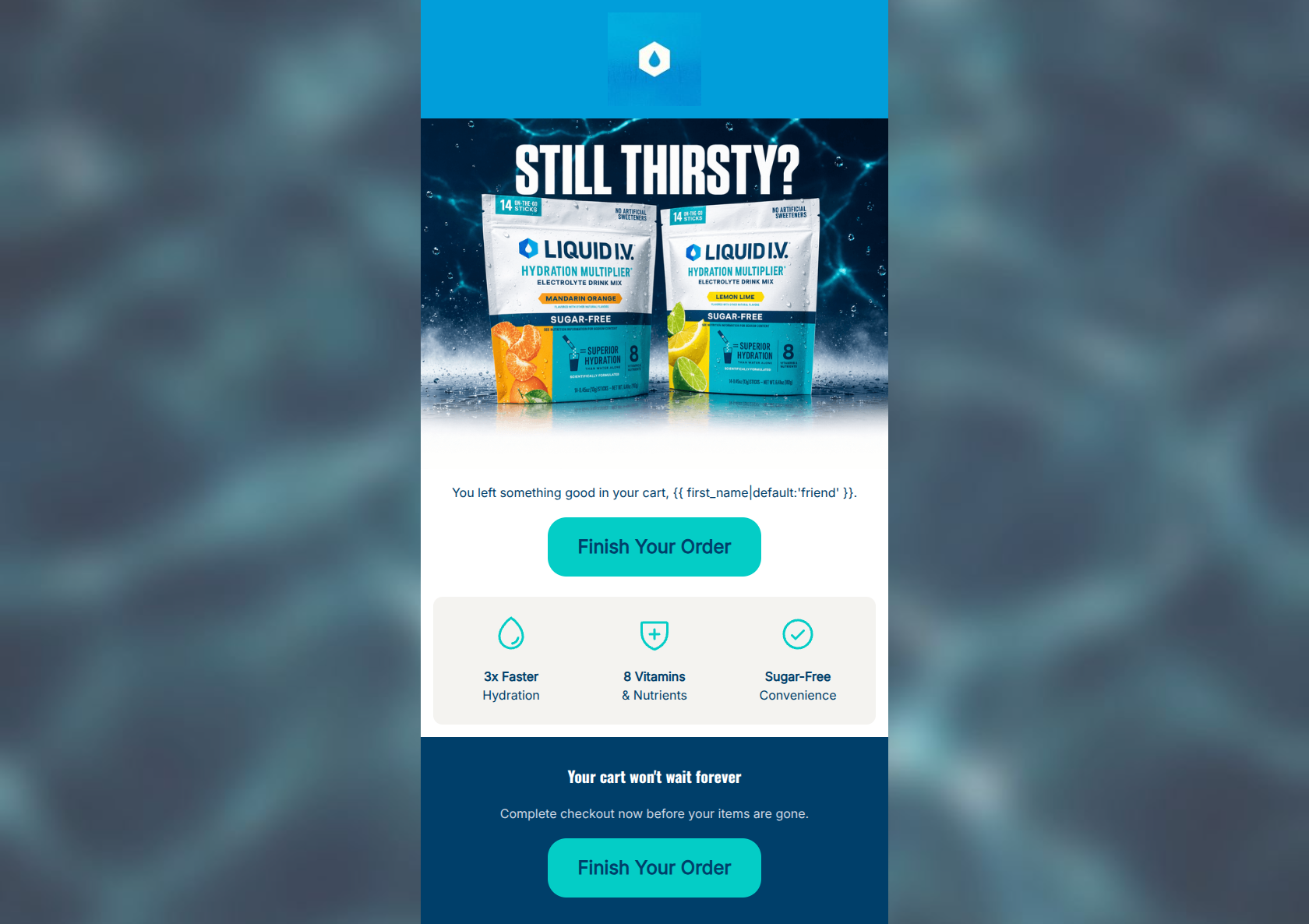
You left something good in your cart, friend.
→ Finish Your Order
3x Faster Hydration
8 Vitamins & Nutrients
Sugar-Free Convenience
Your cart won't wait forever
Complete checkout now before your items are gone.
→ Finish Your Order
Why This Email Works
This is a strong, highly focused cart abandonment email that effectively leverages the brand's 'Still Thirsty?' messaging and core value propositions to drive users back to checkout. The inverted pyramid structure works perfectly, guiding the eye from the hero directly down to the primary CTA. However, it leaves money on the table by introducing off-path links in the value proposition section and missing the opportunity to leverage the brand's existing 'Free Shipping' threshold to overcome purchase hesitation. Overall, it's a very solid baseline that requires only minor structural tweaks to optimize conversion.
Hero (top/initial part) Impact
82/100- Eye-catching, high-quality hero image that immediately reinforces the brand identity.
- Direct and clear opening line that states the purpose of the email.
- Primary CTA is visible immediately below the initial context.
Content Structure & Flow
88/100- Logical progression from reminder -> benefit reinforcement -> urgency -> final CTA.
- Excellent use of distinct background colors to separate different thoughts/sections.
- Easy to digest in a 3-second scan.
Visual Hierarchy & Layout
75/100- The light grey/beige background for the value props effectively separates the clinical benefits from the emotional hero section.
- The dark blue footer block grounds the email and creates strong contrast for the final CTA.
Call-to-Action Strength
85/100- High-contrast teal buttons pop beautifully against both the white and dark blue backgrounds.
- Consistent button copy ('Finish Your Order') and identical destination URLs create a frictionless path.
- The dark blue text on the teal button provides excellent readability.
Message Clarity & Tone
82/100- 'Still Thirsty?' is an excellent, brand-aligned hook.
- The value propositions are distilled into simple, punchy phrases rather than long paragraphs.
- The urgency in the footer ('Your cart won't wait forever') is clear without being overly aggressive.
Readability & Scannability
88/100- Excellent use of bolding on key metrics ('3x Faster', '8 Vitamins') to guide the scanning eye.
- Short, concise text blocks prevent cognitive overload.
- High contrast text throughout the email ensures readability.
Offer & Value Proposition
72/100- Clearly reiterates the proprietary benefits (speed of hydration, nutrient density) that justify the premium price point.
Personalization & Audience Fit
78/100- Uses first name personalization in the opening line.
- The messaging directly addresses the audience's desire for efficient, fast hydration.
Copy Conciseness & Word Economy
86/100- Zero fluff in the value proposition section.
- The hero text gets straight to the point immediately.
Quick Wins
- Remove the href attributes from the three value proposition icons to prevent users from leaking out of the checkout flow to educational pages.
- Update the 'Sugar-Free Convenience' text to something more cohesive like 'Zero Sugar Formula' or 'On-The-Go Hydration'.
- Add a brief mention of the 'Free Shipping over $40' offer near the final CTA to incentivize completion.




Create Professional Email Designs
Generate beautiful, on-brand email designs in seconds. Just enter your brand URL and let AI do the rest.