Health & Wellness Cart Abandonment Email Template
“You forgot something.”
Design Score
81/100This is a structurally sound, highly readable cart abandonment email that executes the basics well. It features a strong, on-brand visual hierarchy, perfectly aligned primary CTAs, and concise copy that respects the reader's time. However, it leaves conversion potential on the table by relying on a static, generic product image rather than dynamic cart contents, and it misses an easy opportunity to overcome price objections by mentioning the brand's free shipping threshold.
Create Your Own
Generate professional email designs like this one in seconds with Kopi AI.
Email Details
- Subject Line
- You forgot something.
- Brand
- Liquid I.V.
- Industry
- Health & Wellness
- Email Type
- Cart Abandonment
- Created
- May 7, 2026
Brand Colors
Email Copy
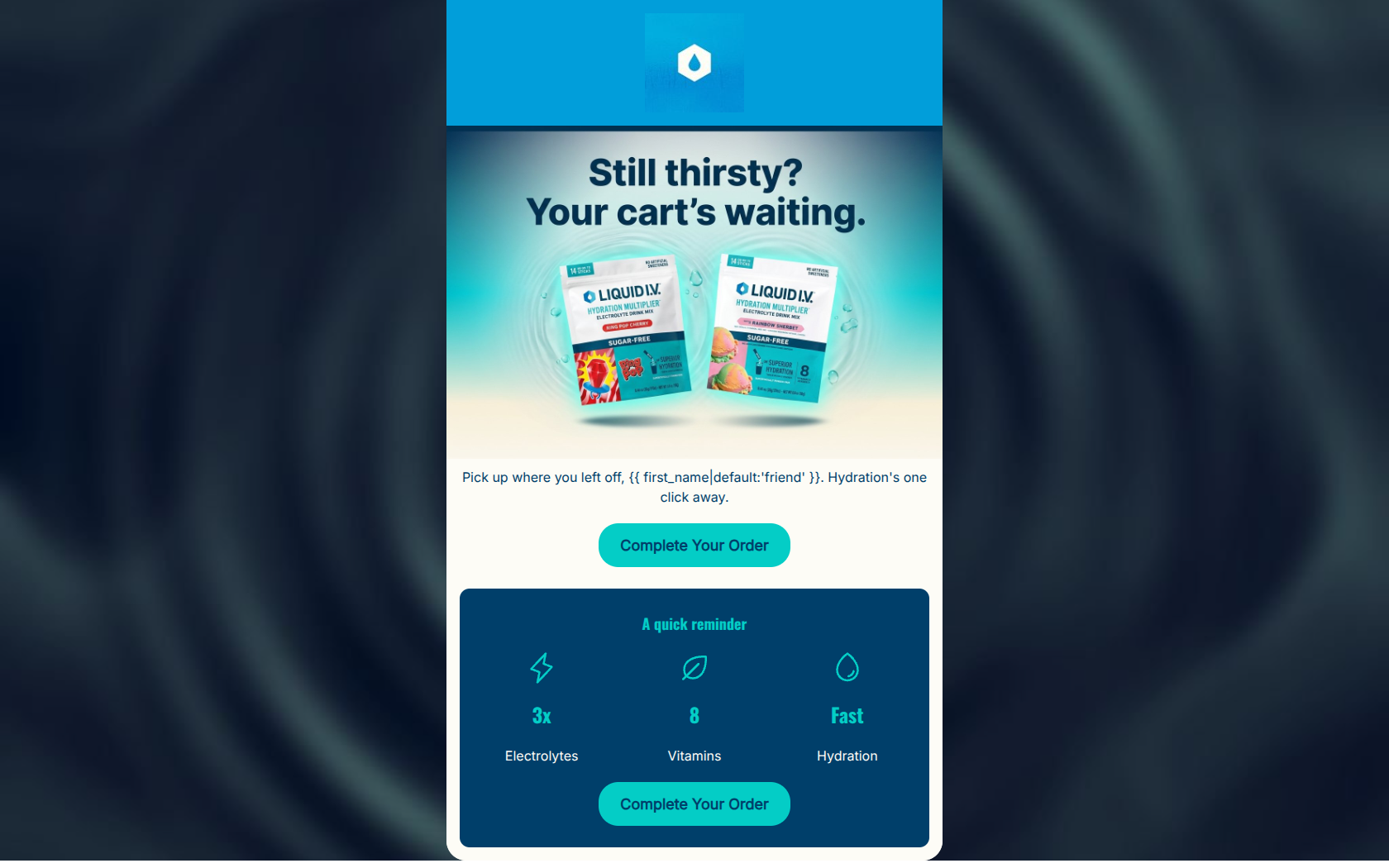
Pick up where you left off, friend. Hydration's one click away.
→ Complete Your Order
A quick reminder
3x
Electrolytes
8
Vitamins
Fast
Hydration
→ Complete Your Order
Why This Email Works
This is a structurally sound, highly readable cart abandonment email that executes the basics well. It features a strong, on-brand visual hierarchy, perfectly aligned primary CTAs, and concise copy that respects the reader's time. However, it leaves conversion potential on the table by relying on a static, generic product image rather than dynamic cart contents, and it misses an easy opportunity to overcome price objections by mentioning the brand's free shipping threshold.
1. Hero (top/initial part) Impact
78/100- The playful, on-brand headline ('Still thirsty?') immediately establishes context.
- The visual design is vibrant and aligns perfectly with Liquid I.V.'s energetic branding.
2. Content Structure & Flow
85/100- Excellent use of the inverted pyramid approach in the top half.
- The dark blue card cleanly separates the 'reminder' section from the main transactional message.
3. Visual Hierarchy & Layout
88/100- Strong use of contrast to draw the eye directly to the primary conversion points.
- The value proposition section is broken down into easily digestible vertical columns with clear icons.
4. Call-to-Action Strength
95/100- Flawless repetition of the primary goal.
- Buttons are visually prominent, featuring high contrast against their respective backgrounds.
5. Message Clarity & Tone
85/100- The conversational opener ('Pick up where you left off, friend.') feels natural and unintrusive.
- Uses Liquid I.V.'s signature energetic but expert tone.
6. Readability & Scannability
90/100- Icon-driven value propositions replace what could have been a dense paragraph.
- Generous padding and whitespace prevent the design from feeling cluttered.
7. Offer & Value Proposition
70/100- Distills complex science (Cellular Transport Layer) into easily understood consumer benefits ('Fast Hydration').
8. Personalization & Audience Fit
65/100- Uses a fallback ('friend') for the first name tag to prevent awkward blanks.
9. Copy Conciseness & Word Economy
92/100- Communicates the core message in under 20 words (excluding graphics).
- Avoids the temptation to oversell or re-educate the user on the entire brand story.
Quick Wins
- Add a simple line of text stating 'Free Shipping on orders over $40' near the CTA to proactively handle a major source of cart friction.
- Increase the font weight of the introductory text ('Pick up where you left off...') to better balance it against the heavy visual elements.
- Add a subtle urgency driver like 'Your items are reserved for a limited time' to the body copy.




Create Professional Email Designs
Generate beautiful, on-brand email designs in seconds. Just enter your brand URL and let AI do the rest.