Health & Wellness Cart Abandonment Email Template

74/100Fair

We saved your hydration.

Liquid IV [eval 2026-03-26]
Share:
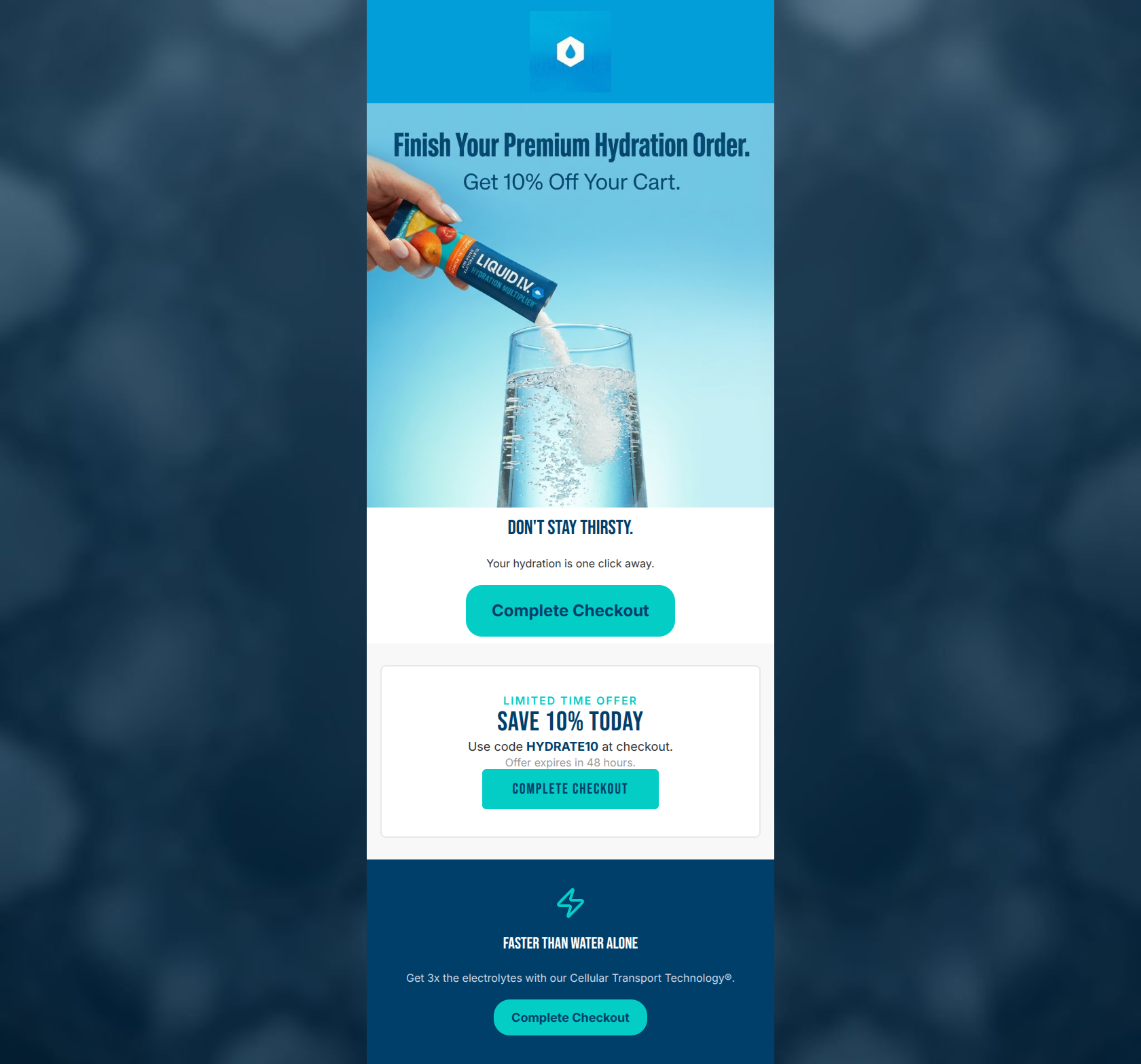
Hand pouring hydration powder into water above a 10% discount offer card for an abandoned cart.

Design Score

74/100
C - Fair

A visually striking cart abandonment email that clearly communicates its 10% discount offer, but suffers from structural friction. The core issue is the disjointed presentation of the offer: the discount is introduced in the hero image, but the required promo code is buried in a secondary card below an initial CTA. Combined with a lack of dynamic cart item visualization and repetitive button placements, the email adds unnecessary cognitive load despite its concise copy and strong brand aesthetic.

Create Your Own

Generate professional email designs like this one in seconds with Kopi AI.

Start Creating

Email Details

Subject Line
We saved your hydration.
Brand
Liquid IV [eval 2026-03-26]
Industry
Health & Wellness
Email Type
Cart Abandonment
Created
March 26, 2026

Brand Colors

Email Copy

Don't Stay Thirsty.

Your hydration is one click away.

Complete Checkout

Faster Than Water Alone

Get 3x the electrolytes with our Cellular Transport Technology®.

Complete Checkout

Why This Email Works

A visually striking cart abandonment email that clearly communicates its 10% discount offer, but suffers from structural friction. The core issue is the disjointed presentation of the offer: the discount is introduced in the hero image, but the required promo code is buried in a secondary card below an initial CTA. Combined with a lack of dynamic cart item visualization and repetitive button placements, the email adds unnecessary cognitive load despite its concise copy and strong brand aesthetic.

Hero Impact

75/100
  • High-quality, on-brand product photography showing the product in action.
  • Immediate introduction of the 10% discount hook.

Content Structure & Flow

65/100
  • Logical progression from cart reminder to incentive to value proposition.
  • Distinct visual sections help separate different types of information.

Visual Hierarchy & Layout

70/100
  • Strong use of whitespace in the central content area.
  • Effective color blocking in the footer to highlight the core value proposition.

Call-to-Action Strength

72/100
  • Excellent color contrast using the brand's neon cyan against dark and light backgrounds.
  • Clear, action-oriented base copy ('Complete Checkout').

Message Clarity & Tone

78/100
  • Clear communication of the 48-hour deadline drives urgency.
  • Tone is supportive and active, fitting the Liquid I.V. brand personality.

Readability & Scannability

85/100
  • Minimal text blocks allow for effortless scanning.
  • High contrast between text (#333333, #FFFFFF) and backgrounds.

Offer & Value Proposition

80/100
  • Strong, clear financial incentive with a deadline.
  • Excellent reinforcement of the proprietary Cellular Transport Technology benefit at the bottom of the funnel.

Personalization & Audience Fit

60/100
  • The scientific messaging ('Cellular Transport Technology') resonates perfectly with the target audience's psychographics.

Copy Conciseness & Word Economy

82/100
  • Zero filler phrases; gets straight to the point.
  • The value proposition is distilled into a punchy, easy-to-digest sentence.

Quick Wins

  • Remove the first 'Complete Checkout' button to prevent users from clicking before they see the required promo code.
  • Consolidate the offer text and promo code into a single, unified block beneath the hero image.
  • Change the secondary CTA copy to 'Claim 10% Off' to differentiate it from the primary checkout action.

Create Professional Email Designs

Generate beautiful, on-brand email designs in seconds. Just enter your brand URL and let AI do the rest.

Start Creating for Free