Travel & Hospitality Cart Abandonment Email Template
“Still thinking it over? Here's 10% off.”
Design Score
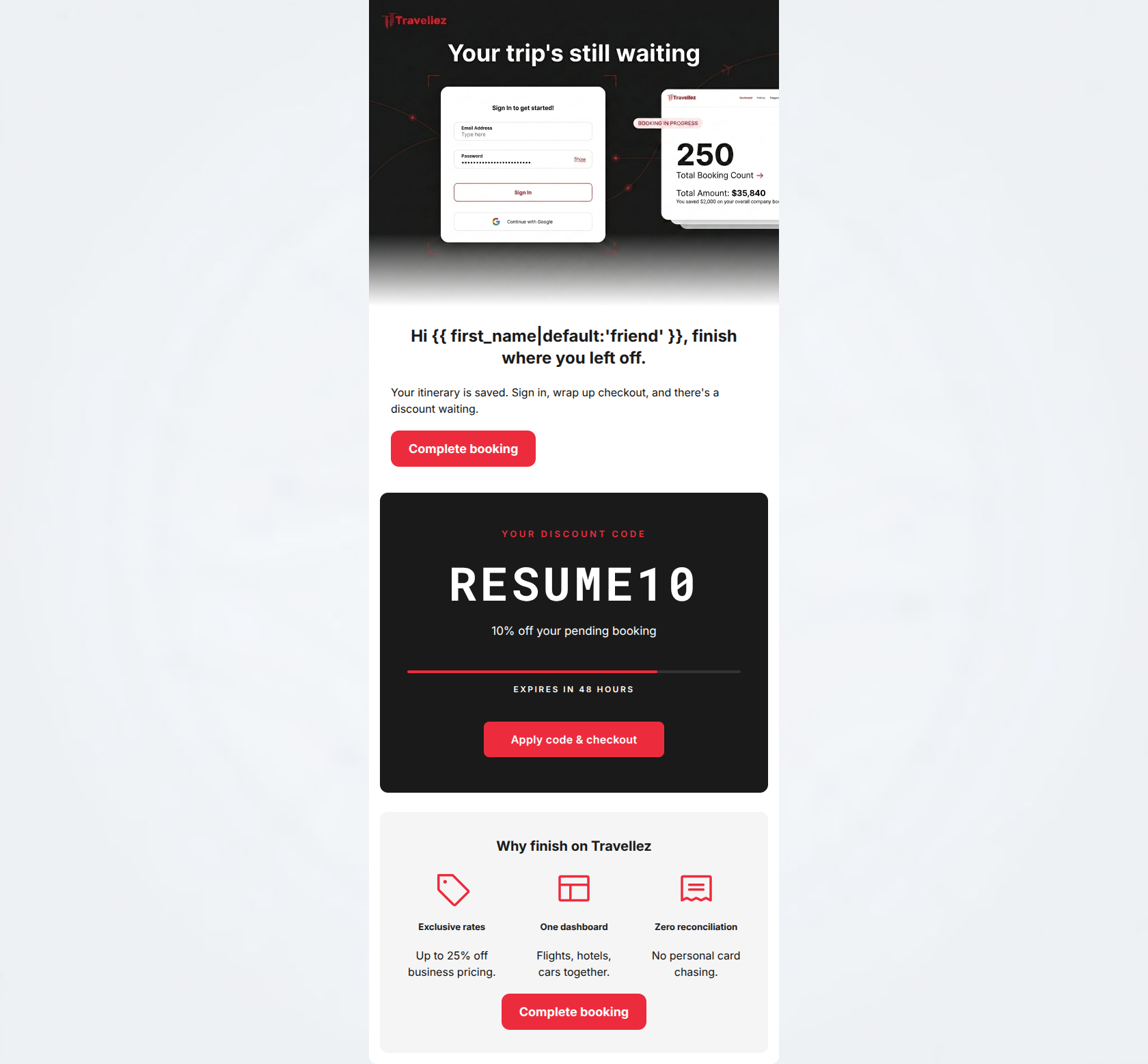
90/100This is an exceptionally strong cart abandonment email. It perfectly executes the core objective: driving the user back to their incomplete booking. The layout uses high-contrast design elements to command attention, particularly the dark promo card which acts as a powerful visual anchor. The copy is tight, empathetic to B2B pain points, and devoid of filler. By repeating the primary call-to-action throughout the logical flow (Reminder -> Incentive -> Value Reinforcement), it creates a frictionless path to conversion. This is top-tier execution.
Create Your Own
Generate professional email designs like this one in seconds with Kopi AI.
Email Details
- Subject Line
- Still thinking it over? Here's 10% off.
- Brand
- Travellez
- Industry
- Travel & Hospitality
- Email Type
- Cart Abandonment
- Created
- May 7, 2026
Brand Colors
Email Copy
Hi friend, finish where you left off.
Your itinerary is saved. Sign in, wrap up checkout, and there's a discount waiting.
→ Complete booking
Why finish on Travellez
Exclusive rates
Up to 25% off business pricing.
One dashboard
Flights, hotels, cars together.
Zero reconciliation
No personal card chasing.
→ Complete booking
Why This Email Works
This is an exceptionally strong cart abandonment email. It perfectly executes the core objective: driving the user back to their incomplete booking. The layout uses high-contrast design elements to command attention, particularly the dark promo card which acts as a powerful visual anchor. The copy is tight, empathetic to B2B pain points, and devoid of filler. By repeating the primary call-to-action throughout the logical flow (Reminder -> Incentive -> Value Reinforcement), it creates a frictionless path to conversion. This is top-tier execution.
Hero (top/initial part) Impact
85/100- Establishes immediate context.
- Visually aligns with the SaaS product aesthetic.
Content Structure & Flow
92/100- Perfect sequential logic for an abandonment flow.
- Each section serves a distinct, singular purpose.
Visual Hierarchy & Layout
88/100- Masterful use of contrast to highlight the primary offer.
- Clear z-pattern scannability in the lower section.
Call-to-Action Strength
96/100- Excellent repetition of the primary conversion goal.
- High visual contrast makes the buttons unmissable.
- CTA copy is action-oriented and clear.
Message Clarity & Tone
90/100- Highly empathetic to the specific B2B audience's pain points.
- Maintains a professional, calm sense of urgency.
Readability & Scannability
94/100- Zero walls of text.
- Iconography aids rapid comprehension of value props.
Offer & Value Proposition
95/100- Clear, compelling financial incentive.
- Strong visual representation of urgency.
- Core brand value props are succinctly restated.
Personalization & Audience Fit
85/100- Addresses audience-specific pain points (reconciliation).
- Appropriate use of basic merge tags.
Copy Conciseness & Word Economy
94/100- Zero filler words.
- Punchy, outcome-focused feature descriptions.
Quick Wins
- Center-align the top 'Complete booking' CTA to create a cohesive vertical scanning path.
- Tighten the opening headline from 'finish where you left off' to a punchier 'Resume your booking'.
Create Professional Email Designs
Generate beautiful, on-brand email designs in seconds. Just enter your brand URL and let AI do the rest.