Travel & Hospitality Product Launch Email Template
“Viceroy Brickell — A Private Invitation”
Design Score
88/100This is a masterclass in ultra-luxury positioning. The email successfully leverages high-end editorial design, expansive whitespace, and meticulous typography to sell 'legacy' and 'exclusivity' rather than just real estate. The tone is perfectly calibrated for UHNW individuals, utilizing precise, evocative language ('stewardship', 'consequential', 'patrimonial') and strong cultural signaling (the Financial Times quote). While the aesthetic and narrative flow are exceptional, the email could be strengthened by grounding the highly abstract copy with a few concrete property details and optimizing the readability of some text blocks.
Create Your Own
Generate professional email designs like this one in seconds with Kopi AI.
Email Details
- Subject Line
- Viceroy Brickell — A Private Invitation
- Brand
- Viceroy Hotels & Resorts
- Industry
- Travel & Hospitality
- Email Type
- Product Launch
- Created
- May 31, 2026
Brand Colors
Email Copy
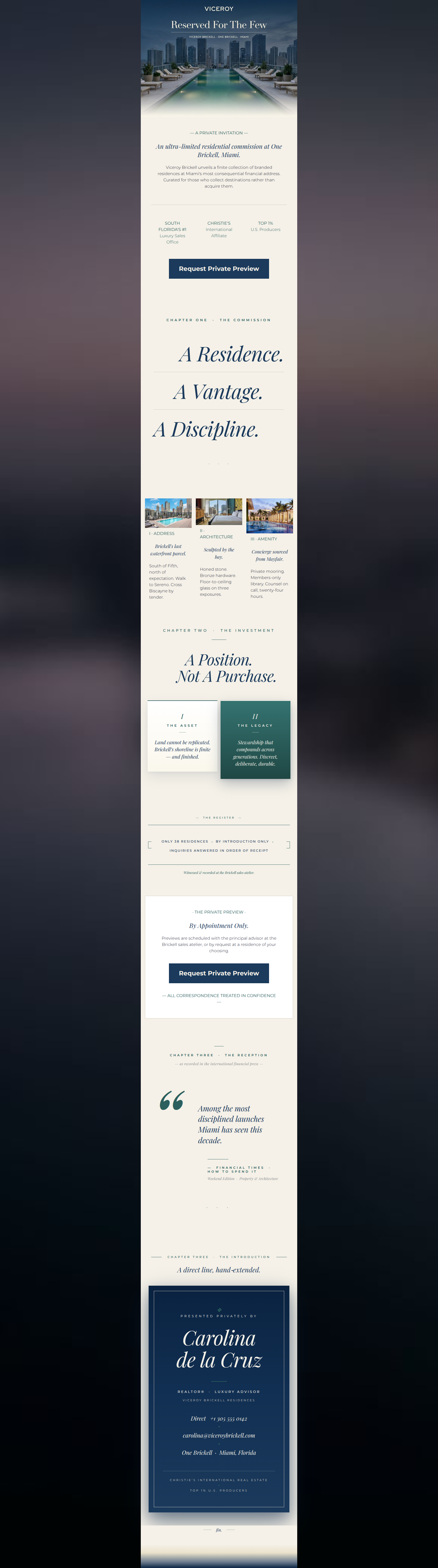
— A PRIVATE INVITATION —
An ultra-limited residential commission at One Brickell, Miami.
Viceroy Brickell unveils a finite collection of branded residences at Miami's most consequential financial address. Curated for those who collect destinations rather than acquire them.
SOUTH FLORIDA'S #1 Luxury Sales Office
CHRISTIE'S International Affiliate
TOP 1% U.S. Producers
→ Request Private Preview
I · ADDRESS
Brickell's last waterfront parcel.
South of Fifth, north of expectation. Walk to Sereno. Cross Biscayne by tender.
II · ARCHITECTURE
Sculpted by the bay.
Honed stone. Bronze hardware. Floor-to-ceiling glass on three exposures.
III · AMENITY
Concierge sourced from Mayfair.
Private mooring. Members-only library. Counsel on call, twenty-four hours.
· THE PRIVATE PREVIEW ·
By Appointment Only.
Previews are scheduled with the principal advisor at the Brickell sales atelier, or by request at a residence of your choosing.
→ Request Private Preview
— ALL CORRESPONDENCE TREATED IN CONFIDENCE —
Why This Email Works
This is a masterclass in ultra-luxury positioning. The email successfully leverages high-end editorial design, expansive whitespace, and meticulous typography to sell 'legacy' and 'exclusivity' rather than just real estate. The tone is perfectly calibrated for UHNW individuals, utilizing precise, evocative language ('stewardship', 'consequential', 'patrimonial') and strong cultural signaling (the Financial Times quote). While the aesthetic and narrative flow are exceptional, the email could be strengthened by grounding the highly abstract copy with a few concrete property details and optimizing the readability of some text blocks.
Hero (top/initial part) Impact
85/100- High-quality imagery that sets an immediate luxury mood.
- Strong, exclusive headline ('Reserved For The Few') that appeals to the target psychographic.
- Quickly establishes the core offer ('ultra-limited residential commission').
Content Structure & Flow
88/100- Editorial 'Chapter' structure creates a compelling, logical flow.
- Excellent pacing, alternating between dense typography and visual breathers.
- The final dossier card acts as a strong, natural culmination of the narrative.
Visual Hierarchy & Layout
92/100- Masterful use of scale and contrast in typography to guide the eye.
- The final dossier card is visually striking and serves as a massive, high-value click target.
- Generous whitespace elevates the perceived value of the content.
Call-to-Action Strength
85/100- Consistent primary CTA destination throughout the email.
- CTA copy is high-intent and matches the exclusive tone of the brand.
- Turning the final visual anchor (the dossier card) into a massive click target is a smart conversion tactic.
Message Clarity & Tone
88/100- Exceptional use of UHNW-specific vocabulary ('patrimonial', 'stewardship', 'consequential').
- Strong cultural signaling via the Financial Times pull-quote.
- Maintains a consistent voice of a discreet, high-end advisor.
Readability & Scannability
82/100- Massive, high-contrast headings create a clear scan path.
- Short sentence structures in key areas facilitate quick reading.
- Clear delineation between sections using dividers and whitespace.
Offer & Value Proposition
86/100- Strong emphasis on scarcity and exclusivity.
- Excellent use of social proof (Christie's, Top 1% Producers).
- Positions the offer as a generational asset rather than a standard real estate transaction.
Personalization & Audience Fit
89/100- Flawless alignment with UHNW aesthetic expectations.
- The 'dossier' and 'commission' framing flatters the recipient's status.
- Including a specific advisor's name and direct contact info builds trust and personalization.
Copy Conciseness & Word Economy
94/100- Brilliant use of distilled, high-impact phrasing.
- No repetitive messaging; each section introduces a new angle (Address, Architecture, Amenity, Investment).
- Avoids generic real estate jargon in favor of precise, editorial language.
Quick Wins
- Correct the duplicate 'CHAPTER THREE' label to ensure logical narrative progression.
- Left-align the body text in the introductory 'Private Invitation' block to improve readability.
- Add a subtle, text-only primary CTA link at the end of the 'Chapter Two' section to bridge the gap in click opportunities.
Create Professional Email Designs
Generate beautiful, on-brand email designs in seconds. Just enter your brand URL and let AI do the rest.