Travel & Hospitality Marketing Email Template
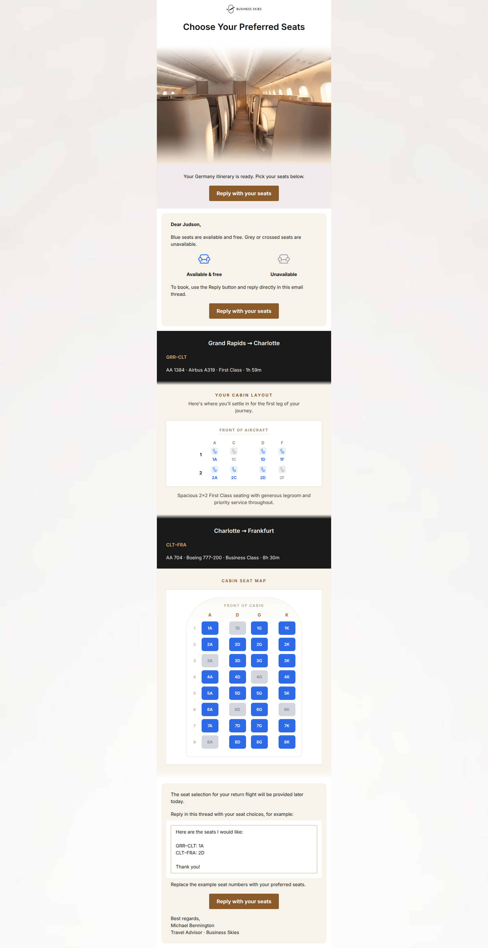
“Choose your seats for Germany, Judson”
Design Score
82/100This is a highly effective, personalized transactional email that perfectly encapsulates the brand's 'concierge' service model. The decision to use a 'reply to book' mechanism, supported by a clear copy-paste example, brillianty reduces cognitive load for an affluent audience. The primary issue holding this email back from a 90+ score is structural pacing: asking the user to reply with their seats before they have even seen the seat maps creates friction. Reordering the elements to follow a 'context -> information -> action' flow will significantly improve the user experience.
Create Your Own
Generate professional email designs like this one in seconds with Kopi AI.
Email Details
- Subject Line
- Choose your seats for Germany, Judson
- Brand
- Business Skies
- Industry
- Travel & Hospitality
- Email Type
- Marketing
- Created
- July 11, 2026
Brand Colors
Email Copy
Choose Your Preferred Seats
Your Germany itinerary is ready. Pick your seats below.
→ Reply with your seats
Dear Judson,
Blue seats are available and free. Grey or crossed seats are unavailable.
Available & free
Unavailable
To book, use the Reply button and reply directly in this email thread.
→ Reply with your seats
Grand Rapids → Charlotte
GRR–CLT
AA 1384 · Airbus A319 · First Class · 1h 59m
Charlotte → Frankfurt
CLT–FRA
AA 704 · Boeing 777-200 · Business Class · 8h 30m
The seat selection for your return flight will be provided later today.
Reply in this thread with your seat choices, for example:
Here are the seats I would like: GRR–CLT: 1A CLT–FRA: 2D Thank you!
Replace the example seat numbers with your preferred seats.
→ Reply with your seats
Best regards, Michael Bennington Travel Advisor · Business Skies
Why This Email Works
This is a highly effective, personalized transactional email that perfectly encapsulates the brand's 'concierge' service model. The decision to use a 'reply to book' mechanism, supported by a clear copy-paste example, brillianty reduces cognitive load for an affluent audience. The primary issue holding this email back from a 90+ score is structural pacing: asking the user to reply with their seats before they have even seen the seat maps creates friction. Reordering the elements to follow a 'context -> information -> action' flow will significantly improve the user experience.
Hero (top/initial part) Impact
75/100- Headline is immediately clear about the email's purpose.
- Aesthetic aligns well with the premium, structured brand guidelines.
Content Structure & Flow
65/100- Dark bands for flight headers create excellent visual compartmentalization.
- The progression from the first leg to the return leg is logical.
Visual Hierarchy & Layout
85/100- Excellent use of stark background color changes to separate logical sections.
- Generous padding around the seat maps prevents the email from feeling cluttered.
Call-to-Action Strength
88/100- Perfect consistency in CTA copy and destination.
- The action ('Reply') perfectly aligns with the high-touch, personal assistant brand positioning.
Message Clarity & Tone
90/100- The personal sign-off from a 'Travel Advisor' reinforces the 24/7 personalized support value proposition.
- Tone is highly functional and devoid of unnecessary throat-clearing.
Readability & Scannability
88/100- Excellent typographic hierarchy in the flight detail bands.
- Clear, isolated presentation of the seat maps.
Offer & Value Proposition
85/100- The transaction mechanism reinforces the brand's 'personal travel assistant' differentiator.
- Clearly communicates that the available seats are 'free', removing a potential mental hurdle.
Personalization & Audience Fit
95/100- Deep integration of user-specific data (name, exact itinerary).
- The layout feels like a bespoke dossier rather than a mass-blast template.
Copy Conciseness & Word Economy
92/100- The example reply block is a masterclass in reducing user friction through concise formatting.
- Zero filler adjectives or marketing fluff.
Quick Wins
- Remove the first two 'Reply with your seats' buttons to prevent users from encountering a CTA before they have the information needed to act.
- Darken the bronze button color (#8A5A2B) to increase contrast against the off-white/ivory backgrounds.
- Simplify the instruction 'To book, use the Reply button and reply directly in this email thread' to 'Reply to this email with your choices.'
Create Professional Email Designs
Generate beautiful, on-brand email designs in seconds. Just enter your brand URL and let AI do the rest.