Travel & Hospitality Order Confirmation Email Template
“Judson, choose your preferred seats to Germany”
Design Score
86/100This is a highly effective, concierge-style transactional email that perfectly aligns with Business Skies' premium brand positioning. The inclusion of visual seat maps and a pre-written reply template drastically reduces cognitive load for the reader. However, the email's momentum is slightly hindered by a generic stock image in the hero section and a premature first CTA that appears before the user has processed the seat options. Minor structural tweaks and a more relevant hero visual will push this into the top tier of conversion-optimized transactional emails.
Create Your Own
Generate professional email designs like this one in seconds with Kopi AI.
Email Details
- Subject Line
- Judson, choose your preferred seats to Germany
- Brand
- Business Skies
- Industry
- Travel & Hospitality
- Email Type
- Order Confirmation
- Created
- July 11, 2026
Brand Colors
Email Copy
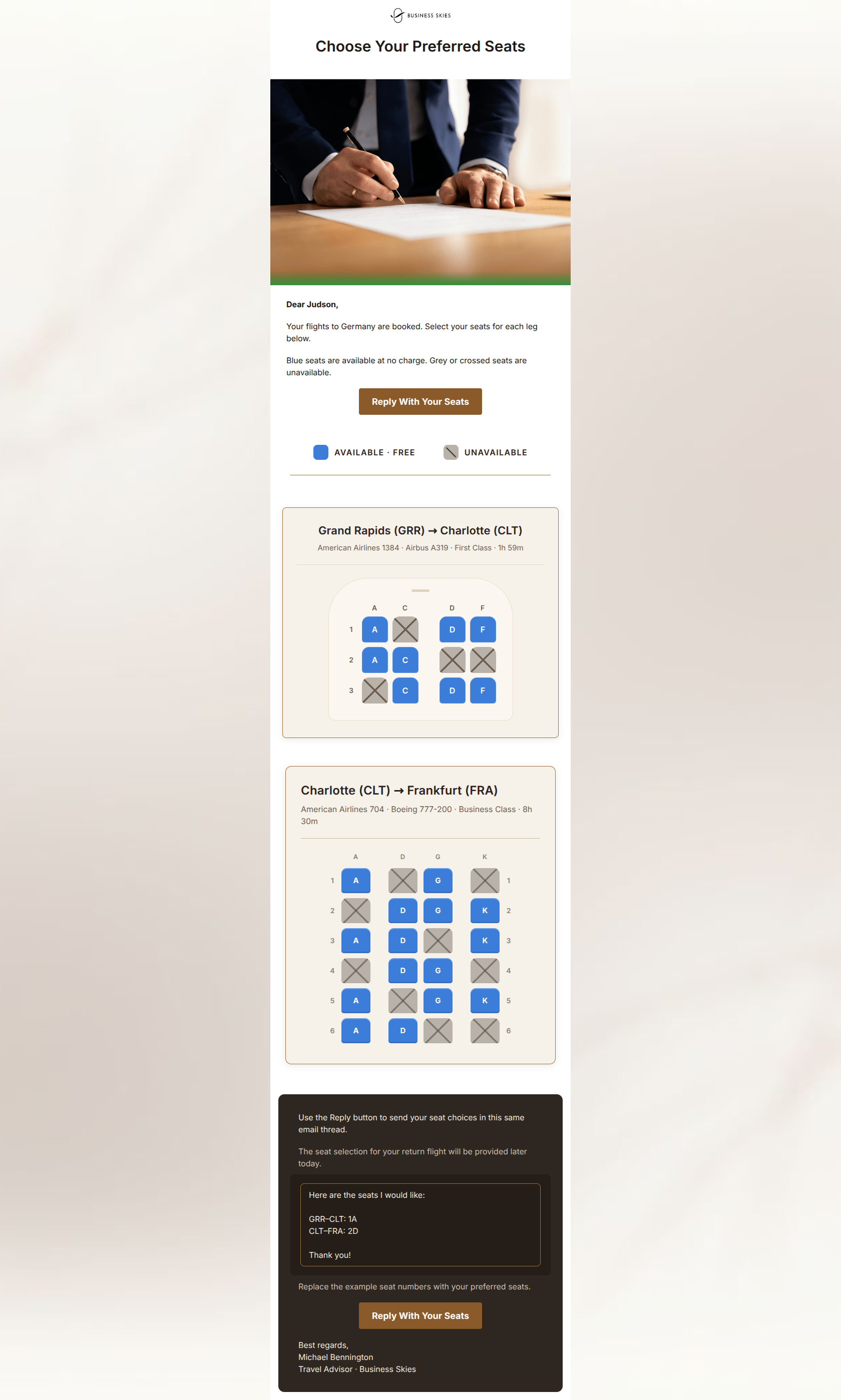
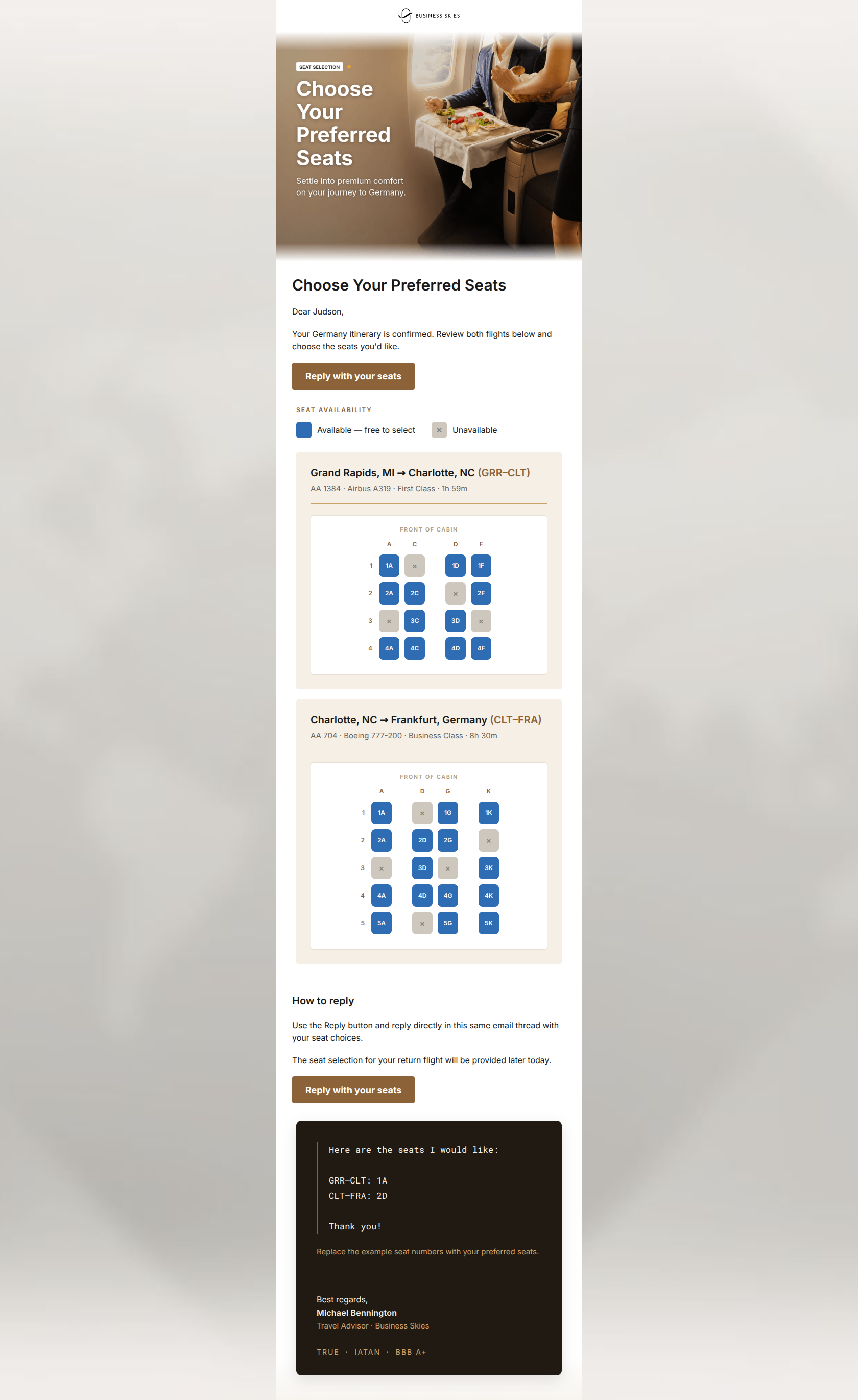
Choose Your Preferred Seats
Dear Judson,
Your flights to Germany are booked. Select your seats for each leg below.
Blue seats are available at no charge. Grey or crossed seats are unavailable.
→ Reply With Your Seats
Use the Reply button to send your seat choices in this same email thread.
The seat selection for your return flight will be provided later today.
Here are the seats I would like: GRR–CLT: 1A CLT–FRA: 2D Thank you!
Replace the example seat numbers with your preferred seats.
→ Reply With Your Seats
Best regards, Michael Bennington Travel Advisor · Business Skies
Why This Email Works
This is a highly effective, concierge-style transactional email that perfectly aligns with Business Skies' premium brand positioning. The inclusion of visual seat maps and a pre-written reply template drastically reduces cognitive load for the reader. However, the email's momentum is slightly hindered by a generic stock image in the hero section and a premature first CTA that appears before the user has processed the seat options. Minor structural tweaks and a more relevant hero visual will push this into the top tier of conversion-optimized transactional emails.
Hero (top/initial part) Impact
72/100- The headline 'Choose Your Preferred Seats' leaves zero ambiguity about the email's purpose.
- Clean, distraction-free top header keeps focus on the primary action.
Content Structure & Flow
85/100- The transition from light background (information) to dark background (action/instructions) naturally guides the eye downward.
- The inclusion of a visual legend immediately prior to the complex seat maps is excellent structural scaffolding.
Visual Hierarchy & Layout
88/100- The flight details (aircraft, duration, class) are appropriately styled in a muted brown, ensuring they don't compete with the seat map visuals.
- The dark footer card effectively draws attention to the final CTA and instructions.
Call-to-Action Strength
92/100- Total consistency in CTA copy and destination (href).
- The copy 'Reply With Your Seats' is specific, action-oriented, and clearly sets expectations for what happens next.
Message Clarity & Tone
90/100- Providing a copy-paste reply template ('Here are the seats I would like...') is a masterful touch that drastically reduces user friction.
- The sign-off from a specific Travel Advisor adds a strong human element.
Readability & Scannability
94/100- Generous whitespace around the seat maps makes complex diagrams feel calm and accessible.
- High contrast text across both light and dark sections.
Offer & Value Proposition
82/100- The explicit callout that the return flight selection 'will be provided later today' proactively answers a likely customer question, reducing support queries.
Personalization & Audience Fit
88/100- Deep data integration (route, aircraft, specific seat layouts).
- The concierge sign-off ('Michael Bennington') makes the email feel like a 1-to-1 communication.
Copy Conciseness & Word Economy
86/100- No filler words in the intro; gets straight to the point.
- The reply template uses minimal words to convey exactly what the travel advisor needs.
Quick Wins
- Delete the redundant sentence explaining seat colors in the intro and let the visual legend do the work.
- Remove the generic stock image of the document signing to reduce cognitive friction.
- Add a brief urgency driver (e.g., 'Seats fill quickly') to encourage an immediate reply.
Create Professional Email Designs
Generate beautiful, on-brand email designs in seconds. Just enter your brand URL and let AI do the rest.