Travel & Hospitality Announcement Email Template
“Julie, We Made Your NYC Trip Happen 🎉”
Design Score
82/100This email does an excellent job handling a complex and potentially high-friction transactional moment (an expensive ticket exchange). The visual hierarchy, particularly the custom pricing and itinerary cards, is outstanding and clearly communicates the value of the exchange. The primary weakness lies in the introductory text blocks, which suffer from wordiness and unnecessary travel industry jargon ('PNR', 'tariff desk') that increases cognitive load without adding consumer value. Tightening the copy and improving the scannability of the plain text sections will elevate this from a strong email to an exceptional one.
Create Your Own
Generate professional email designs like this one in seconds with Kopi AI.
Email Details
- Subject Line
- Julie, We Made Your NYC Trip Happen 🎉
- Brand
- Business Skies
- Industry
- Travel & Hospitality
- Email Type
- Announcement
- Created
- July 11, 2026
Brand Colors
Email Copy
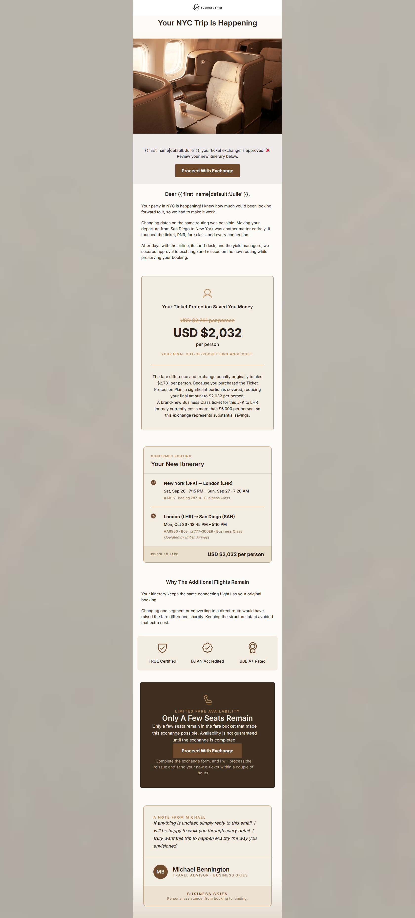
Your NYC Trip Is Happening
Julie, your ticket exchange is approved. 🎉 Review your new itinerary below.
→ Proceed With Exchange
Dear Julie,
Your party in NYC is happening! I knew how much you'd been looking forward to it, so we had to make it work.
Changing dates on the same routing was possible. Moving your departure from San Diego to New York was another matter entirely. It touched the ticket, PNR, fare class, and every connection.
After days with the airline, its tariff desk, and the yield managers, we secured approval to exchange and reissue on the new routing while preserving your booking.
Why The Additional Flights Remain
Your itinerary keeps the same connecting flights as your original booking.
Changing one segment or converting to a direct route would have raised the fare difference sharply. Keeping the structure intact avoided that extra cost.
TRUE Certified
IATAN Accredited
BBB A+ Rated
Why This Email Works
This email does an excellent job handling a complex and potentially high-friction transactional moment (an expensive ticket exchange). The visual hierarchy, particularly the custom pricing and itinerary cards, is outstanding and clearly communicates the value of the exchange. The primary weakness lies in the introductory text blocks, which suffer from wordiness and unnecessary travel industry jargon ('PNR', 'tariff desk') that increases cognitive load without adding consumer value. Tightening the copy and improving the scannability of the plain text sections will elevate this from a strong email to an exceptional one.
Hero (top/initial part) Impact
85/100- Headline focuses on the positive outcome rather than the administrative process.
- Premium imagery aligns perfectly with the target audience's expectations.
- Immediate introduction of the primary CTA above the fold.
Content Structure & Flow
78/100- Excellent use of specialized cards (Savings, Itinerary) to break up complex information.
- The flow naturally guides the user from understanding the value to taking action.
Visual Hierarchy & Layout
85/100- High-contrast 'Urgency' block immediately draws attention before the final sign-off.
- The pricing card effectively uses font size and styling (strikethrough) to highlight value.
- Generous whitespace around the custom cards gives the email a premium, uncluttered feel.
Call-to-Action Strength
95/100- Flawless adherence to a single primary action with consistent verbiage ('Proceed With Exchange').
- CTAs are visually prominent and unambiguous.
- The verbiage exactly matches the mental model of the user at this stage in the transaction.
Message Clarity & Tone
72/100- The tone effectively balances professional authority with empathetic customer service.
- The 'Author Signoff' adds a personal, reassuring touch that fits a premium brand.
Readability & Scannability
75/100- The itinerary breakdown is incredibly easy to read and parse at a glance.
- Trust badges (TRUE, IATAN, BBB) are visual and instantly recognizable.
Offer & Value Proposition
96/100- Brilliant use of price anchoring to reframe a high out-of-pocket cost as a 'substantial savings'.
- Validates the customer's previous purchase decision (Ticket Protection Plan) to build trust.
- Clear, unmistakable presentation of the final cost ensures no surprises.
Personalization & Audience Fit
90/100- Directly references the user's personal travel motivation (the party).
- The sign-off from a specific 'Travel Advisor' enhances the feeling of 1-to-1 service.
- Design and tone perfectly match the affluent target demographic.
Copy Conciseness & Word Economy
65/100- Copy within the custom cards is exceptionally tight and purpose-driven.
- The urgency block communicates scarcity quickly and without hyperbole.
Quick Wins
- Remove all industry jargon (PNR, tariff desk, yield managers) from the introductory text.
- Add bolding to key phrases in the 'Why The Additional Flights Remain' paragraph to aid skimming.
- Tighten the sentence structure in the opening letter to reduce reading time.
Create Professional Email Designs
Generate beautiful, on-brand email designs in seconds. Just enter your brand URL and let AI do the rest.