Health & Wellness Cart Abandonment Email Template
“Still thirsty? Your cart is waiting.”
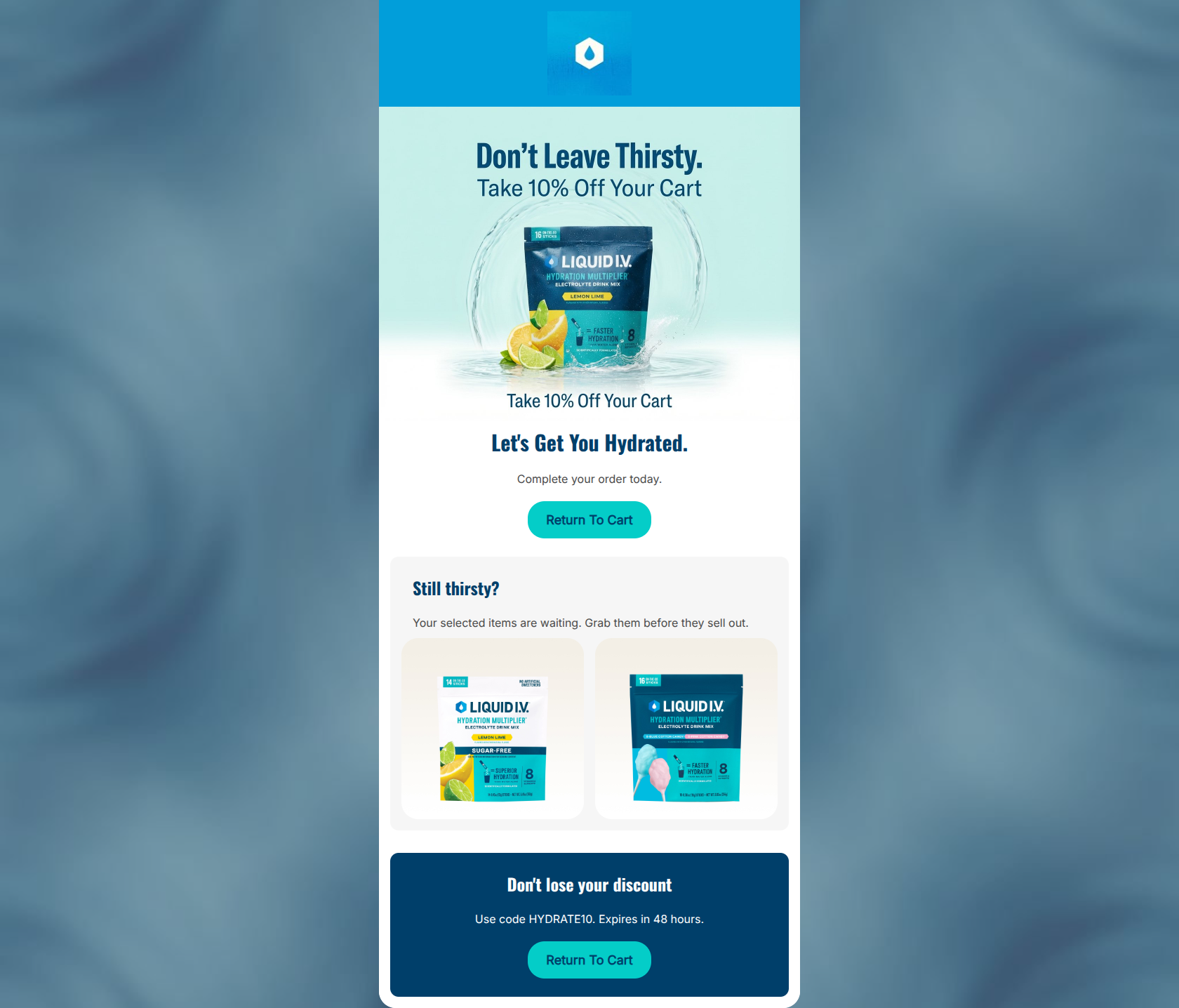
Design Score
65/100This cart abandonment email has a solid foundation with a clear 10% discount offer and on-brand, high-contrast CTAs. However, it suffers from poor structural execution and cognitive friction. The biggest conversion leak is the fragmented presentation of the offer: the 10% hook is at the top, but the actual promo code and expiration details are buried at the bottom, forcing the user to hunt for the information needed to convert. Additionally, the hero section is hampered by redundant copy, repeating the same message in both the image and the HTML text.
Create Your Own
Generate professional email designs like this one in seconds with Kopi AI.
Email Details
- Subject Line
- Still thirsty? Your cart is waiting.
- Brand
- Liquid IV [eval 2026-03-26]
- Industry
- Health & Wellness
- Email Type
- Cart Abandonment
- Created
- March 26, 2026
Brand Colors
Email Copy
Let's Get You Hydrated.
Complete your order today.
→ Return To Cart
Still thirsty?
Your selected items are waiting. Grab them before they sell out.
Don't lose your discount
Use code HYDRATE10. Expires in 48 hours.
→ Return To Cart
Why This Email Works
This cart abandonment email has a solid foundation with a clear 10% discount offer and on-brand, high-contrast CTAs. However, it suffers from poor structural execution and cognitive friction. The biggest conversion leak is the fragmented presentation of the offer: the 10% hook is at the top, but the actual promo code and expiration details are buried at the bottom, forcing the user to hunt for the information needed to convert. Additionally, the hero section is hampered by redundant copy, repeating the same message in both the image and the HTML text.
Hero (top/initial part) Impact
60/100- The image provides a strong, high-quality visual of the product in action.
- The '10% Off' incentive is introduced immediately.
Content Structure & Flow
55/100- Logical thematic progression from reminder to product display to final urgency.
Visual Hierarchy & Layout
65/100- Good use of the secondary light gray background to separate the product section.
- Ample whitespace around elements prevents the layout from feeling cramped.
Call-to-Action Strength
75/100- Strong color contrast makes the buttons unmissable.
- Action-oriented copy ('Return To Cart') sets clear expectations.
Message Clarity & Tone
70/100- On-brand, energetic copywriting.
- Clear connection to the hydration theme.
Readability & Scannability
75/100- Good contrast between the #4A4A4A body text and white background.
- Short, easily digestible paragraphs.
Offer & Value Proposition
65/100- Clear, tangible financial incentive to complete the purchase.
Personalization & Audience Fit
60/100- Utilizes dynamic product imagery based on user behavior.
Copy Conciseness & Word Economy
50/100- The bottom section is relatively concise and gets straight to the point.
Quick Wins
- Delete the redundant HTML text 'Take 10% Off Your Cart' located immediately below the hero image.
- Remove the filler text 'Complete your order today.'
- Move the text 'Use code HYDRATE10. Expires in 48 hours.' from the bottom block to the hero section, placing it right above the primary CTA.




Create Professional Email Designs
Generate beautiful, on-brand email designs in seconds. Just enter your brand URL and let AI do the rest.