Health & Wellness Cart Abandonment Email Template
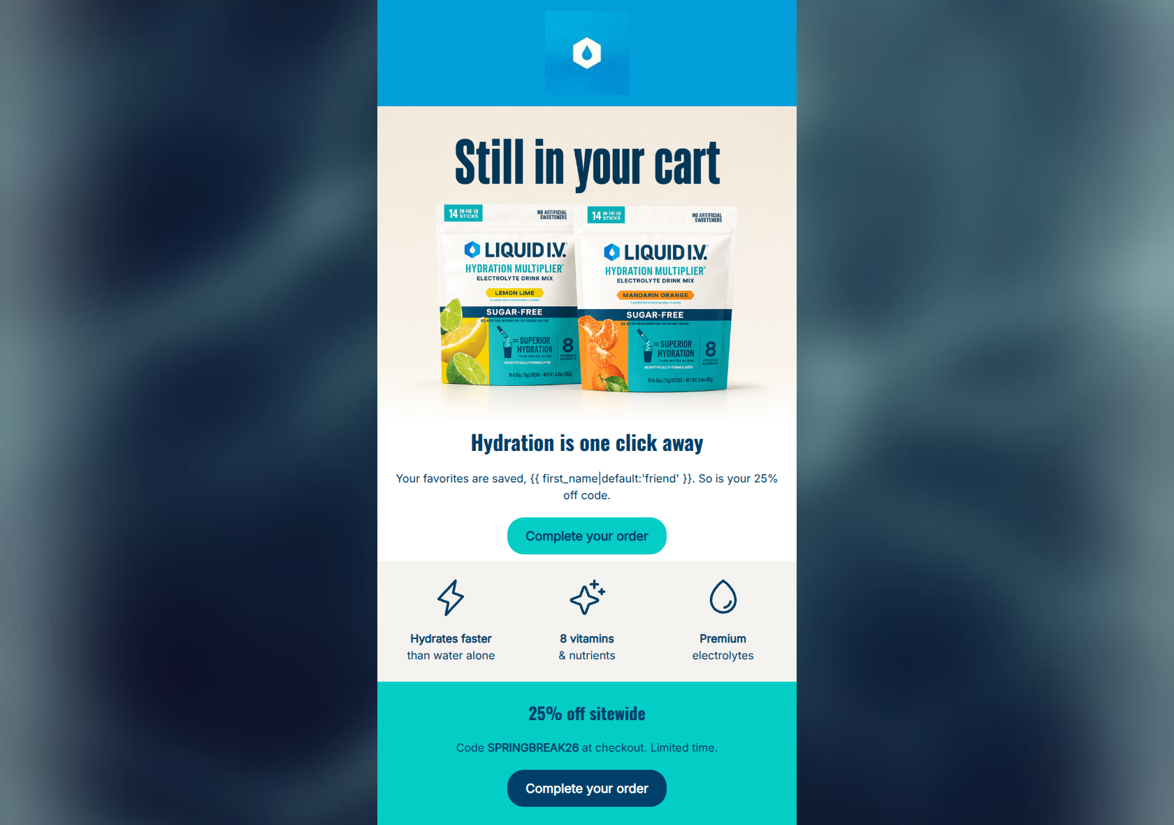
“Still in your cart”
Design Score
88/100This is a highly effective cart abandonment email that leverages a compelling 25% discount and exceptional word economy. The linear flow correctly guides the user back to their cart, and the primary CTAs are perfectly aligned in destination and intent. To elevate the email further, minor leaks in the conversion funnel (such as clickable benefit icons) should be removed, and visual consistency between the primary buttons should be tightened to keep the user relentlessly focused on completing their purchase.
Create Your Own
Generate professional email designs like this one in seconds with Kopi AI.
Email Details
- Subject Line
- Still in your cart
- Brand
- Liquid IV [eval 2026-03-26]
- Industry
- Health & Wellness
- Email Type
- Cart Abandonment
- Created
- April 24, 2026
Brand Colors
Email Copy
Hydration is one click away
Your favorites are saved, friend. So is your 25% off code.
→ Complete your order
Hydrates faster than water alone
8 vitamins & nutrients
Premium electrolytes
25% off sitewide
Code SPRINGBREAK26 at checkout. Limited time.
→ Complete your order
Why This Email Works
This is a highly effective cart abandonment email that leverages a compelling 25% discount and exceptional word economy. The linear flow correctly guides the user back to their cart, and the primary CTAs are perfectly aligned in destination and intent. To elevate the email further, minor leaks in the conversion funnel (such as clickable benefit icons) should be removed, and visual consistency between the primary buttons should be tightened to keep the user relentlessly focused on completing their purchase.
Hero Impact
85/100- Immediate visual recognition of the cart abandonment context.
- Clear and upfront tease of a saved 25% discount code.
Content Structure & Flow
88/100- Perfectly linear flow that moves the user naturally toward the final CTA.
- The inclusion of the value proposition block serves as an excellent, low-friction bridge between the top and bottom sections.
Visual Hierarchy & Layout
85/100- Clean, uncluttered layout that prevents cognitive overload.
- Excellent use of a stark background color change at the bottom to re-engage user attention.
Call-to-Action Strength
82/100- Flawless repetition of the primary goal and destination URL across multiple buttons.
- Clear, action-oriented button copy that tells the user exactly what to do.
Message Clarity & Tone
88/100- Excellent use of the phrase 'Your favorites are saved' to lower user anxiety regarding cart expiration.
- Straightforward, clinical-yet-approachable presentation of the core offer.
Readability & Scannability
95/100- Excellent contrast between the dark blue text and the white/cyan backgrounds.
- Minimal text blocks that do not require heavy reading or slow down the user.
Offer & Value Proposition
90/100- Strong, clear percentage-based discount that feels like a genuine reward.
- Effective mid-email reinforcement of the product's functional benefits to justify the purchase rationally.
Personalization & Audience Fit
82/100- Effective use of the first_name dynamic tag to create a conversational feel.
- Speaks directly to the target audience's desire for efficiency ('one click away').
Copy Conciseness & Word Economy
96/100- Zero filler words or redundant phrases.
- Tight, punchy phrasing that respects the reader's time and directs attention straight to the action.
Quick Wins
- Remove the destination URLs from the three benefit icons to plug a leak in the conversion funnel.
- Add the SPRINGBREAK26 discount code directly into the hero text so users see it instantly upon opening.
- Change the top CTA button to dark blue (#003F6A) to match the bottom CTA and establish a consistent visual cue for checkout.




Create Professional Email Designs
Generate beautiful, on-brand email designs in seconds. Just enter your brand URL and let AI do the rest.