Health & Wellness Cart Abandonment Email Template
“Forgot something? Your hydration is pending.”
Design Score
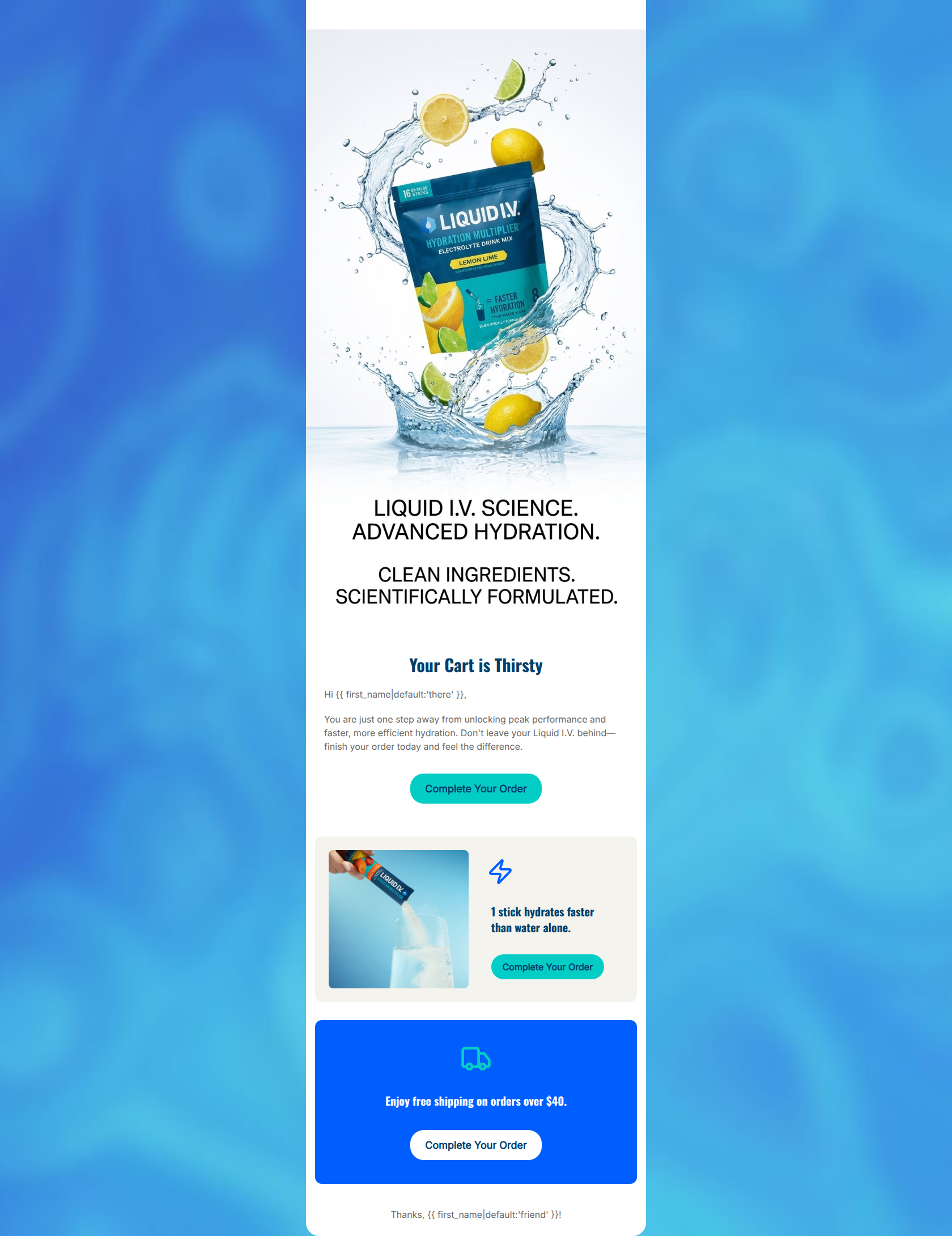
68/100This cart abandonment email features a strong, brand-aligned visual aesthetic with energetic imagery and clear value propositions. However, it relies too heavily on generic elements, missing the most critical component of an abandoned cart email: showing the actual items left behind. Furthermore, the embedded text in the hero image pushes the primary headline and CTA below the fold on many devices, and the repetitive, high-friction CTA copy creates unnecessary cognitive load.
Create Your Own
Generate professional email designs like this one in seconds with Kopi AI.
Email Details
- Subject Line
- Forgot something? Your hydration is pending.
- Brand
- Liquid IV [eval 2026-03-21]
- Industry
- Health & Wellness
- Email Type
- Cart Abandonment
- Created
- March 21, 2026
Brand Colors
Email Copy
Your Cart is Thirsty
Hi there,
You are just one step away from unlocking peak performance and faster, more efficient hydration. Don't leave your Liquid I.V. behind—finish your order today and feel the difference.
→ Complete Your Order
1 stick hydrates faster than water alone.
→ Complete Your Order
Enjoy free shipping on orders over $40.
→ Complete Your Order
Thanks, friend!
Why This Email Works
This cart abandonment email features a strong, brand-aligned visual aesthetic with energetic imagery and clear value propositions. However, it relies too heavily on generic elements, missing the most critical component of an abandoned cart email: showing the actual items left behind. Furthermore, the embedded text in the hero image pushes the primary headline and CTA below the fold on many devices, and the repetitive, high-friction CTA copy creates unnecessary cognitive load.
Hero (top/initial part) Impact
65/100- The dynamic product splash image perfectly aligns with the brand's energetic identity.
- The headline 'Your Cart is Thirsty' is a creative, on-brand spin on typical cart abandonment messaging.
Content Structure & Flow
72/100- Logical top-to-bottom hierarchy covering reminder, value prop, and incentive.
- Distinct visual blocks prevent the content from bleeding together.
Visual Hierarchy & Layout
75/100- Excellent use of contrasting brand colors to separate different messages.
- The bold blue block at the bottom effectively anchors the email and highlights the shipping incentive.
Call-to-Action Strength
60/100- CTAs pass the squint test and are immediately identifiable as clickable elements.
- Adequate spacing around the buttons prevents them from feeling cramped.
Message Clarity & Tone
80/100- Strong, brand-consistent voice that sounds like a trusted wellness partner.
- Clear articulation of the core benefit: '1 stick hydrates faster than water alone.'
Readability & Scannability
78/100- Good use of iconography (lightning bolt, truck) to visually communicate concepts quickly.
- Sufficient contrast between text and background colors.
Offer & Value Proposition
70/100- Strong reinforcement of the core product differentiator (efficacy over water).
- Clear communication of the shipping threshold.
Personalization & Audience Fit
50/100- The overall aesthetic and messaging tone are highly relevant to the active, health-conscious target demographic.
Quick Wins
- Change the CTA copy to be action-oriented and varied (e.g., 'Resume Checkout', 'Get Hydrated', 'Claim Free Shipping').
- Unify the text alignment in the top HTML section (make both the H1 and body text center-aligned).
- Shorten the body copy in the first section to reduce reading time.




Create Professional Email Designs
Generate beautiful, on-brand email designs in seconds. Just enter your brand URL and let AI do the rest.