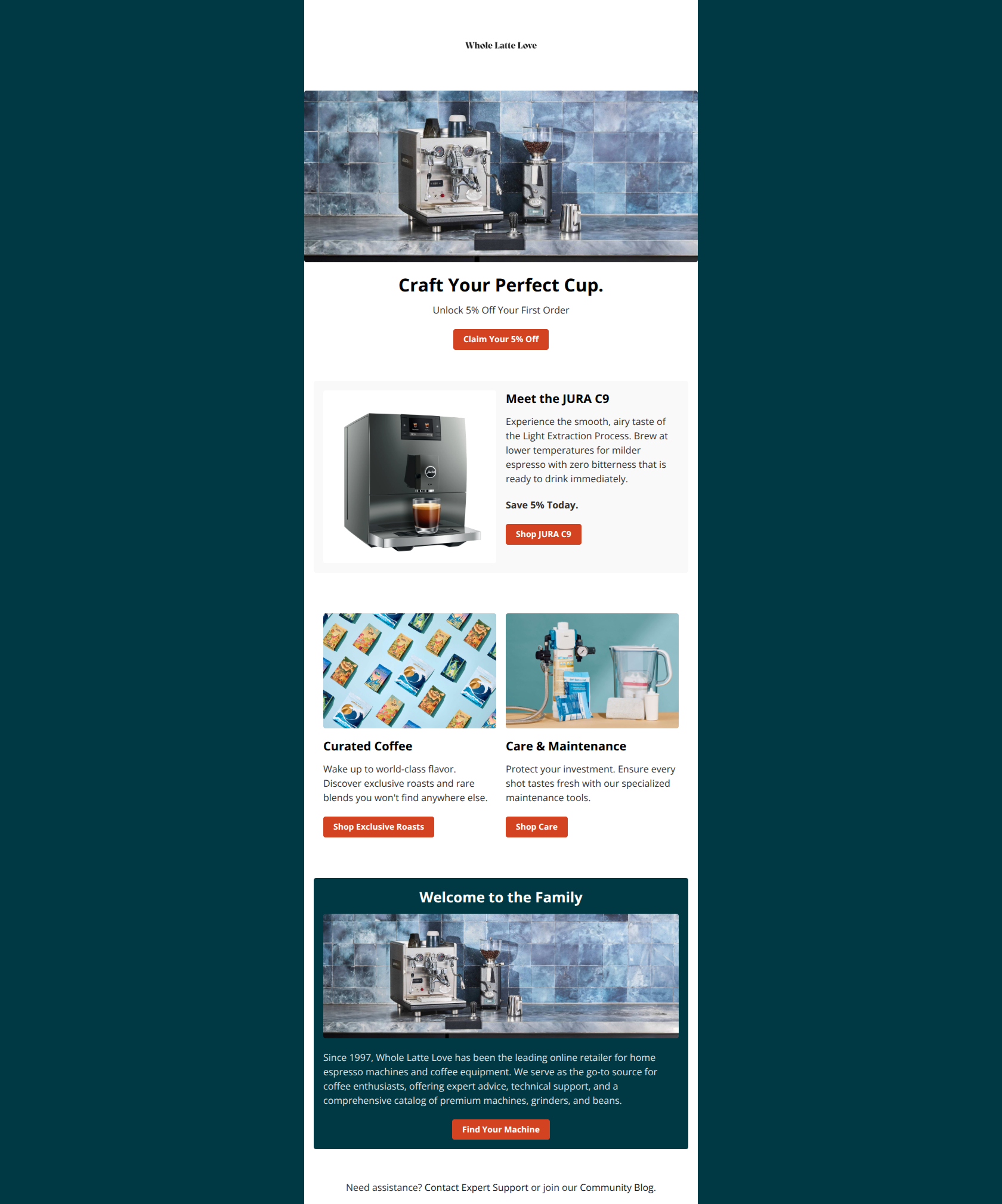
Whole Latte Love
Email Review
“Craft Your Perfect Cup”
Kopi AI analysis from January 9, 2026
This is a solid, professional welcome email with a clear value proposition and consistent branding. The biggest strength is the clean layout and strong CTA contrast, while the primary weakness is the repetitive use of the hero image in the bottom section. To improve conversion, swap the duplicate image for a lifestyle shot or team photo to build more human connection.
Email Screenshot
Quick Wins
- Replace the duplicate machine image in the bottom teal card with a human element (e.g., a barista).
- Bold the '5% Off' text within the primary button to make the value pop more.
- Add 'Free Shipping' or another secondary perk near the hero CTA if applicable.
Priority Actions
- Differentiate CTA styles: Keep the orange buttons for the main offer, but use outline buttons for the secondary categories to create a clear click priority.
- Reduce the vertical footprint of the hero image to bring the 'Meet the JURA C9' content into the initial viewport.
- Transform the 'Welcome to the Family' text block into 3 benefit-driven icons (Expert Advice, Tech Support, Premium Catalog) to improve scannability.
Category Breakdown
Detailed Feedback
Hero Impact
82/100The hero clearly establishes the brand and offer with a high-quality product shot and a benefit-driven headline.
Visual Hierarchy & Layout
74/100The use of white space and distinct sections makes the email very easy to navigate visually.
CTA Strength
85/100The orange-red button color pops perfectly against both white and teal backgrounds, making actions unmistakable.
Message Clarity & Tone
82/100The copy is concise and authoritative, leaning into the 'Expert Support' and 'since 1997' trust signals.
Offer & Value Proposition
76/100The 5% off offer is prominently displayed and repeated to ensure it isn't missed.
Content Structure & Flow
78/100The email follows a logical flow from the Hook (Offer) to the Specific (Jura) to the General (Categories) to the Trust (Brand Story).
Readability & Scannability
86/100Excellent use of bold headings and short paragraphs makes this very easy to skim on mobile.
Personalization & Audience Fit
72/100The imagery and 'Craft Your Perfect Cup' headline resonate well with the 'home barista' persona.
Color & Contrast Notes
- The orange-red primary color (#D34C2C approx) provides excellent contrast against the white background.
- The dark teal (#003D45 approx) creates a sophisticated brand feel but the white text on top is slightly thin for low-vision accessibility.
- The use of light gray for the JURA C9 background card helps it stand out as a featured item without clashing with the white background.
- Color palette is cohesive, moving from warm orange tones to cool teals.
Want to Create Better Emails?
Use Kopi AI to generate professional, on-brand marketing emails that convert. AI-powered email creation in seconds.