QuickTakes
Email Review
“Unlock Free Premium”
Kopi AI analysis from January 13, 2026
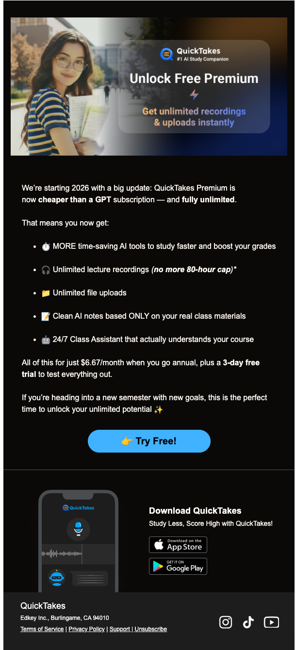
This email effectively uses a student-centric narrative and a high-contrast layout to drive focus toward the CTA. Its greatest strength is the 'cheaper than GPT' value anchor, while its primary weakness is the slight cognitive friction between the 'Free Premium' headline and the paid pricing details later. To maximize clicks, the '3-day free trial' offer should be moved higher to align with the hero's promise.
Email Screenshot
Quick Wins
- Bold '3-day free trial' in the body copy to ensure the low-friction entry point isn't missed.
- Add a secondary 'Download' link or CTA in the hero image itself to capture immediate clicks.
- Center the finger emoji in the button or remove it to keep the focus on the text.
Priority Actions
- Harmonize the 'Free' hook in the hero with the trial offer to reduce bounce rates from users expecting a permanent free tier.
- Restructure the pricing section into a small card or high-visibility callout box to emphasize the GPT price comparison.
- Increase line-height in the footer and legal section to improve mobile readability.
Category Breakdown
Detailed Feedback
Hero Impact
85/100The hero image uses relatable lifestyle photography and a clear dark-to-light gradient that ensures the white text remains legible.
Visual Hierarchy & Layout
78/100The use of emojis as bullet points creates a clear vertical skim path that guides the reader directly to the price and CTA.
CTA Strength
82/100The bright blue button (#4FB8FF) pops exceptionally well against the dark background, passing the 'squint test' easily.
Message Clarity & Tone
88/100The 'cheaper than a GPT subscription' comparison is a brilliant anchor for a student audience who likely already pays for AI tools.
Offer & Value Proposition
75/100Listing 'Unlimited file uploads' and 'Unlimited lecture recordings' directly addresses the primary pain points of the student demographic.
Color & Contrast Notes
- The blue CTA button (#4FB8FF) provides excellent contrast against the black body background.
- The white text on the dark hero overlay is legible, but the glow effect on 'Unlock Free Premium' should be kept subtle to avoid blurring.
- The grey app preview text in the footer is significantly harder to read than the primary body copy.
- Yellow folder and red assistant icons pop well, helping the bulleted list stand out.
Want to Create Better Emails?
Use Kopi AI to generate professional, on-brand marketing emails that convert. AI-powered email creation in seconds.