Nami
Email Review
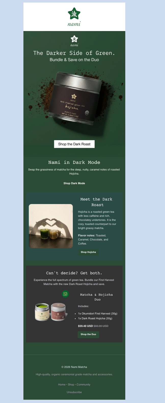
“The Darker Side of Green.”
Kopi AI analysis from January 13, 2026
Nami excels at atmospheric branding and evocative copywriting that builds strong desire for the product. The primary conversion friction comes from inconsistent CTA labels and the delayed visual payoff for the 'Bundle & Save' offer mentioned in the hero. Tightening the CTA strategy and showing the duo immediately will reduce cognitive load and increase click-through rates.
Email Screenshot

Quick Wins
- Change the 'Shop Dark Mode' text link to a button.
- Add '10% Off Duo' text to the hero sub-headline.
- Align the hero CTA text ('Shop the Duo') with the sub-headline's focus.
Priority Actions
- Update the hero image to show both products in the bundle to reduce cognitive friction.
- Standardize the CTA labels to focus on one primary outcome (e.g., 'Shop the Duo').
- Increase spacing between the educational 'Meet the Dark Roast' block and the final offer block to improve scannability.
Category Breakdown
Detailed Feedback
Hero Impact
82/100The visual of the Hojicha tin against the dark green background is striking and establishes the 'Darker Side' theme immediately.
CTA Strength
70/100The primary white button in the hero provides excellent 'squint-test' contrast against the dark background.
Offer & Value Proposition
75/100The discount is clearly calculated ($59.40 vs $66.00), removing 'math friction' for the customer.
Readability & Scannability
78/100Flavor notes are clearly broken out in the 'Meet the Dark Roast' section, making it easy for customers to identify taste preferences.
Color & Contrast Notes
- The white hero button ('Shop the Dark Roast') has the highest contrast in the email and should be the primary click driver.
- The dark-on-dark green color palette is sophisticated but relies heavily on the white text for legibility; ensure font weights are sufficient.
- The '10% OFF' badge uses a bright green that successfully breaks the muted color palette to draw the eye.
- The dark grey background for the 'Can't decide?' section effectively separates the offer from the educational content.
Want to Create Better Emails?
Use Kopi AI to generate professional, on-brand marketing emails that convert. AI-powered email creation in seconds.


