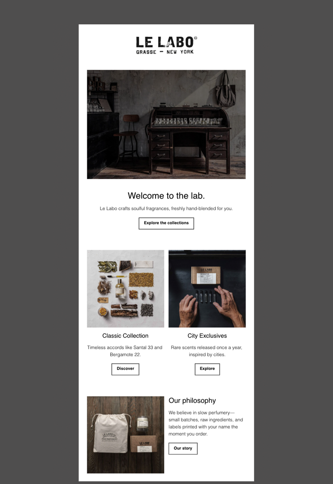
Le Labo
Email Review
“Welcome to the lab.”
Kopi AI analysis from January 12, 2026
The email perfectly captures Le Labo's artisanal aesthetic through high-quality photography and a clean, minimalist layout. While the brand voice is strong, the generic and repetitive CTA copy creates a passive browsing experience rather than a high-intent click path. Improving CTA specificity and visual prominence for the primary action will immediately boost conversion.
Email Screenshot
Quick Wins
- Bold 'Santal 33' and 'Bergamote 22' in the classic collection description to highlight hero products.
- Change the Hero CTA to a solid black button to create a clear primary action.
- Replace repetitive 'Explore' and 'Discover' button copy with specific, outcome-based labels.
Priority Actions
- Diversify the CTA strategy to move from 'passive browsing' (Explore) to 'active shopping' (Shop Now/Find Your Scent).
- Highlight the 'Personalized Labels' feature more prominently, as this is a high-conversion emotional hook.
- Introduce a 'Discovery Set' section to provide a low-risk conversion path for new subscribers.
Category Breakdown
Detailed Feedback
Hero Impact
85/100The atmospheric workshop imagery immediately establishes the brand's 'hand-blended' value proposition and artisanal identity.
Visual Hierarchy & Layout
82/100Excellent use of whitespace and a clear top-down flow that guides the eye from brand discovery to product categories.
CTA Strength
68/100Buttons are clearly defined with consistent bordering and sufficient padding for mobile tap targets.
Message Clarity & Tone
92/100The copy is concise, evocative, and perfectly aligned with a high-end, 'slow perfumery' brand voice.
Offer & Value Proposition
75/100Clearly communicates the 'freshly hand-blended' and 'small batches' differentiators.
Content Structure & Flow
88/100The transition from brand welcome to specific collections to brand philosophy is logical and narrative-driven.
Readability & Scannability
90/100Short paragraphs and clear headings make this email very easy to digest in under 10 seconds.
Personalization & Audience Fit
70/100The aesthetic is perfectly tailored to the likely target demographic of luxury/niche fragrance enthusiasts.
Color & Contrast Notes
- High-contrast black text on white background ensures maximum legibility across all devices.
- The use of muted, desaturated imagery creates a cohesive, premium feel that doesn't distract from the copy.
- Outlined buttons (Ghost buttons) are on-brand but may benefit from a solid fill for the primary CTA to improve the 'squint test' focal point.
- The monochromatic palette maintains brand sophistication but relies heavily on imagery for visual interest.
Want to Create Better Emails?
Use Kopi AI to generate professional, on-brand marketing emails that convert. AI-powered email creation in seconds.