Le Labo
Email Review
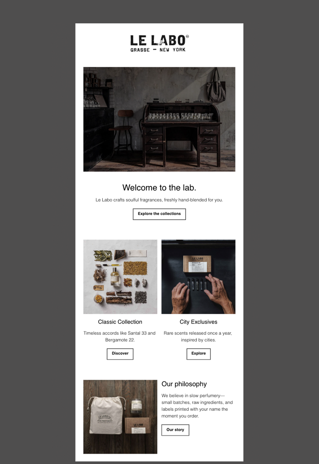
“Welcome to the lab.”
Kopi AI analysis from January 12, 2026
The email captures the brand's artisanal, high-end aesthetic perfectly through moody photography and generous whitespace. Its biggest weakness is the passive 'ghost button' CTAs that blend into the layout rather than driving clicks. To improve, the brand needs to inject more urgency or a clear 'start here' path for new customers.
Email Screenshot
Quick Wins
- Invert the hero CTA button (black background, white text) to make it the clear primary action.
- Update button text from 'Explore' and 'Discover' to 'Shop Now' or 'View Scent'.
- Add a 'Bestsellers' tag to the Santal 33 mention to provide social proof.
Priority Actions
- Incorporate a 'Discovery Set' offer to lower the purchase barrier for new subscribers.
- Hyperlink the product images, not just the buttons, to increase the total clickable area.
- Clarify the 'City Exclusives' value proposition to emphasize their limited-time availability.
Category Breakdown
Detailed Feedback
Hero Impact
82/100The moody, high-contrast image of the laboratory desk immediately establishes the brand's 'slow perfumery' identity and artisanal positioning.
Visual Hierarchy & Layout
85/100The transition from a single-column hero to a two-column product grid is clean and prevents the email from feeling too long.
CTA Strength
65/100Buttons are consistently styled and placed directly under relevant content blocks.
Message Clarity & Tone
90/100The tone is perfectly aligned with the brand's minimalist and intellectual persona.
Offer & Value Proposition
70/100The value prop of 'hand-blended for you' and 'labels printed with your name' is clear and unique.
Content Structure & Flow
80/100The flow from 'Who we are' to 'What we sell' to 'Why we do it' is a logical narrative for a welcome email.
Readability & Scannability
92/100Excellent use of typography and line spacing. The short paragraphs are very easy to digest on mobile.
Personalization & Audience Fit
60/100The 'hand-blended for you' copy makes the product feel personal even if the email isn't tailored to a specific user.
Color & Contrast Notes
- High-contrast black text on white background ensures excellent legibility.
- The photography uses a desaturated, earthy palette that reinforces the brand's 'raw' aesthetic.
- The primary CTAs (ghost buttons) have very low visual weight and fail the 'squint test' for prominence.
- The consistent use of monochrome maintains a premium, gallery-like feel.
Want to Create Better Emails?
Use Kopi AI to generate professional, on-brand marketing emails that convert. AI-powered email creation in seconds.