SparrowDesk
Email Review
“A box of chocolates for your support team?”
Kopi AI analysis from August 26, 2026
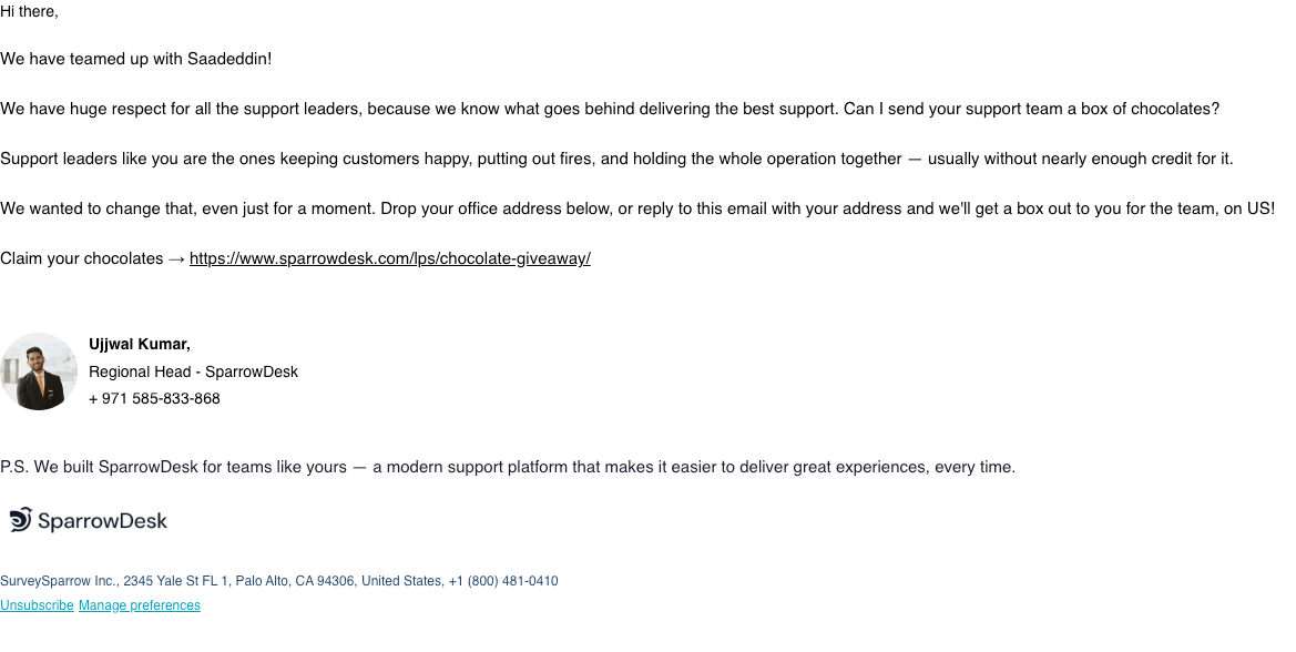
The offer—free chocolate for support teams—is highly engaging and personal, but it's buried in a dense plain-text layout. Transitioning from a naked URL to a prominent CTA button and adding a clear visual hook will significantly increase the click-through rate.
Email Screenshot
Quick Wins
- Convert the raw giveaway URL into a stylized button.
- Bold the offer: 'Can I send your support team a box of chocolates?'
- Add a headline at the top to state the purpose of the email immediately.
Priority Actions
- Restructure the email to follow a 'Hook-Value-CTA' format by moving the offer question earlier.
- Eliminate the choice between 'link' and 'reply' in the main body to drive all traffic to a single high-converting landing page.
- Increase the font size of the main body text to 16px-18px to improve readability on mobile devices.
Category Breakdown
Detailed Feedback
Hero Impact
45/100The personal 'Hi there' and the direct mention of a partnership with Saadeddin establishes a local/relevant context immediately.
Visual Hierarchy & Layout
50/100The simple, single-column layout is low-friction and feels like a personal 1-to-1 email.
CTA Strength
40/100The anchor text 'Claim your chocolates' is benefit-oriented and uses a directional arrow.
Message Clarity & Tone
75/100The tone is empathetic and appreciative, specifically calling out the hard work of support leaders.
Offer & Value Proposition
85/100The offer is concrete, tangible, and 'on US!', which reduces perceived risk and friction.
Content Structure & Flow
60/100The narrative follows a logical 'Who we are' -> 'Why we care' -> 'The Gift' -> 'How to get it' flow.
Readability & Scannability
55/100Sentence structures are relatively short and easy to parse.
Personalization & Audience Fit
70/100The email is clearly segmented for 'Support leaders,' making the recipient feel seen.
Color & Contrast Notes
- The standard blue hyperlink on white provides good contrast, but lacks 'brand' feel.
- The signature photo adds a human element and warmth that breaks the monochrome text.
- The SparrowDesk logo at the bottom is subtle but provides necessary brand authority.
- Lack of a 'pop' color (like a brand green or orange) makes the call-to-action feel non-urgent.
Want to Create Better Emails?
Use Kopi AI to generate professional, on-brand marketing emails that convert. AI-powered email creation in seconds.