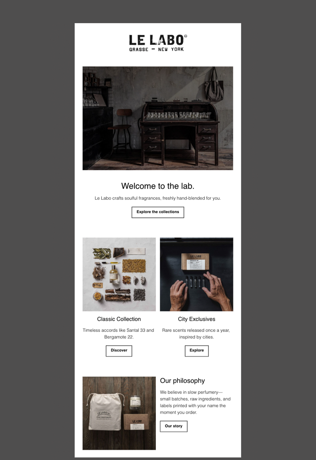
Le Labo
Email Review
“Welcome to the lab.”
Kopi AI analysis from January 12, 2026
The email perfectly captures Le Labo's minimalist, artisanal aesthetic with high-quality photography and excellent use of whitespace. Its biggest weakness is the 'ghost' button styling, which lacks the visual weight needed to drive high click-through rates. To improve, the primary CTA needs more contrast to stand out from the supporting content.
Email Screenshot
Quick Wins
- Invert the 'Explore the collections' button to a solid black background.
- Increase the brightness and contrast of the top lab interior image.
- Bold the names of the collections (e.g., 'Classic Collection') to make them pop from the subtext.
Priority Actions
- Differentiate the primary action from secondary actions using visual weight (solid vs. outline buttons).
- Standardize font sizes across all sections to improve mobile legibility and visual consistency.
- Integrate a 'Discovery Set' CTA as the primary low-friction conversion point for new subscribers.
Category Breakdown
Detailed Feedback
Hero Impact
75/100The hero image establishes a moody, 'lab-like' atmosphere that aligns with the brand's physical retail experience.
Visual Hierarchy & Layout
82/100The single-column to two-column transition is smooth and logically guides the eye downward.
CTA Strength
60/100The copy 'Explore the collections' is clear and on-brand for a discovery-focused welcome email.
Message Clarity & Tone
85/100The copy is concise, evocative, and effectively communicates the 'slow perfumery' value proposition.
Offer & Value Proposition
70/100The 'hand-blended for you' mention is a strong, unique selling point mentioned early.
Content Structure & Flow
85/100The sequence from 'Welcome' to 'Product Categories' to 'Brand Values' is a textbook-perfect welcome flow structure.
Readability & Scannability
90/100Excellent use of a clean sans-serif font and short paragraphs makes this very easy to skim.
Personalization & Audience Fit
60/100The tone fits the 'sophisticated minimalist' persona perfectly.
Color & Contrast Notes
- The monochromatic black-on-white palette provides maximum readability for all text elements.
- The primary hero image is quite dark, which may cause 'black crush' on OLED screens at low brightness.
- The thin 1px button borders are the weakest point of contrast, making the clickable areas look like decorative boxes.
- The photography maintains a consistent muted earth-tone palette that reinforces the premium brand identity.
Want to Create Better Emails?
Use Kopi AI to generate professional, on-brand marketing emails that convert. AI-powered email creation in seconds.