MKBHD
Email Review
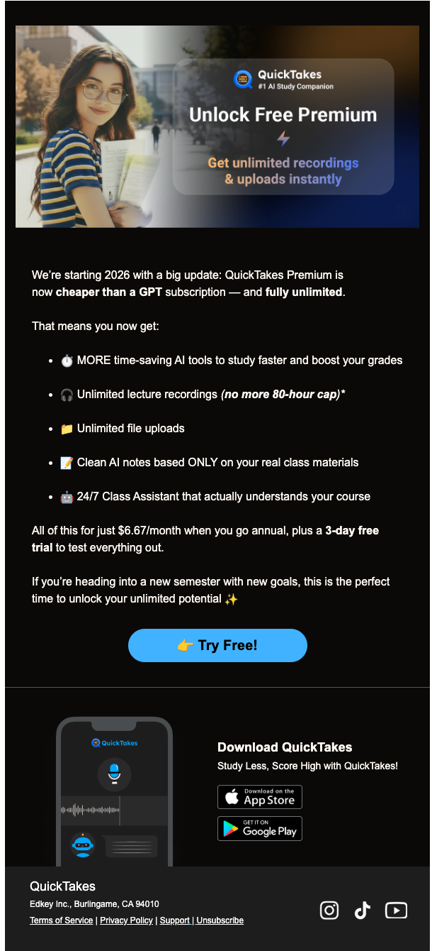
“System Incomplete: Configuration Paused”
Kopi AI analysis from January 9, 2026
This email features exceptional brand alignment and a clever 'tech-setup' narrative that resonates with the audience. The primary conversion hurdle is the generic shopping cart placeholder, which fails to leverage the visual desire of the items left behind. Strengthening the connection between the abandoned product and the 'The Core Four' upsells will drive higher click-through rates.
Email Screenshot
Quick Wins
- Swap the generic cart icon for the actual item left in the cart.
- Make the 'TECH10' discount code larger and bolder in the 'Cart Status' section.
- Add a 'Free shipping' or 'Quality Guarantee' badge near the checkout CTA to lower purchase friction.
Priority Actions
- Implement dynamic product blocks to show the specific abandoned item image and title.
- Optimize the 'The Core Four' section by using lifestyle imagery instead of flat lays to increase visual desire.
- Tighten the 'Latest Upload' block to ensure it doesn't distract from the primary goal of finishing the purchase.
Category Breakdown
Detailed Feedback
Hero Impact
92/100The 'System Incomplete' headline paired with a high-quality, on-brand image of Marques creates immediate urgency and authority.
Visual Hierarchy & Layout
70/100Clean sectioning with distinct color blocks (White for recovery, Black for upsells) helps separate the primary goal from secondary browsing.
CTA Strength
85/100The copy 'Resume Configuration' is brilliant; it stays within the tech/pro-grade theme rather than using a generic 'Shop Now'.
Message Clarity & Tone
90/100The voice is consistent, using terms like 'pro-grade,' 'configuration,' and 'matte black staples' that speak directly to the target tech enthusiast.
Offer & Value Proposition
82/100The 10% discount is clearly stated and framed as 'unlocking' a benefit.
Personalization & Audience Fit
55/100The copy 'We noticed you left some equipment behind' successfully acknowledges user behavior.
Color & Contrast Notes
- The red CTAs (#E31C2D approx) have excellent 'pop' against both white and black backgrounds.
- The 'The Core Four' section uses white text on a black background which provides high legibility for product names.
- The price text ($29.00) in red on black is slightly harder to read than the white text; consider a bolder weight.
- The use of 'Matte Black' aesthetic matches the brand's physical product design perfectly.
Want to Create Better Emails?
Use Kopi AI to generate professional, on-brand marketing emails that convert. AI-powered email creation in seconds.