BeIN Forum
Email Review
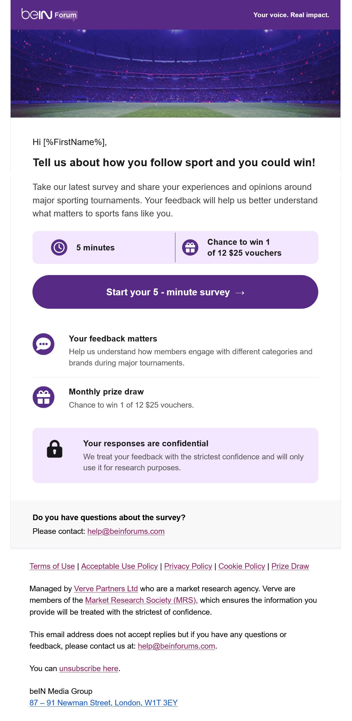
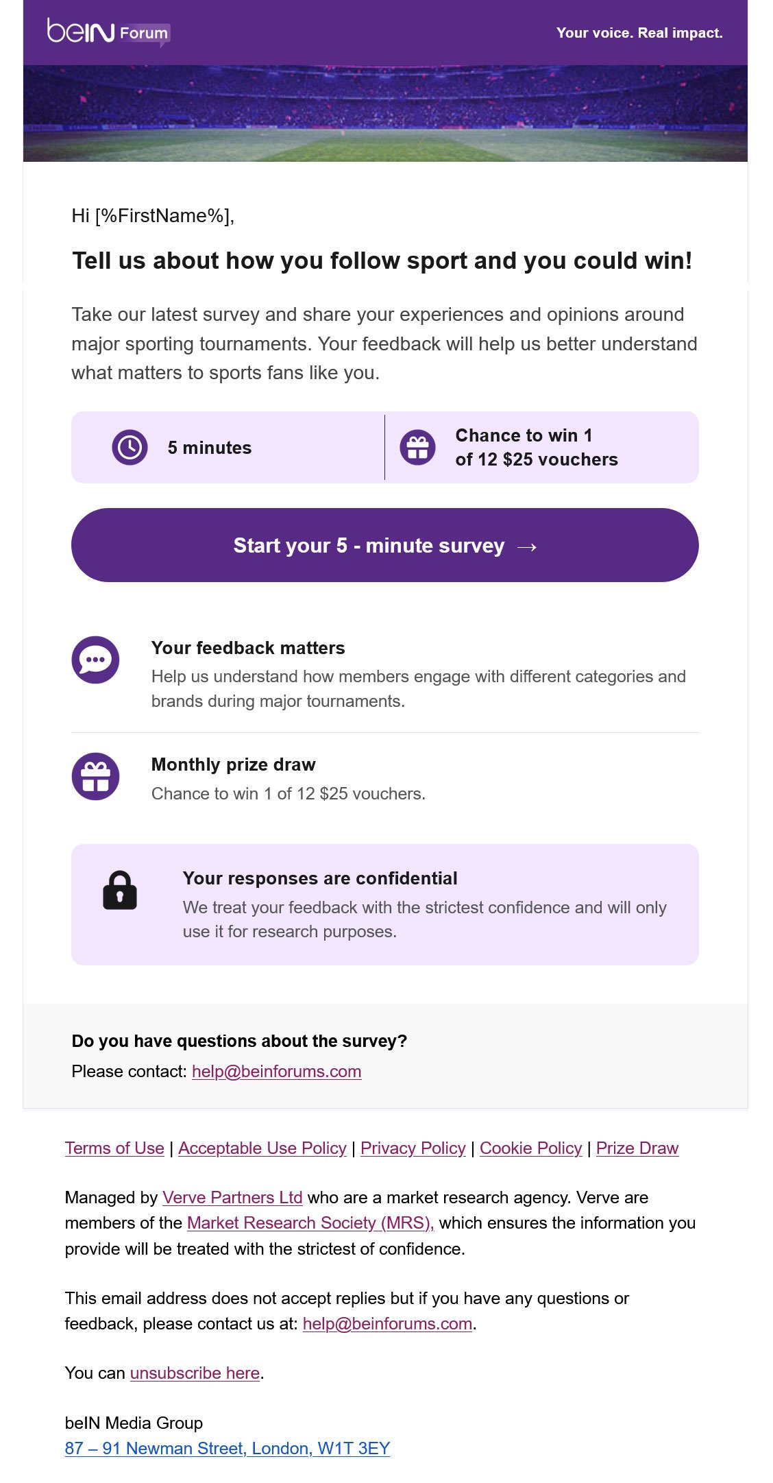
“Tell us about how you follow sport and you could win!”
Kopi AI analysis from September 14, 2026
The email establishes a clear value-to-time ratio by highlighting the 5-minute commitment and reward early. However, significant redundancy in the secondary content sections creates unnecessary scroll-length and cognitive load. Consolidating the benefit statements will streamline the path to the primary CTA.
Email Screenshot
Quick Wins
- Delete the duplicate 'Monthly prize draw' row to reduce email length.
- Bold the word '5 minutes' and '$25 vouchers' in the body copy to draw the eye to the value-to-time ratio.
- Move the 'Your responses are confidential' text to a small caption directly below the CTA.
Priority Actions
- Consolidate the three info-rows below the CTA into a single 'Why Join?' row or move them above the fold to drive the initial click.
- Re-write the headline to be more benefit-centric (e.g., 'Share your feedback, win a $25 voucher').
- Tighten the vertical spacing between the logo header and the hero image to bring the 'Hi [%FirstName%]' greeting higher in the viewport.
Category Breakdown
Detailed Feedback
Hero Impact
75/100The '5 minutes' and prize info boxes provide immediate context for the request before the user even reads the body text.
Visual Hierarchy & Layout
68/100The use of the purple brand color for the CTA button makes it the clear focal point against the white/gray background.
CTA Strength
88/100The CTA is highly specific, incorporating the time commitment ('5 - minute survey') and a directional arrow to imply progress.
Message Clarity & Tone
82/100The tone is professional and transparent about how the data will be used (market research).
Offer & Value Proposition
80/100The offer ($25 voucher) is concrete and the odds (1 of 12) are clearly stated, reducing 'sweepstakes skepticism'.
Content Structure & Flow
65/100The use of icon-led blocks makes the information easy to scan for mobile users.
Readability & Scannability
78/100Short paragraphs and clear bullet-style icons help the user digest the requirements quickly.
Personalization & Audience Fit
70/100Uses a first-name placeholder which is standard but effective for survey requests.
Color & Contrast Notes
- The deep purple CTA button (Start your 5 - minute survey) provides excellent contrast against the white canvas.
- The light purple background in the 'Your responses are confidential' block helps distinguish trust-building info from general info.
- White text on the purple header 'Your voice. Real impact.' is legible and reinforces brand identity.
- Gray text in the 'Questions' block is slightly recessed, which appropriately de-prioritizes it compared to the main action.
Want to Create Better Emails?
Use Kopi AI to generate professional, on-brand marketing emails that convert. AI-powered email creation in seconds.