Email Review
Email Review
Kopi AI analysis from January 9, 2026
The email excels at educational storytelling and establishing a supportive brand voice for a sensitive product category. However, the conversion path is cluttered with seven competing CTAs and a redundant secondary introduction that pushes the most valuable content too far down the page. Consolidating the top sections and clarifying the hero headline will significantly reduce cognitive load.
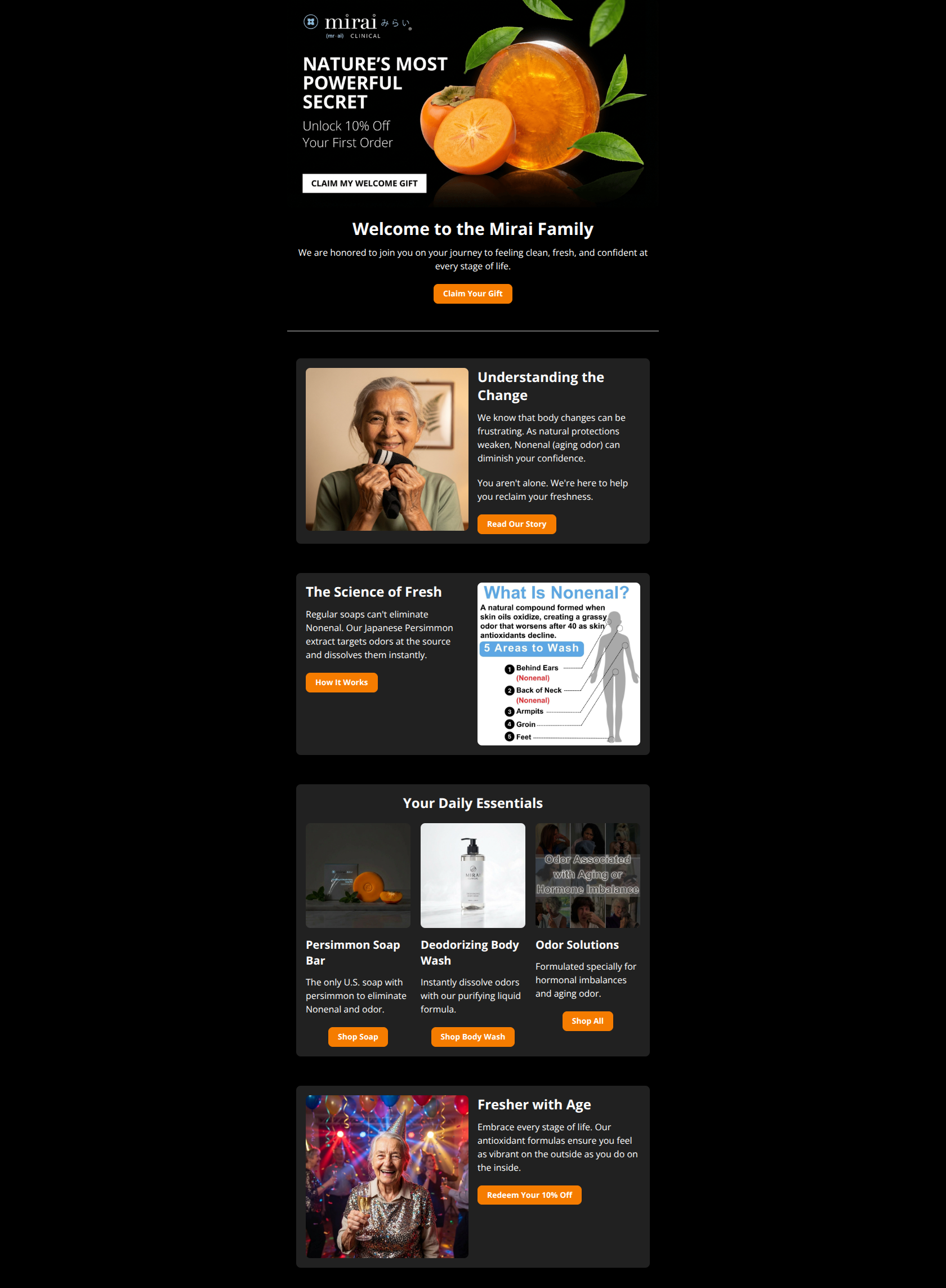
Email Screenshot
Quick Wins
- Delete the redundant 'Welcome to the Mirai Family' section to bring the educational content 'above the fold'.
- Replace the 'Odor Solutions' collage image with a single, clear product shot to match the visual rhythm of the other two product cards.
- Increase the font size of the 10% off offer in the hero to make the incentive more 'unmissable'.
Priority Actions
- Refine the Hero headline from a generic 'Secret' hook to a benefit-driven statement about eliminating Nonenal odor.
- Consolidate the primary CTAs; limit the email to 3-4 high-value clicks rather than 7 to focus the user's attention.
- Convert the 'What is Nonenal' infographic into a mobile-optimized layout with larger, accessible text.
Category Breakdown
Detailed Feedback
Hero Impact
78/100The high-quality imagery of the persimmon fruit immediately establishes the 'natural' value proposition and creates a premium feel.
Visual Hierarchy & Layout
70/100The use of dark cards against a black background creates a sophisticated, clinical-yet-premium aesthetic that organizes content well.
CTA Strength
72/100The orange button color provides excellent contrast against the dark background, making them easy to spot during a quick scroll.
Message Clarity & Tone
88/100The copy handles the topic of 'aging odor' with grace and empathy, using phrases like 'You aren't alone' to build trust.
Readability & Scannability
75/100Short paragraphs and clear headers like 'Understanding the Change' make the text easy to digest on mobile.
Color & Contrast Notes
- The orange buttons (#FF8C00 style) achieve high prominence against the black background for a strong 'squint test' result.
- White body text on dark gray cards maintains good legibility while softening the look compared to pure black/white.
- The red labels within the 'What is Nonenal' diagram lack sufficient contrast and may be missed by users with visual impairments.
- Overall palette is cohesive, reinforcing the 'Clinical' brand name with a clean, dark-mode-friendly execution.
Want to Create Better Emails?
Use Kopi AI to generate professional, on-brand marketing emails that convert. AI-powered email creation in seconds.