Psymark
Email Review
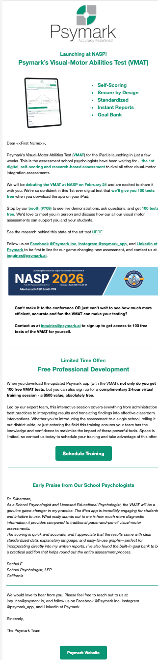
“Psymark’s Visual-Motor Abilities Test (VMAT) is Launching”
Kopi AI analysis from February 8, 2026
The email features an incredibly strong value proposition—including a $500 training offer and 100 free tests—but buries these incentives under dense paragraphs and a delayed CTA. To maximize clicks, the primary offer needs a prominent button in the hero section and the text-heavy layout must be broken into scannable cards.
Email Screenshot
Quick Wins
- Add a 'Get 100 Free Tests' button immediately after the first paragraph.
- Un-italicize the testimonial to make it more readable.
- Bolding the '$500 value' phrase in the offer section to make it jump out during a scan.
Priority Actions
- Restructure the hero to lead with the '100 free tests' offer instead of just a product feature list.
- Consolidate the multiple contact links (email addresses and social handles) into a single, clean footer section to avoid distraction.
- Redesign the 'Free Professional Development' section into a visual 'Value Box' that clearly highlights the $500 savings.
Category Breakdown
Detailed Feedback
Hero Impact
60/100The product name and logo are clear, and the iPad visual immediately identifies this as a digital tool.
CTA Strength
55/100The teal 'Schedule Training' button uses a distinct brand color that contrasts well against the white background.
Readability & Scannability
50/100The use of bullet points at the top helps establish product features quickly.
Visual Hierarchy & Layout
62/100Horizontal dividers are used correctly to separate the introduction from the offer and the social proof.
Color & Contrast Notes
- The teal brand color (#009681 equivalent) provides excellent contrast for buttons on white.
- Green bolded text within the body paragraphs is used too frequently, which creates visual noise and reduces the impact of the key points.
- The grey text in the footer and signature is slightly too light; darkening it by 10% would improve legibility.
- The white text inside the teal buttons passes the 'squint test' for accessibility.
Want to Create Better Emails?
Use Kopi AI to generate professional, on-brand marketing emails that convert. AI-powered email creation in seconds.