Play Hockey
Email Review
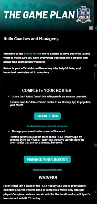
“The Game Plan”
Kopi AI analysis from February 27, 2026
The email establishes a strong visual identity and uses high-contrast CTAs to drive necessary pre-event actions. However, the inclusion of a placeholder 'EVENT NAME' in the opening sentence is a critical QA failure that undermines professional trust. Addressing this and moving away from centered text for dense instructions will significantly improve conversion.
Email Screenshot
Quick Wins
- Fix the 'EVENT NAME' placeholder immediately.
- Left-align all instructional body copy for faster scanning.
- Increase the font size of the help links ('How to share...') by 2px.
Priority Actions
- Implement a QA checklist to ensure all dynamic tags/placeholders are populated before deployment.
- Group the 'Roster' and 'Waivers' sections into visually distinct cards or with horizontal dividers to separate the distinct tasks.
- A/B test button copy to see if more specific actions (e.g., 'Open Roster Manager') drive higher click-through than generic terms.
Category Breakdown
Detailed Feedback
Hero Impact
82/100The 'Game Plan' headline is bold, on-brand, and instantly communicates the purpose of the email as a logistical guide.
Message Clarity & Tone
45/100The tone is appropriately direct and instructional for a logistical 'how-to' guide for coaches.
CTA Strength
78/100The teal buttons provide excellent contrast against the black background and have clear, button-like shapes.
Readability & Scannability
60/100Clear capitalization on headers like 'COMPLETE YOUR ROSTER' and 'WAIVERS' helps break up the sections.
Color & Contrast Notes
- The brand teal provides high-visibility contrast against the black background for buttons.
- White body text on black is high contrast but can cause 'halation' (blurring) for some readers; slightly increasing line height would help.
- The secondary 'How to' links below the buttons are significantly smaller and harder to read.
Want to Create Better Emails?
Use Kopi AI to generate professional, on-brand marketing emails that convert. AI-powered email creation in seconds.