Oac
Email Review
“Cosy season is here. Which ball are you?”
Kopi AI analysis from October 13, 2026
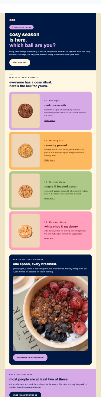
This email excels at seasonal storytelling and ritual-based marketing, creating a strong emotional hook through evocative copy. The layout is highly scannable, though the conversion path is slightly weakened by low-contrast text links within the product cards. Strengthening the CTA prominence in the mid-section will turn this high-engagement asset into a high-conversion one.
Email Screenshot
Quick Wins
- Bold the 'that's me ->' links in every product card to increase visibility.
- Add a 'Shop All' link in the top-right header for users who don't want to scroll.
- Increase the font size of the product titles (e.g., 'dark cocoa nib') by 2-4 pixels.
Priority Actions
- Upgrade the product card text links into pill-shaped buttons to maximize mobile click-through rates.
- Include a secondary CTA in the 'breakfast crumb' section that links directly to that product page rather than just the general lineup.
- Add a small 'Add to Cart' or 'Buy Now' button under the final 'Autumn Line-up' CTA to reduce the steps to purchase.
Category Breakdown
Detailed Feedback
Hero Impact
90/100The 'cosy season' headline combined with the quiz-style 'which ball are you?' creates immediate curiosity and personal relevance.
Visual Hierarchy & Layout
88/100The alternating card colors (lavender, orange, sage, pink) create a clear rhythm that guides the eye through the product lineup.
CTA Strength
74/100The CTA copy 'that’s me' is highly personalized and reinforces the 'identity' angle of the email.
Message Clarity & Tone
95/100The copy is masterful—phrases like 'no popcorn crumbs on the couch' and 'inbox still full' anchor the product in relatable, specific moments.
Offer & Value Proposition
82/100The email successfully frames protein balls as a 'ritual' rather than just a snack, increasing perceived value.
Color & Contrast Notes
- The navy text on the orange and pink cards is legible, but the 'that’s me ->' arrow links are very thin and risk disappearing.
- The use of white text on the navy 'one spoon' section is high-contrast and very easy to read.
- The lavender background for the final section ('most people are...') provides a soft but effective visual 'stop' for the footer.
Want to Create Better Emails?
Use Kopi AI to generate professional, on-brand marketing emails that convert. AI-powered email creation in seconds.