beIN Forum
Email Review
“Tell us about how you follow sport and you could win!”
Kopi AI analysis from September 14, 2026
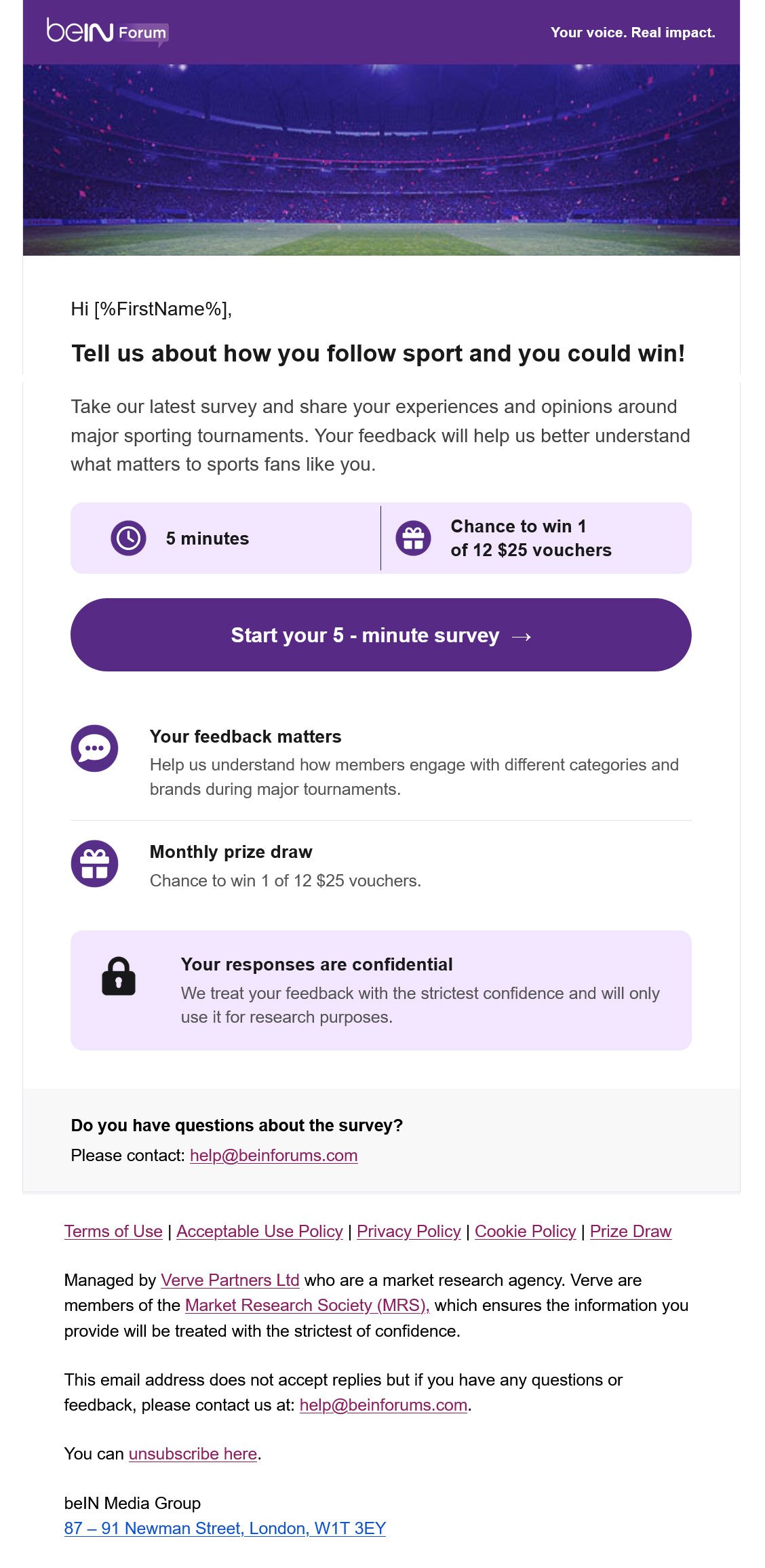
This email features a highly effective visual hierarchy and a friction-less primary CTA that makes the task feel low-effort. The biggest weakness is the generic hero image and the technical appearance of the personalization tag. To boost conversion, make the reward more prominent and ensure the 'Your voice' value prop is more than just a tagline.
Email Screenshot
Quick Wins
- Replace '[%FirstName%]' with a friendly 'Hi' or a properly formatted name fallback.
- Bold the '5 minutes' and '$25 vouchers' text inside the light purple boxes to make them pop during a quick scan.
- Change the hero image alt-text to include the specific survey topic (e.g., 'Major sporting tournaments survey').
Priority Actions
- Re-crop the hero image or reduce its height by 30% to bring the headline and '5-minute' claim higher up in the initial view.
- Add a 'Why it matters' bullet point that specifically mentions one recent change made based on forum feedback to prove the 'Real Impact' claim.
- Test a version where the CTA button is a slightly more contrasting color (like an accent gold or orange) to see if it increases click-through rates against the purple brand theme.
Category Breakdown
Detailed Feedback
Hero Impact
75/100The hero image creates a high-energy sporting atmosphere that aligns with the brand's niche.
Visual Hierarchy & Layout
88/100The use of the dual-column stat box (Time/Reward) immediately follows the headline, giving the reader exactly what they need to decide.
CTA Strength
92/100The primary button uses specific, outcome-oriented copy ('Start your 5 - minute survey') which sets clear expectations for the user.
Message Clarity & Tone
85/100The copy is concise and professional, respecting the user's time by getting straight to the point.
Offer & Value Proposition
72/100The reward (12 x $25 vouchers) is clearly stated with an icon for quick recognition.
Readability & Scannability
90/100Excellent use of iconography and horizontal rules to separate ideas and prevent a 'wall of text.'
Color & Contrast Notes
- The brand purple (#4D2683) provides excellent contrast against white for the primary CTA.
- The light purple background in the info boxes helps group related content without making the design feel heavy.
- Text links in the footer are slightly small but acceptable for compliance content.
- The white text on the purple header bar is crisp and easy to read.
Want to Create Better Emails?
Use Kopi AI to generate professional, on-brand marketing emails that convert. AI-powered email creation in seconds.