Ferosticker
Email Review
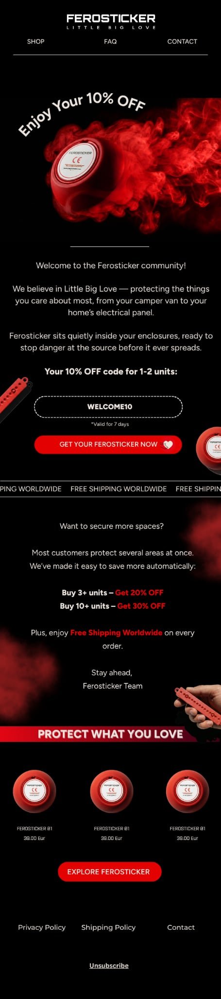
“Welcome to the Ferosticker community!”
Kopi AI analysis from May 12, 2026
This email effectively uses high-contrast branding and clear tiered offers to drive urgency. While the visual identity is striking, the hero section relies too heavily on stylized text rather than immediately communicating the product's lifesaving utility. Consolidating the repetitive product grid and sharpening the value proposition will better convert interest into action.
Email Screenshot
Quick Wins
- Shorten the primary button text to 'Protect Your Home Now'.
- Change the red 'Free Shipping' text to white bold to improve readability against the black background.
- Add a 'Save 30% on 10+ units' badge to the product images at the bottom to reinforce the bulk offer.
Priority Actions
- Reorganize the content flow so the 'how it works' explanation precedes the specific discount code.
- Remove the repetitive 3-column product grid and replace it with a single, high-impact 'Starter Pack' or 'Home Bundle' callout.
- Incorporate a 'How to Install' 3-step visual guide to lower the perceived barrier to using the stickers.
Category Breakdown
Detailed Feedback
Hero Impact
75/100The high-quality product photography and curved typography create a sleek, premium brand feel immediately upon opening.
Visual Hierarchy & Layout
82/100The black background provides a sophisticated canvas that makes the red product accents and white text highly legible.
CTA Strength
72/100The primary red button 'GET YOUR FEROSTICKER NOW' uses high-contrast color and stands out clearly against the black background.
Message Clarity & Tone
85/100The copy 'protecting the things you care about most' effectively bridges the gap between a technical product and an emotional benefit.
Offer & Value Proposition
88/100The tiered discount structure (3+ units for 20%, 10+ units for 30%) is a brilliant way to increase Average Order Value for a multi-use product.
Color & Contrast Notes
- Red on black provides excellent visual pop for buttons and key offers.
- The curved white text on the hero has good contrast but may be harder to read for some users due to the arc.
- Red text for 'Free Shipping Worldwide' inside the body text is slightly harder to read than the white text nearby; bold white would be safer.
- The use of 'Ferosticker B1' in small grey text under the products is low contrast and difficult to read.
Want to Create Better Emails?
Use Kopi AI to generate professional, on-brand marketing emails that convert. AI-powered email creation in seconds.