Email Review
Email Review
Kopi AI analysis from January 9, 2026
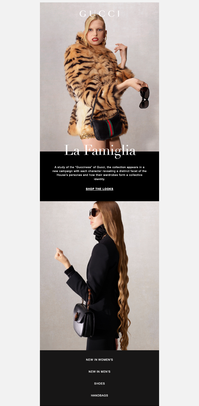
Gucci's aesthetic is impeccably luxury, leveraging high-end editorial photography that maintains brand prestige. However, the conversion path is severely throttled by an over-reliance on underlined text links and abstract, low-clarity copy. The immediate fix is to transform the primary 'SHOP THE LOOKS' link into a high-contrast button to drive the click.
Email Screenshot
Quick Wins
- Turn 'SHOP THE LOOKS' into a high-contrast white button.
- Move the Gucci logo out of the image and into a solid black header.
- Increase the font size and padding of the bottom navigation links (Women's, Men's, etc.) for better tapability.
Priority Actions
- Replace abstract 'campaign' copy with a direct shopping invitation that mentions specific product categories shown.
- Introduce a small product carousel or grid featuring the bag and sunglasses shown in the images to reduce the number of clicks to purchase.
- Establish a clearer visual 'end' to the email by adding a distinct footer section with social proof or store locator links.
Category Breakdown
Detailed Feedback
Hero Impact
78/100The 'La Famiglia' image is high-impact and communicates the brand's unique tiger-print aesthetic and luxury positioning immediately.
CTA Strength
45/100The primary CTA 'SHOP THE LOOKS' is centered and capitalized for focus.
Message Clarity & Tone
60/100The tone is consistent with high-fashion editorial, using sophisticated language like 'study' and 'collective identity'.
Visual Hierarchy & Layout
72/100The single-column stack creates a clean, focused narrative flow from the hero image to the navigation links.
Color & Contrast Notes
- White text on black background provides excellent readability in the copy block.
- The white logo on a light-colored image background (model's face/hair) creates a visibility struggle.
- The monochromatic black-and-white footer navigation is elegant but lacks visual weight to draw the eye downward.
Want to Create Better Emails?
Use Kopi AI to generate professional, on-brand marketing emails that convert. AI-powered email creation in seconds.