Em-Smart
Email Review
“Summer Sales: Up to 50% Off”
Kopi AI analysis from July 10, 2026
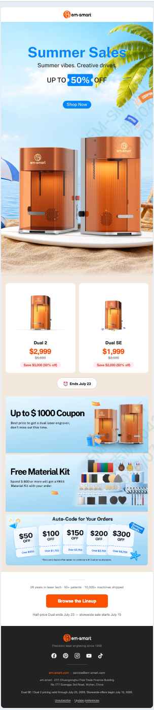
The email features a high-impact hero and massive value propositions ($3,000+ savings), but it suffers from 'offer fatigue' in the lower half. The stacking of coupons, free kits, and auto-coded tiered discounts creates high cognitive load. To improve conversion, consolidate the secondary offers and increase the visual contrast of the primary CTA.
Email Screenshot
Quick Wins
- Change the hero 'Shop Now' button color to orange.
- Bolding the 'Ends July 23' date in the pill-shaped notification to increase urgency.
- Increase the font size of the spend-threshold labels in the 'Auto-Code' section.
Priority Actions
- Consolidate the three bottom offer modules (Coupon, Kit, Auto-code) into two clear sections: 'Bonus Gift' and 'Tiered Savings'.
- Add a 'Total Potential Savings' headline to the hero to bridge the gap between 50% off and the $1000 coupon.
- Refine the visual hierarchy of the Auto-Code section to ensure the discount amount is the clear hero of each card.
Category Breakdown
Detailed Feedback
Hero Impact
82/100The hero image creates an immediate seasonal vibe that matches the headline, and the '50% OFF' callout is impossible to miss.
Visual Hierarchy & Layout
65/100The product grid effectively uses whitespace to frame the high-ticket machines, making the $3,000 savings stand out.
CTA Strength
70/100The use of a secondary CTA ('Browse the Lineup') at the bottom provides a clear path for users who scrolled past the hero.
Message Clarity & Tone
60/100The 'Summer vibes. Creative drives.' tagline is punchy and aspirational.
Offer & Value Proposition
88/100The specific dollar amounts saved ($3,000 and $2,000) are highly compelling for high-ticket hardware.
Readability & Scannability
58/100Clear price anchoring with the strikethrough 'was' prices next to the 'now' prices.
Color & Contrast Notes
- The blue CTA in the hero fails the squint test due to the similar blue hues in the sky.
- Orange price text on white product cards provides excellent legibility and draws the eye to the deal.
- The white text on the light blue tiered-discount cards is extremely difficult to read.
- The dark grey footer with white/orange text is well-structured and professionally balanced.
Want to Create Better Emails?
Use Kopi AI to generate professional, on-brand marketing emails that convert. AI-powered email creation in seconds.